No items found.
No items found.
Building an impactful presentation can feel daunting. I’ve spent plenty of late nights staring at a blank deck, wondering where to start, what data to include, and how to make the slides look impressive.
Like most people, PowerPoint was my default tool for years.
But as new presentation software and AI-powered presentation makers entered the market promising speed and efficiency, I started testing them to see which ones could make my job easier.
What I learned is this: the hardest part of a presentation isn’t the content, it’s turning that content into a polished deck that keeps your audience engaged.
Most of us know exactly what we want to say, but the slides don’t always bring the message across. I used to spend hours tweaking layouts, adjusting spacing, and fixing formatting.
Trying better tools changed that. They helped me save time, focus more on the story, and finally build slides I felt confident presenting.
Today, there are countless presentation tools out there, and figuring out which one fits your needs can get overwhelming fast.
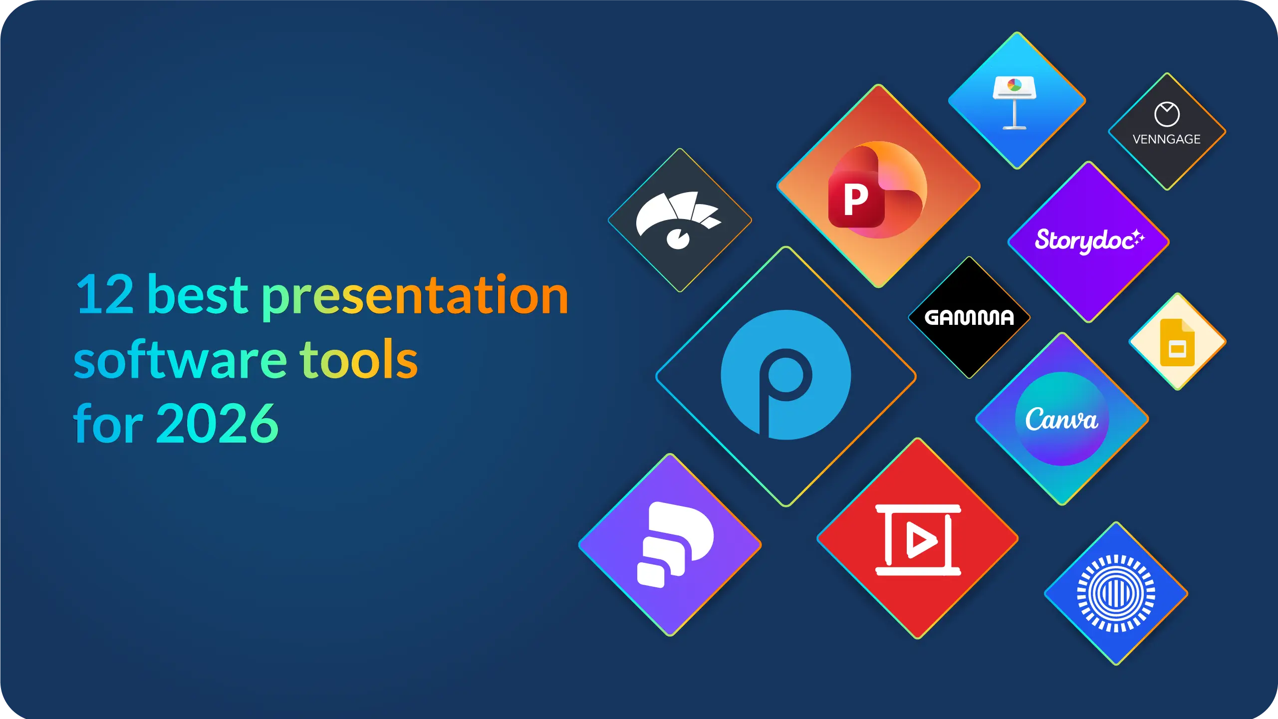
After testing a wide array of AI presentation tools, trying different features, and digging into real user reviews, I narrowed it down to the 12 best presentation software options for 2026, so you can choose the right one for your use case.
To give you a quick overview, here’s a comparison of the 12 best presentation software options I’ve selected.
I looked at ease of use, standout features, and general pricing based on what platforms like G2, Capterra, and other review sites currently show.
Each tool excels in different areas, whether you’re looking for AI-powered design, smooth collaboration, or something that simply helps you create clean, professional slides with less effort.
I started by reviewing more than 20 presentation tools. As I tested them, one thing became clear: the “best presentation software” looks different for everyone.
Some people want speed. Others want more design control. Some need strong collaboration features, and others care most about data storytelling.
So instead of creating just another generic list from a quick search, I focused on what actually matters in real day-to-day work.
The tools I selected consistently earned strong ratings on trusted review platforms like G2, Capterra, and Trustpilot.
These sites combine large numbers of verified user reviews with clear categories and transparent scoring, which helped me compare tools fairly.
Most of the software on this list are tools I’ve personally tested. For the few I couldn’t try myself, like Apple Keynote, I relied on insights from professionals who use them regularly and cross-checked their feedback with verified G2 reviews.
My goal with this breakdown is simple: to help you quickly figure out which tool fits your needs without spending hours researching. I hope the insights here make your decision a whole lot easier.
In the beginning, speed was the only thing I cared about. I just wanted a tool that helped me build slides faster.
But over time, I realized that great presentation software needs to do much more than save a few minutes.
It has to support good storytelling, make collaboration easier, and help you create slides that look professional without extra effort.
Here are the criteria I eventually narrowed down:
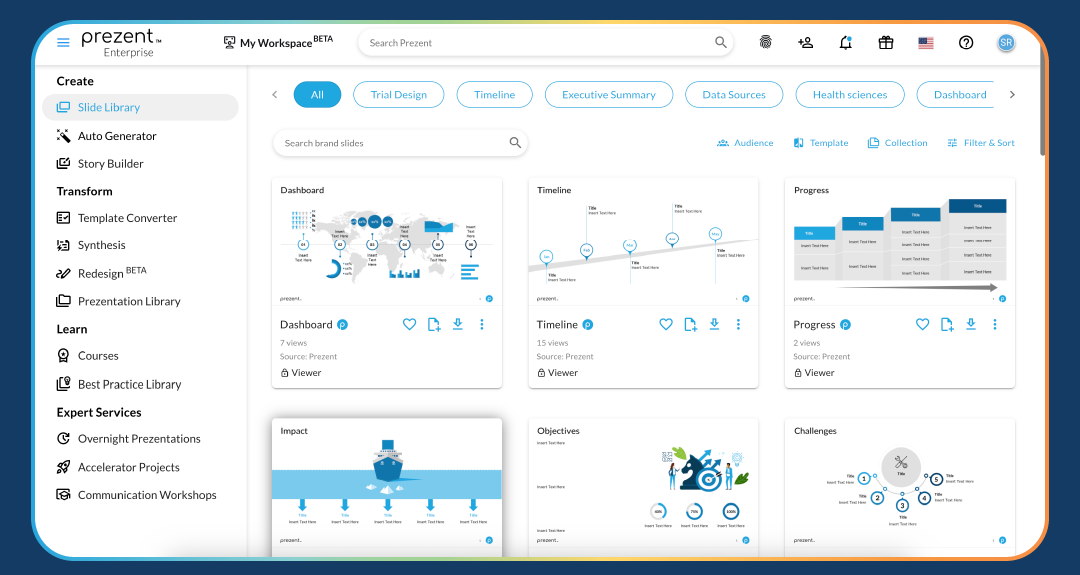
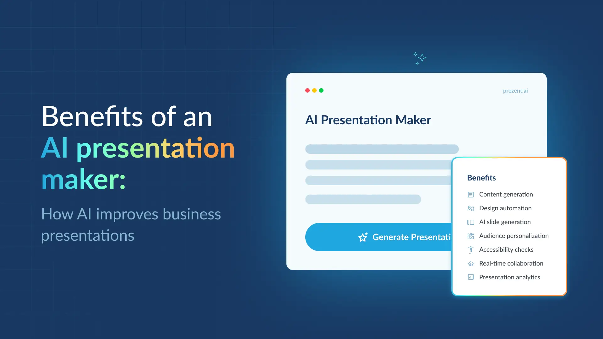
Prezent was the first presentation platform I tried that truly felt built for enterprise teams.
What surprised and honestly delighted me was how well its AI could create on-brand, context-aware decks from just a simple prompt and supporting documents, or even with rough notes.
And by context, I don’t mean a generic deck with surface-level edits. The slides reflect the language of your industry, your function, and even the specific audience you’re targeting.
The platform uses the right jargon, tone, and layouts without you having to guide every detail.
This AI presentation software is extremely easy to use. You can build a brand-new deck from scratch or refresh an existing one by changing the audience, the template, layout, or images.
Everything feels smooth and efficient, and the end result looks like it was designed by an expert, with almost no manual formatting on your part.
Prezent also has one of the strongest template libraries I’ve seen, with more than 35,000 expert-designed templates and 1,000+ storylines based on real business use cases.
It even summarizes long decks into clean executive summaries that highlight what matters most for the audience you’re presenting to.
Collaboration is also simple. You can get real-time comments from your team, work together on the same deck, and move quickly without version issues.
It integrates well with tools like Google Slides and Microsoft PowerPoint, and the API capabilities make it easy to build on-brand decks directly inside your existing workflow without switching platforms.
According to G2, Prezent is rated as a High Performer, with especially strong scores in brand consistency and time savings for enterprise teams.
Many reviewers mention that it becomes their “single source of truth” for templates and helps non-designers create polished, on-brand slides with confidence.
“Aligning our brand guidelines across many verticals and users within our global organization has been a major part of why we use Prezent and what makes it a frequent source of slides and content.”- User feedback- G2
Prezent is built primarily for enterprise teams. Small teams or individual users may need to wait for a version that fits their needs and budget.
I’m hoping they eventually roll out a version that’s easier for solo professionals and small businesses to adopt, because the value is genuinely impressive.
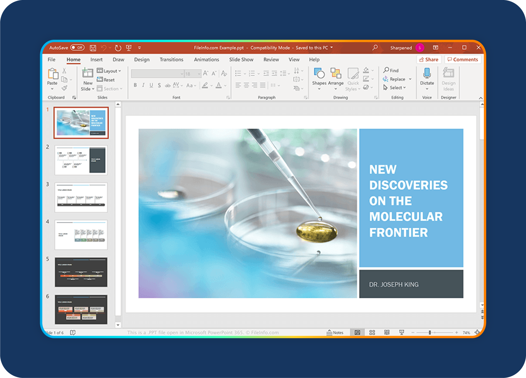
Microsoft PowerPoint is still the go-to presentation tool for many teams, and I completely understand why.
Whenever I need full control over animations, charts, layouts, or any kind of detailed visual work, PowerPoint is usually the first thing I open.
It gives you almost unlimited flexibility, especially for offline presentations or moments when you want every slide to look exactly how you envisioned it.
What stands out most is the depth of its features. You can build complex charts (especially when linked to Excel), create polished transitions, customize slide masters, and use countless add-ins to take your deck even further.
With newer updates like Microsoft Designer and Copilot, PowerPoint now offers AI support that helps with layout ideas and content suggestions. It still requires manual work, but the AI definitely speeds things up.
PowerPoint also fits naturally into Microsoft 365 workflows. If you already use Excel, Outlook, Teams, or OneDrive, everything syncs smoothly.
Unlike many cloud tools, it works beautifully offline, something I rely on when presenting in places with spotty Wi-Fi.
It remains one of the strongest tools for businesses that need full design control, though many teams still look for a PowerPoint alternative for enterprises when speed or collaboration is the priority.
On G2, PowerPoint gets a lot of love for its versatility. Reviewers often mention its wide range of design options, strong charting tools, and the Microsoft Designer feature, which suggests clean layouts without you having to tweak every detail.
At the same time, some users point out that the large feature set can feel overwhelming, especially for beginners, and that collaboration isn’t always as smooth as tools like Google Slides.
“It offers a wide range of templates, themes, and design ideas for polished presentations. Integrating images, videos, audio, charts, and animations is easy. Works seamlessly with Word, Excel, and Teams for collaboration.”- User review- Capterra
The biggest challenge with PowerPoint is that it can feel heavy when you’re trying to build something quickly. There are a lot of manual steps, and that can get frustrating fast.
There’s also a learning curve, especially if you want to create more advanced designs, and it often takes more time than you expect.
On top of that, the full experience requires a Microsoft 365 subscription, which may not be the most budget-friendly option for individuals or smaller teams.
Google Slides is everyone’s first choice when they’re looking for a Microsoft PowerPoint alternative.
The easy collaboration and the fact that it’s completely free make it an easy choice for a lot of people. When collaboration matters more than advanced design options, this tool really shines.
Whenever I’m working on team decks, internal updates, or anything that requires several people editing at the same time, Google Slides delivers a smooth, real-time experience.
It’s simple, lightweight, and easy for anyone to jump into, which makes it great for everyday business presentations.
Since it’s part of Google Workspace, Slides works naturally with Docs, Sheets, and Drive. Pulling in charts, comments, or shared assets is quick and doesn’t come with the usual versioning headaches.
Autosave also gives you peace of mind when you’re moving fast. The design options are more limited than PowerPoint, but honestly, that’s often a plus; it keeps you focused on the message instead of getting lost in formatting.
Google Slides may not be the best fit for complex visual storytelling or highly polished creative decks, but for collaboration and accessibility, it’s hard to beat, especially at this price point.

G2 reviewers frequently highlight how easy Google Slides is to use and how strong its collaboration features are.
Many users appreciate its simplicity and the fact that it works directly in the browser without installing anything.
At the same time, reviews mention that the template selection and design options are more limited than tools like Canva or Prezi.
Users also note that while offline mode exists, it’s not as seamless as desktop-first apps, especially in low-connectivity situations.
“Google Slides is a perfect complement to the other Google Workspace features. It is very easy to throw together a presentation that works seamlessly with Google Meet.”- User review- Capterra
My only setback with Google Slides is that it doesn’t offer much for highly customized or visually complex decks.
If you want advanced animations, richer templates, or more creative control, you may quickly feel the limitations. And because the best experience relies on a strong internet connection, it’s not always ideal when you’re working offline or traveling.
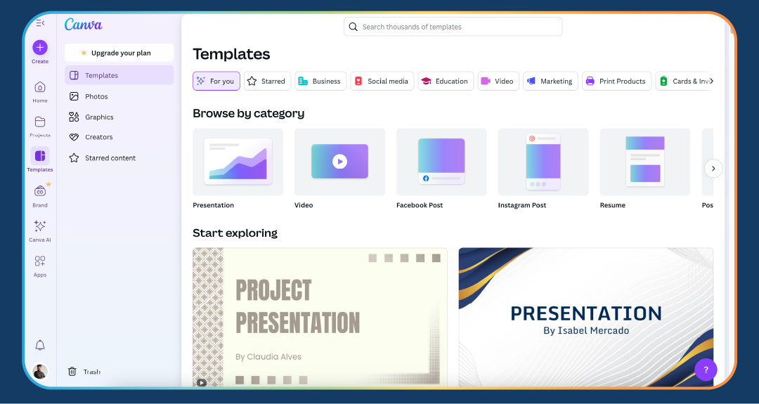
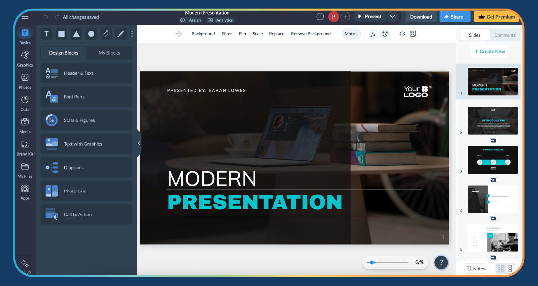
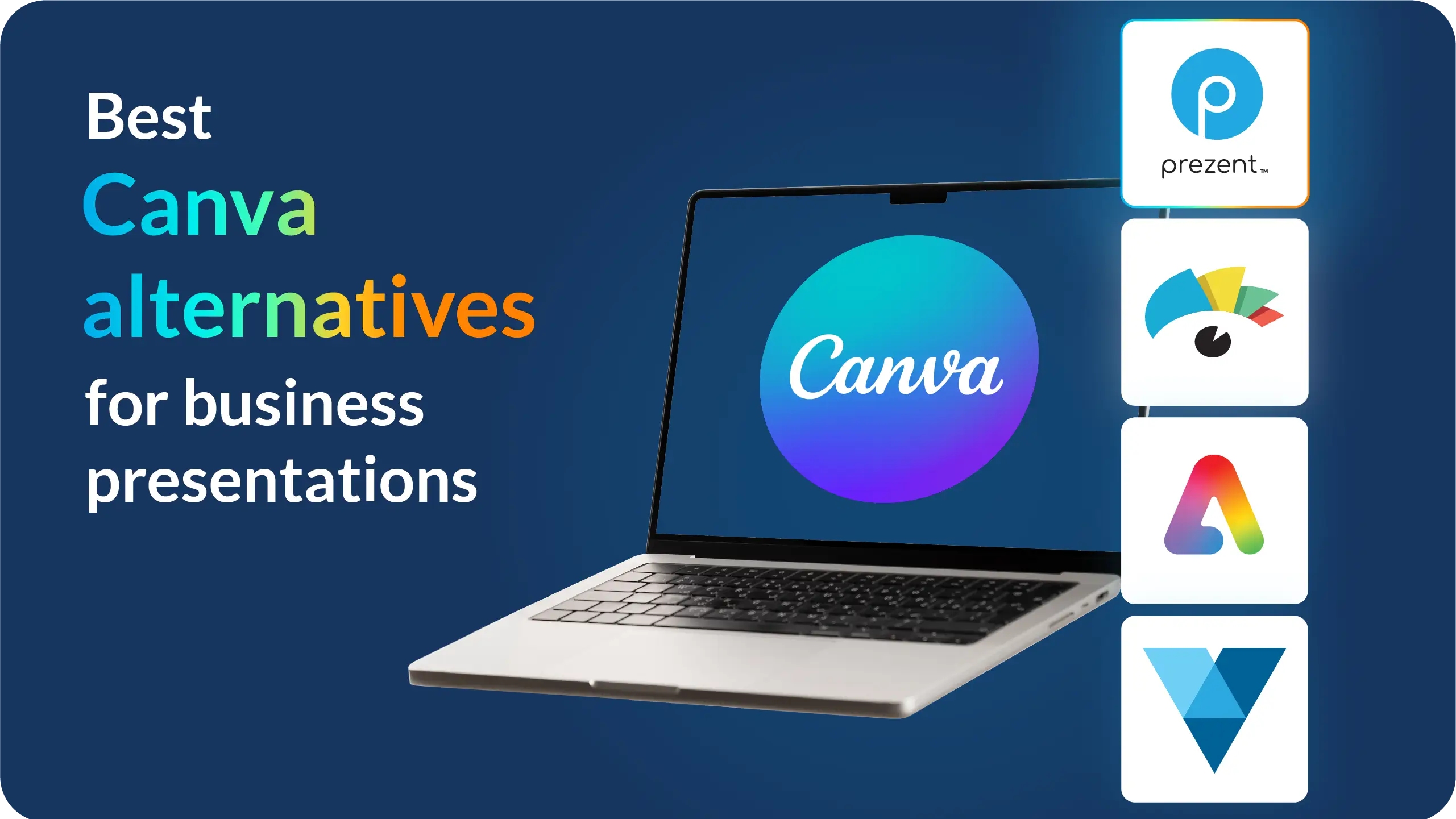
I turned to Canva when I was looking for a faster way to create clean, professional slides without getting stuck in heavy design work.
It’s one of the most popular presentation design tools for non-designers, which is why so many people use it for everything from social graphics to one-pagers, and the same applies to presentations.
When I need a polished deck quickly, especially for marketing, events, or anything that needs a strong visual punch, Canva’s templates and drag-and-drop editor make the process smooth and fast.
What I like most is how familiar the interface feels across formats. If you know how to create a social post or flyer in Canva, designing a presentation feels just as intuitive.
Features like Brand Kits, team folders, and template locking make it easy to keep decks consistent across a team.
For companies that care a lot about staying on brand, Canva does a great job of making that simple.
Canva also has a massive library of templates, photos, graphics, icons, and videos, so you’re never hunting for assets.
With features like Magic Resize and AI-assisted design suggestions, it’s easy to experiment and quickly produce something that looks clean and professional.
G2 reviewers consistently praise Canva for its ease of use and the strength of its free plan. Many small teams and solo creators say it helps them produce visually appealing work without needing advanced design skills.
Some reviewers mention that Canva can feel limiting for complex business decks or data-heavy presentations, and that certain features are locked behind the paid tiers. But overall, the tool scores high for value and accessibility.
“I really appreciate how simple it is to navigate the platform. I enjoy having access to a wide range of assets and graphics, along with the convenience of ready-made templates that are easy to customize.”- User review- G2
The main limitation with Canva is its flexibility. When you need complex charts, custom layouts, or more control over the finer details, Canva can feel restrictive compared to tools like PowerPoint or Visme.
It also relies heavily on a good internet connection, and some exporting or collaboration features are limited in the lower-tier plans. Still, for quick, visual-first presentations, it’s one of the easiest and most enjoyable tools to use.
Visme was the first tool I really explored when I wanted to move beyond regular slides and try something more interactive.
It’s great for creating data-rich visuals, infographics, dashboards, and reports that feel more like interactive experiences than traditional presentations.
If your work involves charts, timelines, or anything where you want your audience to dig into the information instead of just viewing it, Visme gives you the control to make that happen.
It does take a little time to get used to, definitely more than Canva, but the extra learning curve comes with more power. You get access to advanced charts, data widgets, animations, and interactive elements that most other tools simply don’t offer.
For teams, the strong brand controls and collaboration features make it easy to keep everything consistent, and the platform supports many different visual formats, not just slide decks.
That’s why Visme works so well for teams that need solid data storytelling presentation software.
G2 reviewers often praise Visme for its powerful data visualization features and the range of export options.
Many users say it helps them build content that looks more polished and engaging than what they can produce in simpler tools.
However, reviewers also point out that some advanced features can feel overwhelming at first and may require a bit of practice before you feel fully comfortable.
“Visme provides a wide range of user-friendly templates, making it both creative and easy to navigate. It’s an excellent, easy-to-use tool with plenty of templates for creating videos, presentations, and infographics.”- User review- G2
Visme is great for detailed, interactive presentations, but it can feel a little heavy when you just want to create a quick, simple deck.
The interface has a lot of options, which can slow you down if you’re in a hurry. Some of the most powerful features are also limited to higher-priced plans, which may not be ideal for smaller teams or individual users.
Still, if your work involves data or interactive content, Visme is one of the strongest tools out there.
I wanted to try out Prezi after hearing so much about its zoomable format, and it really did turn out to be an interesting tool.
The way it lets you glide between big-picture ideas and deeper details creates a natural storytelling flow that’s genuinely captivating.
My presentations felt more dynamic than a traditional slide deck. Instead of going slide by slide, Prezi made it easy to drill into each element, which made the whole experience feel more fluid and engaging.
I noticed the impact during a marketing performance presentation. Instead of flipping through static sections, we could zoom into the top-performing ads, jump across different campaigns, and explore the areas the audience wanted to see in more detail. It gave the team a clearer sense of the story behind the numbers.
I’ll be honest, it can feel a little overwhelming at first, especially if you’re used to PowerPoint or Google Slides. But once you understand how the canvas works, you can build presentations that feel more like guided story maps than linear decks.
For educators, trainers, and presenters who want to keep an audience visually engaged, this format makes a noticeable difference.
Prezi shows up in almost every list of top interactive presentation tools or PowerPoint alternatives, and for good reason; it brings a fresh storytelling approach that most tools simply don’t offer.

G2 reviewers often praise Prezi for its visual impact and the dynamic feel of its presentations.
Users highlight how engaging the zoomable format is, especially for teaching, training sessions, or storytelling-heavy pitches.
Some reviewers do mention that it takes time to master the canvas concept and that Prezi’s structure can feel less straightforward than classic slide tools.
“Prezi is a software that is a more advanced version of PowerPoint presentation, also because they have large collaborative whiteboards where ideas and stories can be explained in a much better way.”- User review- G2
The main thing I wish Prezi offered was a slightly simpler learning curve. While the zoomable canvas is powerful, it can feel unfamiliar at first, especially if you're used to traditional slide formats.
It also isn’t always the best choice for data-heavy or corporate decks that rely on more structured layouts. But for storytelling and audience engagement, Prezi is a standout.
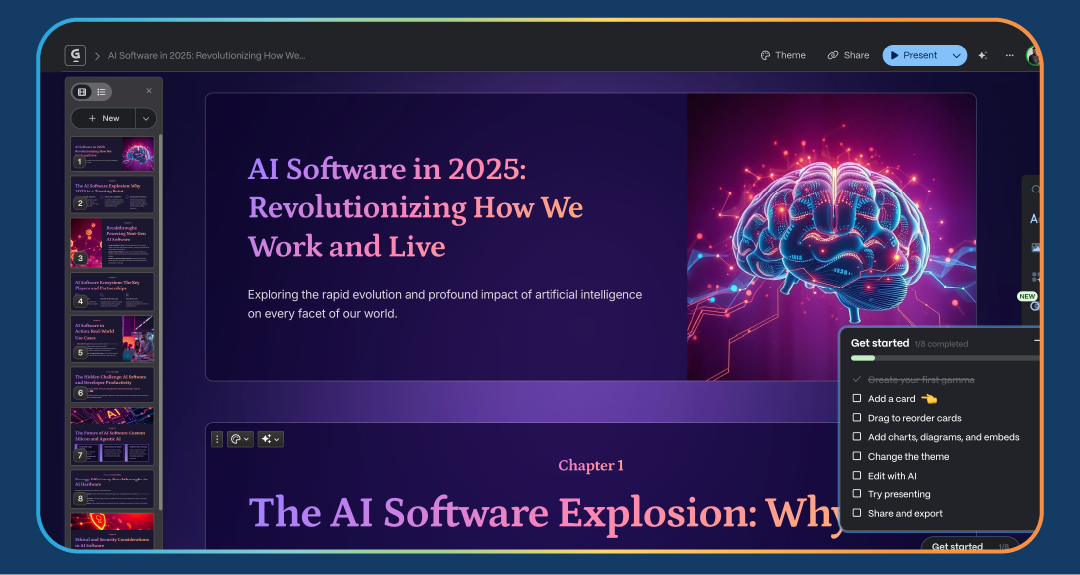
Just like Prezent, Gamma is also known for its AI capabilities, especially its ability to create a presentation from a simple prompt.
AI is the talk of the town right now and suddenly everywhere, so of course, I wanted to try it out for presentations. Honestly, who wants to spend hours or days building decks anymore?
With Gamma, you can start with a prompt, an outline, or even a rough document, and it turns your content into a clean, modern presentation almost instantly.
What really makes Gamma interesting is its web-native, card-based format. Instead of clicking through slides, your presentation feels more like a smooth, scrollable story.
It’s lightweight, AI-driven, and designed to take you from draft to shareable deck without the friction of a traditional design-heavy workflow.
For teams that want something fresh and minimal, especially startups, sales teams, and internal comms, Gamma’s speed and simplicity make a noticeable difference.
G2 reviewers appreciate how easy Gamma makes the drafting process. Users often mention that it helps them turn rough ideas into clean presentations without much editing. The AI support and modern themes get a lot of positive feedback.
At the same time, reviewers note that Gamma isn’t as customizable as PowerPoint or as design-rich as Canva, so it works best when you value speed and simplicity over precise creative control.
“I am impressed with Gamma's intuitive and user-friendly setup process, particularly the wizard setup that makes it predictable and clear. It simplifies the creation of beautiful presentations with impressive AI features, even for someone like me who struggles with design.”- User review- G2
Gamma’s simplicity is a strength, but it also creates limitations. The card-based layouts can feel restrictive when you need more advanced formatting or detailed visuals.
It’s also a tool that works best online, so it’s not ideal if you often present or build decks offline. Still, for quick drafts, internal updates, and modern web-style presentations, Gamma is one of the easiest tools to work with.
By now, it’s clear that every presentation tool has its own USP, something it does better than the rest.
Pitch is no different. It’s known for its collaborative features, and I personally felt that it offers a more modern experience compared to traditional desktop software.
Pitch is built with collaboration at its core, and it really shows. The interface feels clean and lightweight, almost like using a productivity app rather than a classic slide tool.
It’s especially popular among startups and product teams because it makes working together on a deck feel fast and natural.
What stood out to me is how well Pitch blends design and teamwork. You get polished, ready-to-use templates that make your slides look sharp from the start, along with version history, comments, and real-time editing.
It’s ideal for teams that work in the browser and want something simpler and more flexible than PowerPoint without giving up quality.
If your team works fast and needs decks that can keep up, Pitch makes the whole process, from first draft to final review, feel incredibly smooth.

On G2, Pitch earns strong feedback for its collaboration tools and clean interface. Users often mention how quickly they can build team decks and how the templates help them stay organized and consistent.
Reviewers also highlight Pitch’s speed, especially how responsive it feels in the browser. Some users point out that while Pitch is great for team workflows, it may not offer the same depth of design customization as PowerPoint or the visual creativity of Canva.
“I’ve been using Pitch for several months now, and it has genuinely made creating presentations much easier and more enjoyable for me. The interface is highly intuitive, and the templates have a modern feel without being overly complex.”- User review- G2
While Pitch is excellent for collaboration and quick team presentations, I sometimes find it limiting when I need highly custom layouts or more advanced design elements.
It’s clearly built for speed and teamwork, not deep design control, so you may hit a ceiling if your deck requires heavy customization.
Also, since it’s web-based, it works best with a reliable internet connection. Still, for modern teams that value collaboration, Pitch makes the whole process feel refreshingly simple.
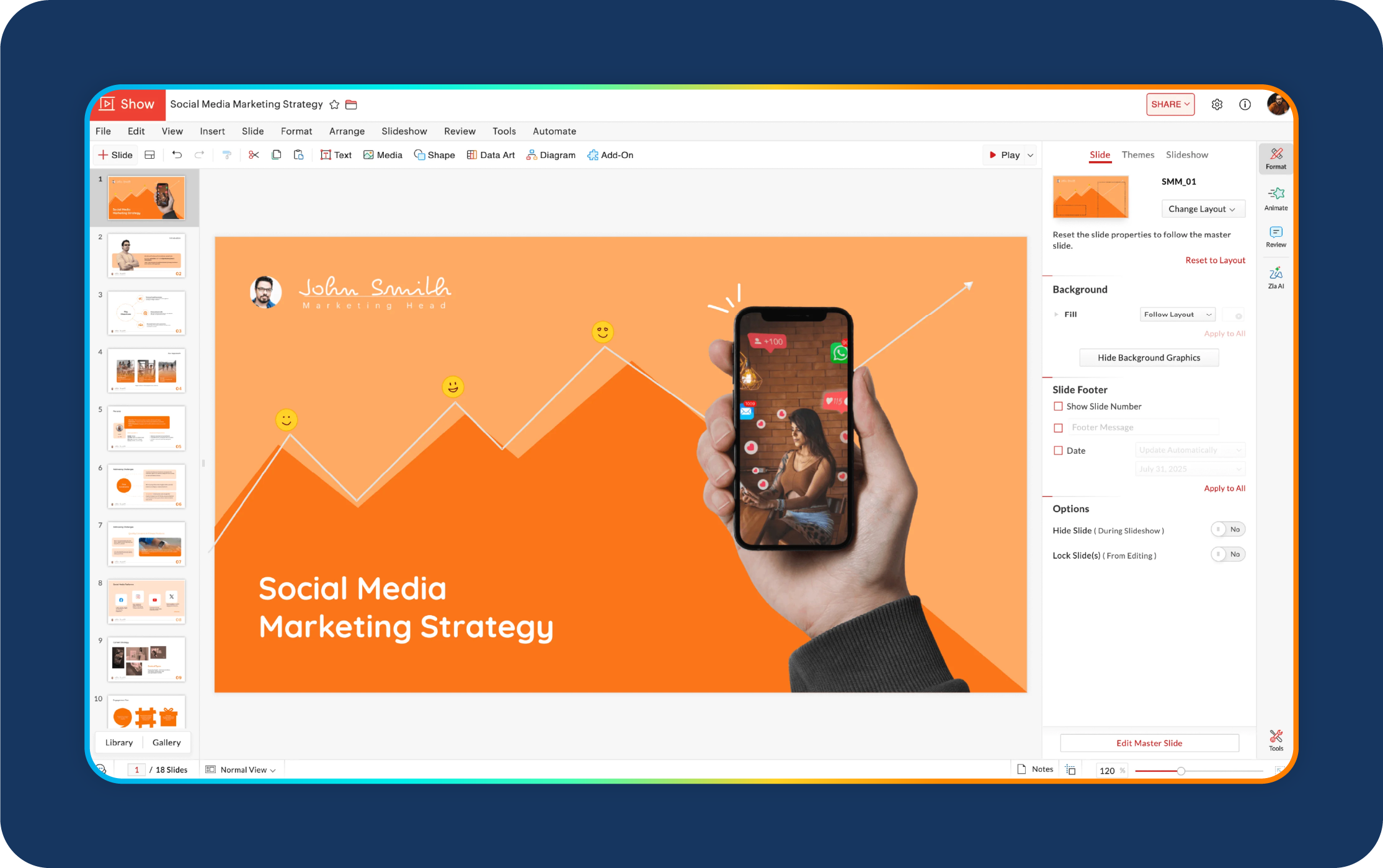
I decided to try Zoho Show because I had already used a few Zoho apps in the past, and I was curious to see how well their presentation tool fit into the larger ecosystem.
It turned out to be a solid, browser-based alternative to PowerPoint, especially if your team already lives in Zoho’s world.
The tool feels business-focused, practical, and built for teams that want their workflows, data, and content to stay connected.
Zoho Show offers a clean interface with enough templates and editing features to get the job done without feeling overwhelmed. It’s not as design-heavy as Canva or Visme, but that simplicity works in its favor.
The collaboration features, cloud access, and integration with other Zoho products make it great for teams that want everything in one place.
If your organization uses Zoho CRM, Projects, Desk, or other Zoho tools, Zoho Show fits right in.
G2 reviewers often highlight how helpful Zoho Show is for teams already using Zoho Workspace. Users appreciate its cloud-native setup, smooth collaboration, and easy sharing.
Many reviews point out that it offers a familiar, PowerPoint-like experience in the browser, but with the added benefit of tight integration across Zoho apps.
Some reviewers also note that while Zoho Show is reliable, it’s not as visually advanced or design-focused as tools like Canva or Prezi.
“Zoho Show is really easy to use and implement in our system. This offers a lot of features, and we use this all the time. It was really easy to integrate into our system, and customer service is also really great.”- User review- G2
Zoho Show works best when you’re already invested in the Zoho ecosystem, so it may feel less compelling if you use completely different tools.
It also isn’t the strongest option for highly visual or creative decks. The design options are more limited compared to Canva, Visme, or Prezi.
Still, for straightforward business presentations and smooth collaboration, Zoho Show delivers exactly what most teams need.
Honestly, I haven’t used Keynote personally since I don’t have a Mac or an iPhone. But the popularity and loyalty of Apple users definitely made me curious about it.
Apple has a reputation for unique, high-quality products, so I wanted to understand whether Keynote lives up to the same standard.
I reached out to several professionals who rely on it daily, and their feedback was consistently positive.
For Apple users, it’s no surprise that Keynote is their go-to tool, thanks to its polished animations, smooth performance, and tight integration across the Apple ecosystem.
Based on this loyal user base and what review sites like G2 consistently highlight, Keynote stands out for producing visually refined presentations with very little manual work.
Professionals who work on Mac or iOS often say Keynote feels noticeably smoother than many other tools. The transitions, typography, and default templates give decks a clean, sophisticated look right from the start.
Reviewers also mention that presenting from a Mac, iPad, or even an iPhone feels seamless, which makes it a reliable choice for teams that are fully in the Apple ecosystem.

According to G2 reviewers, Keynote regularly earns high marks for design quality, smooth animations, and overall performance on Apple hardware.
Users highlight how easy it is to make professional-looking presentations and how consistent the tool feels across devices. However, they also note that collaboration can be challenging when working with colleagues who don’t use Apple products. While exporting to PowerPoint or PDF works well, real-time collaboration isn’t as flexible as browser-based tools like Google Slides.
“I jumped into Keynote a few years ago and never looked back. I predominantly use its flawless ability to build animated sequences – from simple mini-presentations to fairly complex productions. It offers the ability to paste other Mac app images, which is a real time saver.”- User review- G2
Based on user feedback, the main limitation is that Keynote works best only if your team is fully in the Apple ecosystem. Collaborating with Windows users or using mixed devices can create friction.
Some professionals also mention that certain features don’t transition perfectly across platforms, and that teams using cloud-first workflows may find Keynote less convenient.
Still, for those who work primarily on Mac and care about polished, motion-rich presentations, Keynote remains a top choice.
I used Storydoc mainly to explore how effective its analytics feature really is, since that’s what the tool is widely known for.
I’ll happily admit, if your objective is a conversion, whether it’s sales, investor discussions, or any situation where you want to understand audience sentiment, this is a tool worth trying.
Storydoc presentations feel more like mini web pages than traditional slides, and that format makes it easy to see how people skim through the content asynchronously.
Those insights alone can help you prepare better for follow-up conversations.
What impressed me most was how simple it is to personalize each presentation. You can add dynamic fields, like a department name, region, or campaign theme, and Storydoc automatically updates the deck.
When I used it for a marketing plan, the built-in analytics were especially helpful. I could see which sections grabbed the most attention, which parts people skipped, and where engagement dropped off.
That level of detail made my follow-up discussions with stakeholders far more focused and productive.
Another thing I liked is that most of Storydoc’s templates are built for real business needs like pitches, marketing overviews, proposals, reports, and investor updates.
So you’re not starting from scratch; you’re working with layouts that already feel structured and professional. It is a powerful tool for teams wanting interactive sales presentation software with built-in analytics.

G2 reviewers frequently praise Storydoc for its interactive design and built-in engagement analytics.
Marketing and sales teams often mention that the tool helps them understand how their audience consumes the content, which is something traditional slide tools don’t provide.
Reviewers also appreciate the polished templates tailored to business use cases.
At the same time, some users feel the pricing is a bit high for small teams, and the format is better suited for asynchronous viewing than traditional in-person presentations.
“Storydoc has completely changed the way I present content. It’s super intuitive, and the final decks look modern, interactive, and way more engaging than traditional slides.”- User review- G2
While Storydoc works beautifully for interactive, web-style presentations, it’s not ideal for classic slide-by-slide talks you deliver in front of a room.
The format is built for scrolling experiences, which can feel less structured in live settings.
Pricing can also be on the higher side for smaller teams or individual users. Still, for marketing, business, and investor presentations where engagement insights matter, Storydoc offers a fresh and effective alternative to static slides.
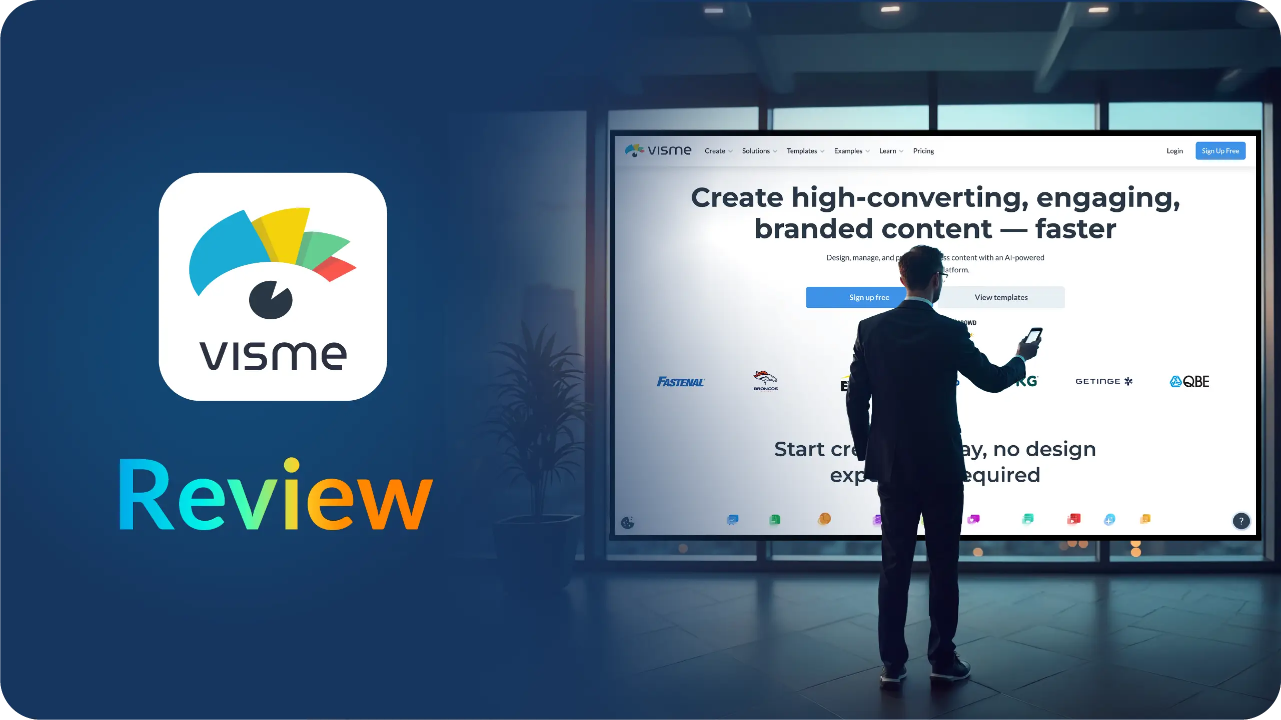
I turn to Venngage when I need to turn ideas or data into polished visuals quickly, without getting pulled into heavy design work.
It’s especially useful when the goal isn’t a full slide-by-slide presentation, but clear visuals like infographics, reports, dashboards, or supporting slides that explain information at a glance.
What stands out is how Venngage blends AI with a simple editor. I can start with plain text, a rough idea, or a spreadsheet and generate a clean visual layout almost instantly.
Instead of worrying about spacing or structure, I can focus on the message while the tool handles the design foundation.
Venngage is also strong on brand consistency and accessibility. Brand Kits help keep colors, fonts, and logos consistent, and the built-in accessibility checks make it easier to create visuals that are readable and inclusive.
For marketing, product, education, and internal comms teams, this makes it a reliable option for professional visuals without relying on a design team.
On G2, Venngage is frequently praised for its ease of use and strong template library.
Reviewers often highlight how helpful it is for non-designers to create infographics and reports for marketing, education, and internal communications.
Users also appreciate the accessibility features and export flexibility, which make the tool practical for everyday business use.
“Venngage is a straightforward tool to make any form of design. People with almost nil experience can get started with this tool. The best part of Venngage is that it has thousands of customizable templates to get you started.”- User review- G2
Venngage isn’t built to replace full presentation workflows like PowerPoint or Prezent. If you need advanced slide sequencing or complex animations, it can feel limited.
Some of the more powerful AI and branding features are also reserved for higher-tier plans, which smaller teams may outgrow quickly. Still, for fast, on-brand visuals, Venngage does a very good job.
With so many great presentation tools available today, the “best” one really depends on your needs, your team, and how you like to work. Here’s a simple way to narrow it down:
There are many other strong presentation tools and AI-powered platforms that I haven’t listed here, but are still worth exploring.
Options like Beautiful.ai, Synthesia, Decktopus, and Mentimeter each hold their own place in the market and may fit specific needs better than others.
At the end of the day, there’s no one-size-fits-all “best presentation software.” The right choice is the tool that helps you turn your ideas into a clear, compelling story with the least friction.
If you’re looking for a powerful AI presentation platform built for business teams, feel free to explore Prezent.
Schedule a demo or start your 14-day free trial to see how it can transform your workflow.
There really isn’t one perfect answer. When I’m choosing a tool for business use, I look for a balance of ease of use, collaboration, branding, and compatibility with the tools my team already works in.
The “best” option is the one that fits your workflow, not just the one with the highest star rating.
Start with your priorities. Do you care most about speed? Design flexibility? Real-time collaboration? AI support? Once you know what matters most, it becomes much easier to compare tools and pick the one that aligns with your needs rather than getting distracted by features you’ll never use.
Yes. When you’re creating a lot of decks, AI tools can save hours on outlining, drafting, and slide formatting. The time saved goes back into work that actually drives business value like strategy, storytelling, and preparation, instead of manual cleanup.
In my experience, yes. Advanced AI tools like Prezent can turn a prompt or document into a strong first draft that’s on-brand, contextually accurate, and tailored to your audience.
Instead of building slides from scratch, you can focus on checking the data and fine-tuning the message.
For distributed teams, browser-based tools with real-time co-editing are the easiest to work with. Anything that supports quick link sharing, comments, and live updates helps reduce friction across time zones and devices.
For internal updates or early-stage teams, free or freemium tools can work well. But once brand control, security, AI features, or support become important, most businesses benefit from moving to a paid plan.
I revisit my presentation stack every year or two. New AI features, pricing changes, and integrations can make a big difference in productivity, and a small upgrade can save your team a lot of time.
.jpg)
Anoob is the Head of Content at Prezent with over 16 years of experience in marketing and content. He has worked with leading startups such as SocialPilot, Writesonic, BigBasket, FreshMenu, GupShup, and SimplyHired. Passionate about social media and digital tools, Anoob enjoys testing new platforms to help businesses make better marketing decisions. You can connect with him on LinkedIn.

.png)

