blog
March 17, 2026
Niyati Mahale

15 AI Reporting Tools I Tested for Faster, Clearer Reporting

Explore AI reporting tools that automate data analysis, dashboards, and reporting. Compare platforms that help teams turn data into clear insights faster.
ai-reporting-tools

Reporting sounds simple until you actually start doing it. Pulling data from different sources, structuring it into something meaningful, and turning it into a clear report can quickly become time-consuming.

I’ve worked with many teams that have the right data but struggle to present insights in a way stakeholders can quickly understand. Recently, AI reporting tools have started changing that workflow. They can automate data prep, surface patterns, suggest visualizations, and even help structure reports.

I spent time exploring several platforms to see where they genuinely help and where they fall short. In this guide, I’ll walk through the AI reporting tools that stood out and who each one is best for.

Quick comparison of the best AI reporting tools (2026)

To give you a quick overview, here’s a comparison of the AI reporting tools I’ll be covering in this guide.

I looked at things like automation capabilities, integrations, visualization quality, collaboration features, and pricing, based on both hands-on testing and information available on review platforms like G2 and Capterra.

Different tools excel in different areas. Some are built for enterprise analytics, others for marketing dashboards, and some are designed to turn reporting insights into clear presentations for leadership teams.

Tool AI Capability Integrations Real-time Dashboards Free Plan Best For
Prezent.ai AI-generated business reports & presentations Enterprise systems, documents, APIs No Executive reporting
Tableau AI analytics & visualization recommendations 100+ data connectors Limited Advanced analytics teams
Power BI Natural language queries & automated insights Microsoft ecosystem Yes Microsoft-based organizations
Looker Studio AI-assisted reporting Google ecosystem Yes Marketing reporting
Sisense AI-powered embedded analytics Databases, APIs No Product analytics
Domo AI alerts and automated insights 1000+ integrations No Real-time operations
Zoho Analytics AI assistant for report generation Zoho apps + external tools Yes Small businesses
Qlik Sense Associative AI analytics Enterprise data platforms Yes Enterprise BI
ThoughtSpot Search-based AI analytics Cloud data warehouses Limited Self-service analytics
Klipfolio Automated KPI dashboards Marketing & CRM tools Yes Agencies & marketing teams
IBM Cognos Analytics AI-powered enterprise reporting Enterprise data systems No Enterprise governance
SAP Analytics Cloud AI planning and forecasting SAP ecosystem No SAP-based organizations
Yellowfin Automated insights & storytelling Enterprise databases No Data storytelling
Chartio SQL-based reporting workflows Databases & SaaS tools No Startups & SaaS analytics
Mode Analytics SQL + Python reporting workflows Modern data warehouses Limited Data teams & analysts

How I evaluated these AI reporting tools

When I started exploring reporting tools, my initial goal was simple: find something that reduces the time spent preparing reports.

But after testing more platforms, I realized the best tools don’t just automate reporting. They also help teams turn raw data into insights people can actually understand.

So instead of just looking at feature lists, I focused on what matters in real reporting workflows.

Here are the criteria I used to evaluate the tools in this list.

  • Ease of use: A reporting tool shouldn’t require hours of training just to build a dashboard. I looked for platforms where you can start exploring data and building reports without a steep learning curve.
  • Data integrations: Most teams pull data from multiple sources like CRMs, spreadsheets, marketing tools, or databases. Strong integrations make reporting significantly easier.
  • Automation and AI features: AI reporting tools should help automate things like data prep, trend detection, chart suggestions, and report generation.
  • Visualization quality: Clear charts and dashboards matter. If insights aren’t visually easy to understand, the report loses impact.
  • Collaboration: Reporting rarely happens in isolation. I looked for tools that make it easy to share dashboards, comment on insights, and collaborate with teams.
  • Scalability: Some tools work great for small teams but struggle with enterprise data volumes. I considered whether the platform can grow with an organization.

My picks for the best AI reporting tools in 2026

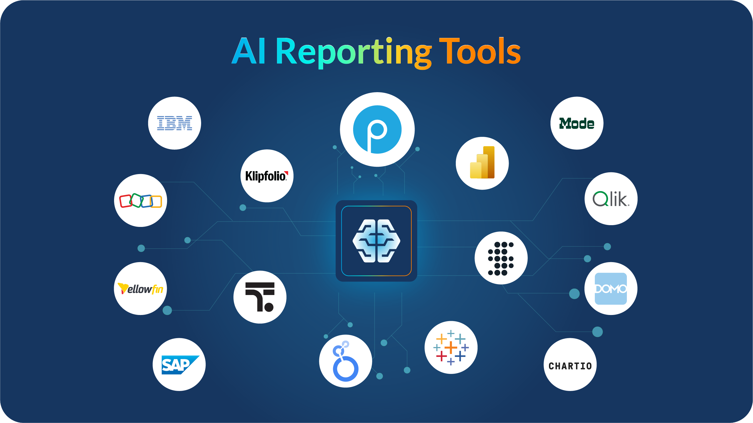
Below are the AI reporting tools that stood out most during my research and testing.

Each one solves a slightly different problem. Some are built for advanced analytics, others for automated dashboards, and some focus on turning insights into clear, business-ready reports and presentations.

1. Prezent.ai: Best for turning business insights into executive-ready presentations

One thing I’ve noticed while working with reporting data is that the hardest part usually isn’t the analytics itself.

It’s explaining the insights clearly to stakeholders.

Dashboards can show the numbers, but leadership teams still expect a well-structured story that explains what the data actually means. That often turns into hours of building slides and formatting presentations.

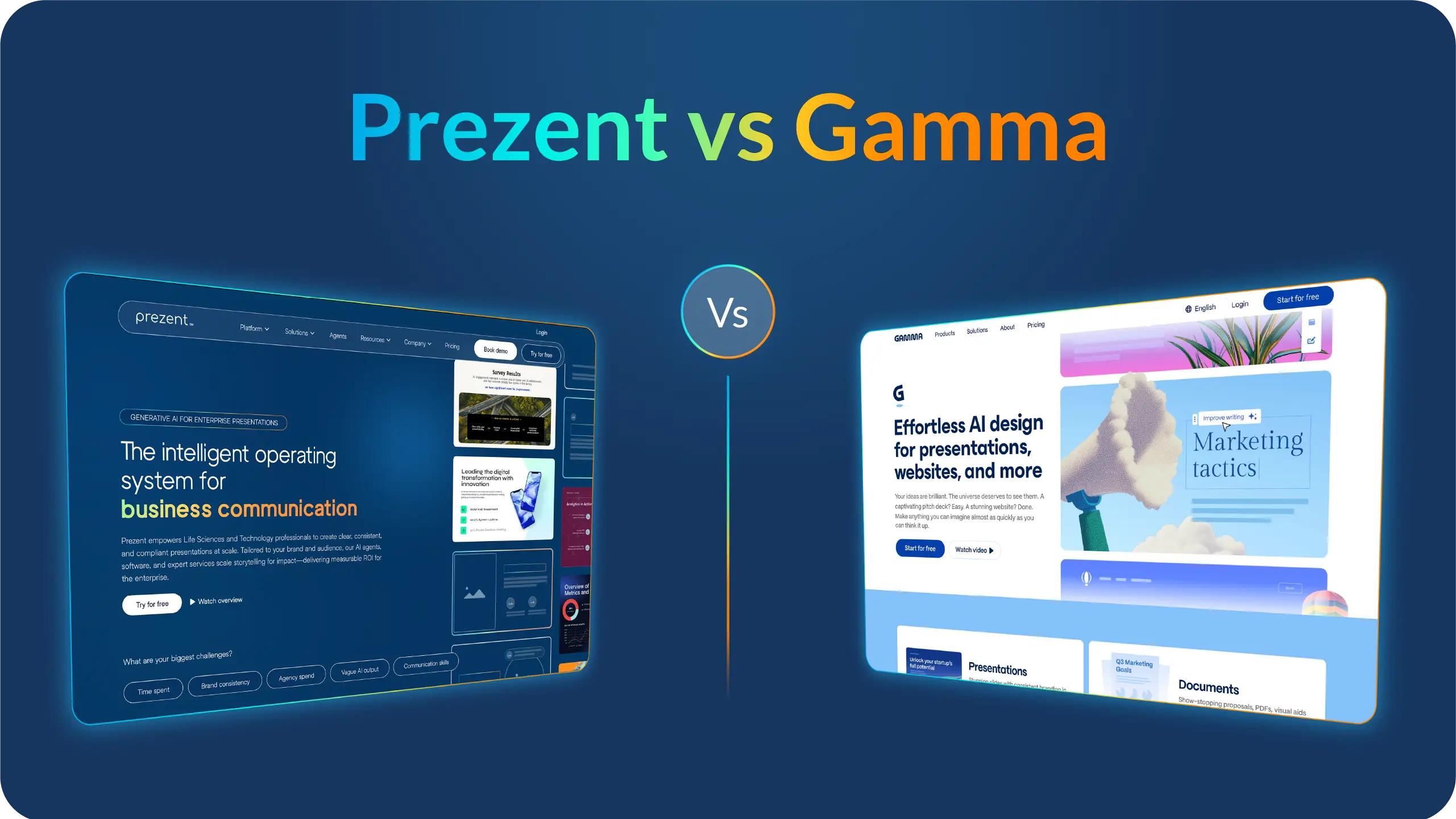
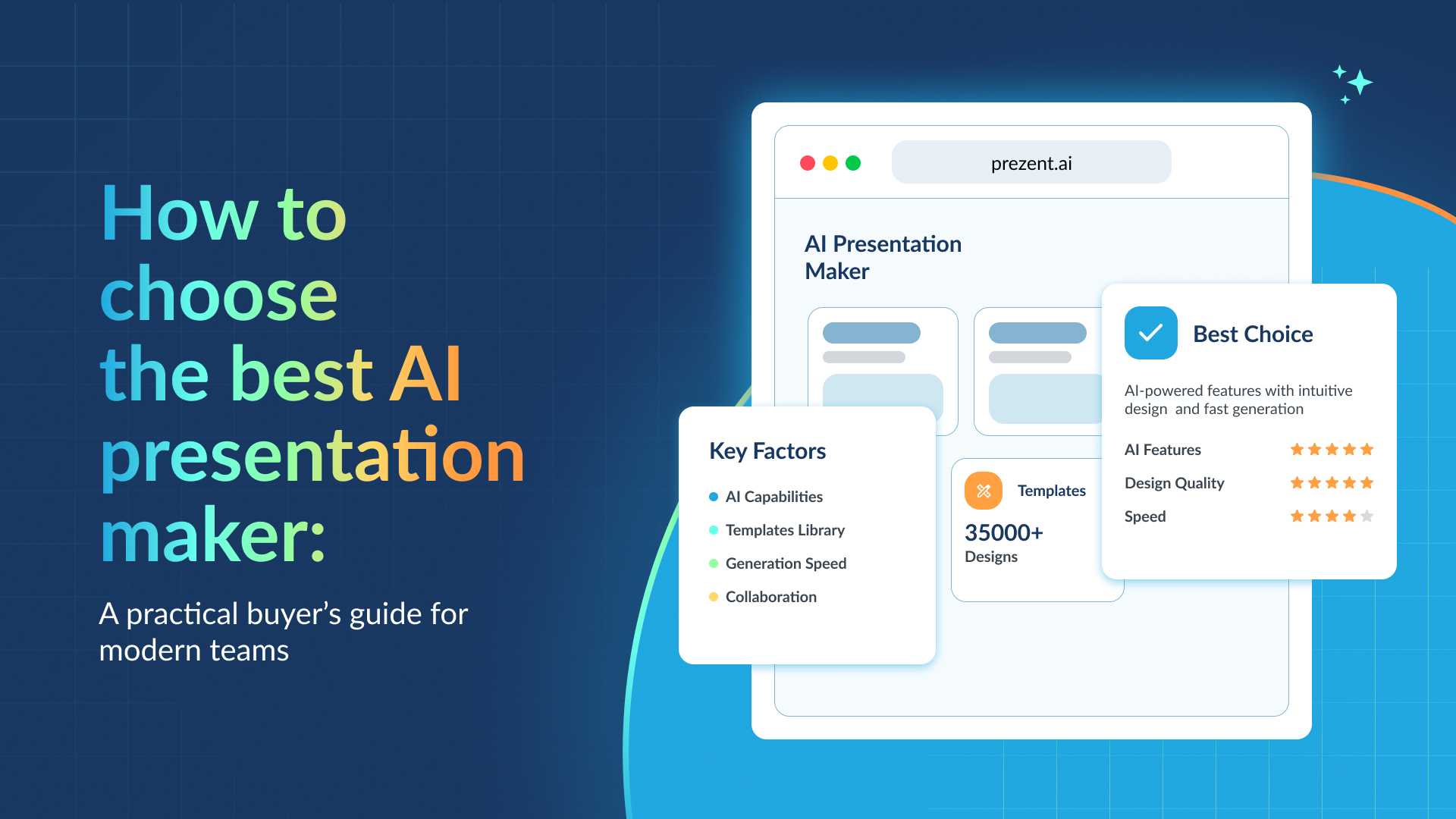
Prezent.ai approaches reporting from a different angle. Instead of focusing only on dashboards, it helps teams turn insights into clear, on-brand business presentations much faster.

The platform is built primarily for enterprise teams in industries like life sciences and technology, where communicating complex information clearly is critical. Its AI agents, software platform, and expert services work together to help teams create audience-specific presentations while staying aligned with brand guidelines.

During my research, what stood out most is how the platform focuses on business communication, not just slide design.

Key features of Prezent.ai

  • Astrid AI, the AI presentation generator, can turn prompts, documents, or data into structured presentations tailored to your audience and brand guidelines.
  • Brand-controlled templates and slide libraries that help teams maintain consistent branding across presentations with locked templates and approved slide assets.
  • Story builder and presentation synthesis tools that turn long documents or data-heavy content into concise summaries and structured slides.
  • Presentation library and template converter that can transform existing decks into company-approved templates without manual formatting.
  • Expert presentation services that allow enterprise teams to get polished, on-brand presentations built overnight.
  • Learning resources and communication training including courses and best-practice libraries focused on improving business storytelling.

My favorite things about using Prezent

  • It focuses on business storytelling rather than just slide design, which helps teams communicate insights clearly instead of spending time formatting slides.
  • Strong brand governance makes it easier for large organizations to keep presentations visually consistent across teams.
  • The contextual AI considers audience, industry language, and company guidelines when generating slides, which makes the output more relevant than generic AI content.

What I wish Prezent.ai had

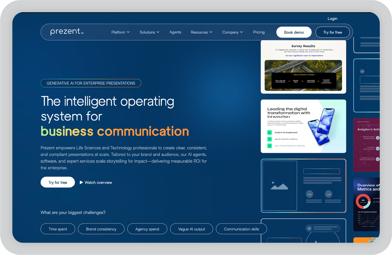
Prezent.ai is clearly designed with enterprise organizations in mind, particularly teams in life sciences and technology. Smaller teams or individual professionals may find it harder to adopt depending on pricing and onboarding requirements.

That said, for organizations creating large volumes of presentations and reports, the platform can significantly reduce the time spent turning insights into polished, stakeholder-ready decks.

2. Tableau: Best for advanced data visualization and analytics

Tableau is one of the tools I often hear about when teams talk about serious data analytics. When I first explored it, what immediately stood out was how powerful the visualization capabilities are.

If you’re working with large datasets, Tableau makes it much easier to turn raw numbers into charts and dashboards that people can actually understand. Instead of static reports, you can create interactive dashboards where stakeholders explore the data themselves, filter views, and drill into specific metrics.

Over the years, Tableau has also added more AI-driven features that help surface insights automatically and suggest visualizations based on the data you’re analyzing. For teams that spend a lot of time preparing reports, those small automation features can make a noticeable difference.

Key features of Tableau

  • AI-powered analytics that helps surface insights and suggest visualizations based on your dataset.
  • Advanced visualization tools that allow you to turn complex data into interactive dashboards.
  • Extensive data connectors that support spreadsheets, cloud databases, and enterprise data warehouses.
  • Drag-and-drop dashboard builder that makes it easier to create visual reports without writing code.
  • Interactive dashboards that allow users to filter data, drill down into metrics, and explore trends.
  • Enterprise security and governance features that support large teams managing sensitive data.

My favorite things about using Tableau

  • The visualizations are extremely powerful and make complex datasets easier to explain.
  • Once you get comfortable with the interface, building dashboards feels very flexible.
  • Interactive dashboards allow stakeholders to explore the data themselves instead of relying on static reports.

What I wish Tableau had

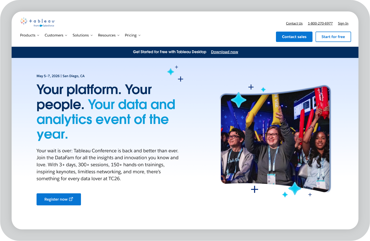
Tableau is powerful, but it does come with a learning curve. When I first explored it, some of the advanced features took time to fully understand.

It’s also primarily an analytics tool. When I want to present insights to leadership or clients, I often still need to move those visuals into a presentation or report to explain the story behind the data.

3. Power BI: Best for teams working in the Microsoft ecosystem

Power BI is one of the first tools I usually look at when a team already works heavily with Microsoft products. If your workflow includes Excel, Teams, or Azure, Power BI tends to fit in very naturally.

When I explored Power BI, what stood out most was how easy it is to connect different data sources and turn them into dashboards quickly. The interface feels familiar if you’ve used other Microsoft tools, which makes it easier for teams to get started without a steep learning curve.

Power BI has also added several AI-driven features over the years, including natural language queries and automated insights. That means you can ask questions about your data in plain language and the tool will generate charts or visualizations based on the query.

Key features of Power BI

  • Natural language queries that allow users to ask questions about their data and generate visualizations automatically.
  • Deep integration with Microsoft tools like Excel, Azure, and Teams for smoother reporting workflows.
  • Interactive dashboards that update in real time as new data flows into the system.
  • Large library of connectors that support databases, cloud services, and third-party apps.
  • Built-in AI insights that help highlight trends, anomalies, and key metrics.
  • Collaboration features that allow teams to share dashboards and reports easily.

My favorite things about using Power BI

  • The integration with Microsoft tools makes reporting workflows much smoother.
  • Building dashboards feels approachable, especially for teams already comfortable with Excel.
  • The natural language query feature is helpful when you want quick insights without building complex reports.

What I wish Power BI had

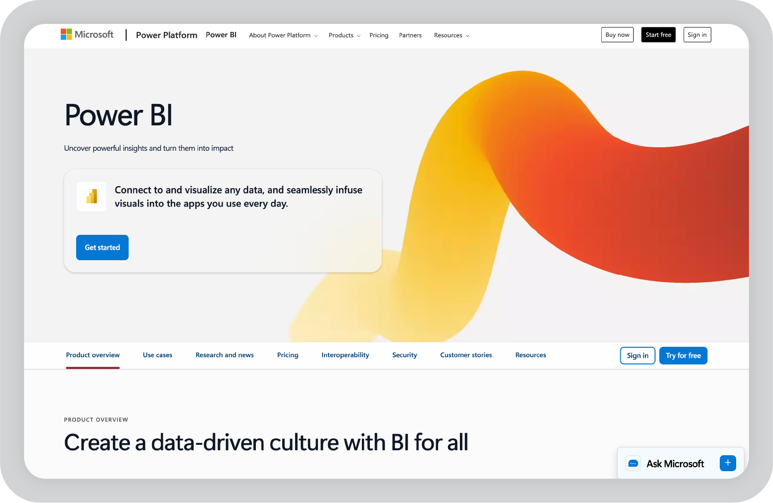
Power BI can become complex once you start building more advanced models or working with large datasets. Some features also work best if your organization is already using the broader Microsoft ecosystem.

For teams that rely heavily on other platforms, setting up integrations may take a bit more effort.

4. Google Looker Studio: Best for marketing and campaign reporting

Google Looker Studio is one of the tools I often see marketing teams rely on for reporting. Since it connects easily with products like Google Analytics, Google Ads, and Google Sheets, setting up dashboards can be surprisingly fast.

When I tried it for marketing-style reporting, I appreciated how quickly I could pull campaign data into a dashboard and start visualizing results. It’s not as advanced as some enterprise BI tools, but it’s very accessible and works well for teams that need quick reporting without a complicated setup.

Because it’s cloud-based, sharing reports is also simple. You can generate a link and allow stakeholders to view dashboards in real time, which makes it convenient for agencies or teams working with clients.

Key features of Google Looker Studio

  • Native integrations with Google Analytics, Google Ads, Sheets, and other Google products.
  • Drag-and-drop dashboard builder that allows quick report creation without coding.
  • Real-time dashboards that update automatically as connected data sources change.
  • Customizable charts and visualizations for campaign performance tracking.
  • Shareable dashboards that can be accessed through simple links.
  • Large template library for marketing and analytics reports.

My favorite things about using Looker Studio

  • It’s extremely easy to connect Google marketing data and start building dashboards.
  • Sharing reports with stakeholders or clients is simple and fast.
  • The platform is free, which makes it very accessible for small teams.

What I wish Looker Studio had

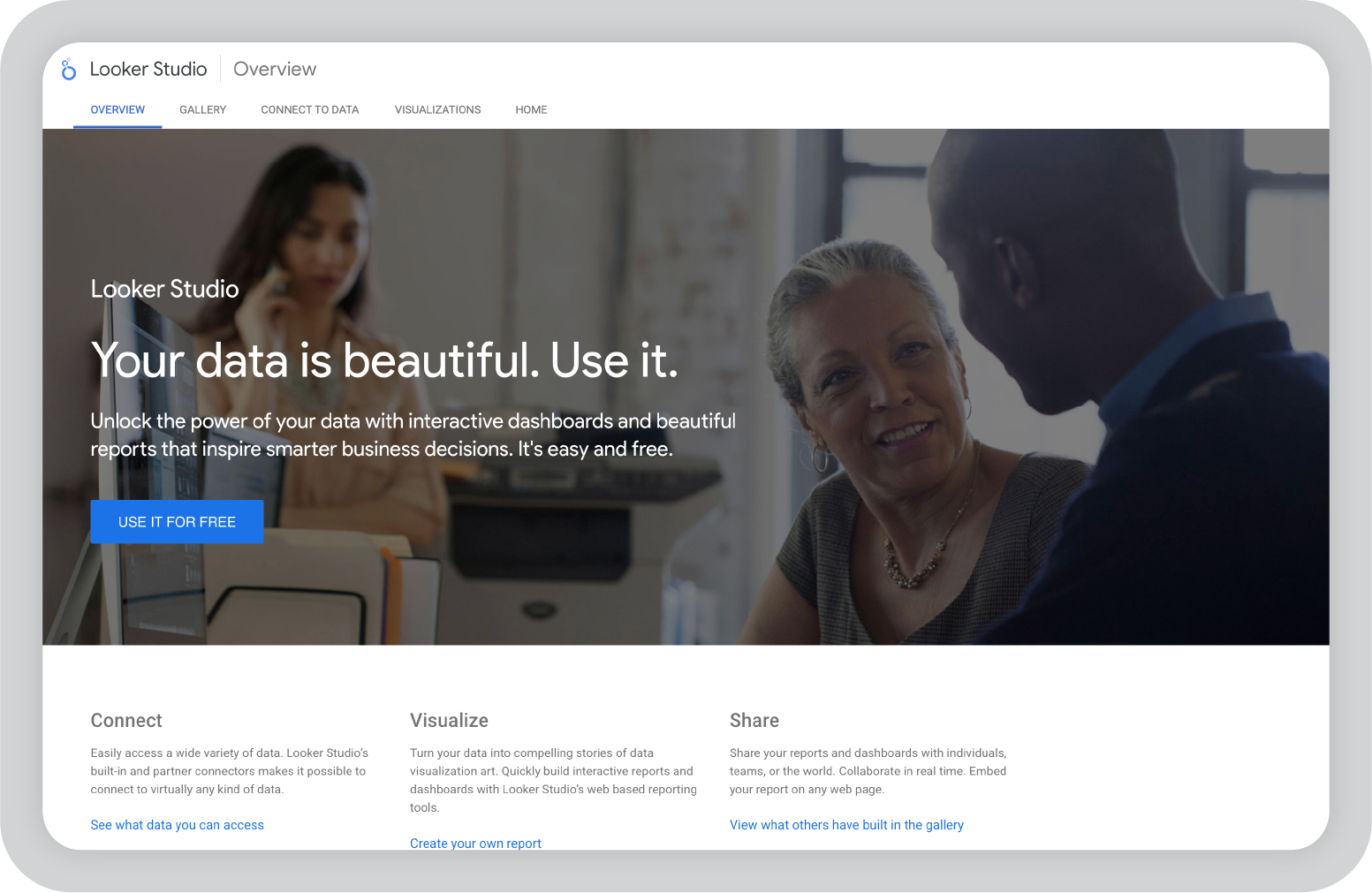
Looker Studio works best for lighter reporting use cases. When datasets become very large or complex, the platform can start to feel limited compared to enterprise analytics tools.

Customization options are also more basic, so teams looking for deeper analytics or advanced modeling may need a more powerful BI platform.

5. Sisense: Best for embedded analytics and product data teams

Sisense is a tool I started exploring after seeing it mentioned frequently in conversations around embedded analytics. Unlike many traditional reporting tools that focus mainly on internal dashboards, Sisense is often used to build analytics directly into products and applications.

What I found interesting is how flexible the platform is when it comes to working with complex data environments. Teams can combine multiple data sources, build custom analytics layers, and then deliver those insights either through internal dashboards or embedded experiences inside customer-facing tools.

For companies that want analytics to be part of their product experience rather than just internal reporting, Sisense offers a lot of flexibility.

Key features of Sisense

  • Embedded analytics capabilities that allow teams to integrate dashboards and reporting directly into their applications or products.
  • AI-driven analytics features that help uncover patterns in large datasets and automate certain parts of data analysis.
  • Flexible data modeling tools that allow teams to combine multiple data sources and build customized analytics layers.
  • Wide range of connectors that support databases, cloud platforms, and enterprise data systems.
  • API-first architecture that makes it easier for developers to build custom analytics experiences.
  • Enterprise-grade security and governance features designed for organizations handling sensitive or large-scale data.

My favorite things about using Sisense

  • The embedded analytics capabilities make it easier to deliver insights directly inside products.
  • The platform is very flexible when it comes to working with different data sources.
  • It’s powerful enough to support both internal dashboards and customer-facing analytics.

What I wish Sisense had

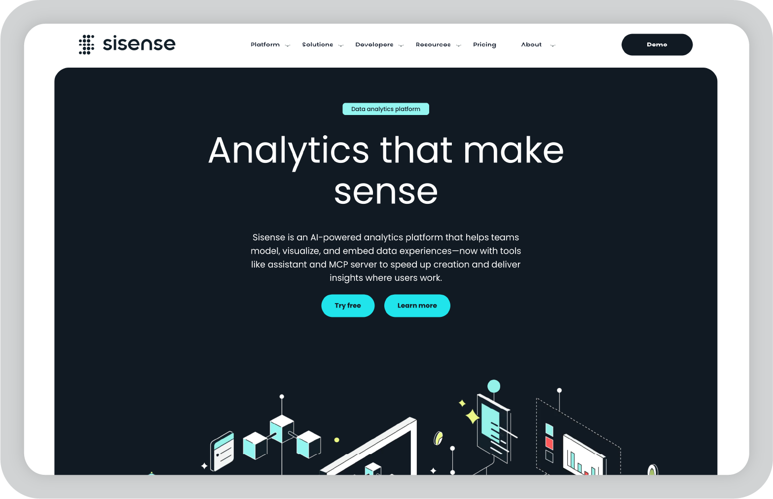
Sisense is clearly designed with technical teams in mind, and some parts of the platform may feel complex for non-technical users. Setting up data models and embedded analytics can require more planning and development work compared to simpler reporting tools.

6. Domo: Best for real-time operational reporting

Domo is a platform I explored while looking at tools that specialize in real-time data reporting. Many organizations want dashboards that update continuously as new data flows in, and Domo is designed specifically for that type of use case.

When I looked into the platform, what stood out most was the number of data connectors available. Domo integrates with hundreds of tools and services, which makes it possible to pull operational data from many different systems into one centralized dashboard.

It’s also designed to be accessible across teams. Dashboards can be viewed on mobile devices, shared across departments, and configured to trigger alerts when key metrics change.

Key features of Domo

  • Real-time dashboards that automatically update as new data flows into connected systems.
  • Extensive library of data connectors that allow teams to integrate data from marketing tools, databases, financial systems, and cloud platforms.
  • AI-powered insights that help identify trends, anomalies, and performance changes across datasets.
  • Mobile-friendly dashboards that allow teams to monitor key metrics from anywhere.
  • Automated alerts and notifications that inform teams when specific thresholds or changes occur in their data.
  • Collaboration features that allow departments to share dashboards and discuss insights within the platform.

My favorite things about using Domo

  • The real-time dashboards make it easy to monitor operational performance continuously.
  • The number of integrations available makes it easier to centralize data from many systems.
  • The mobile experience is surprisingly strong, which is useful for teams that need quick access to metrics.

What I wish Domo had

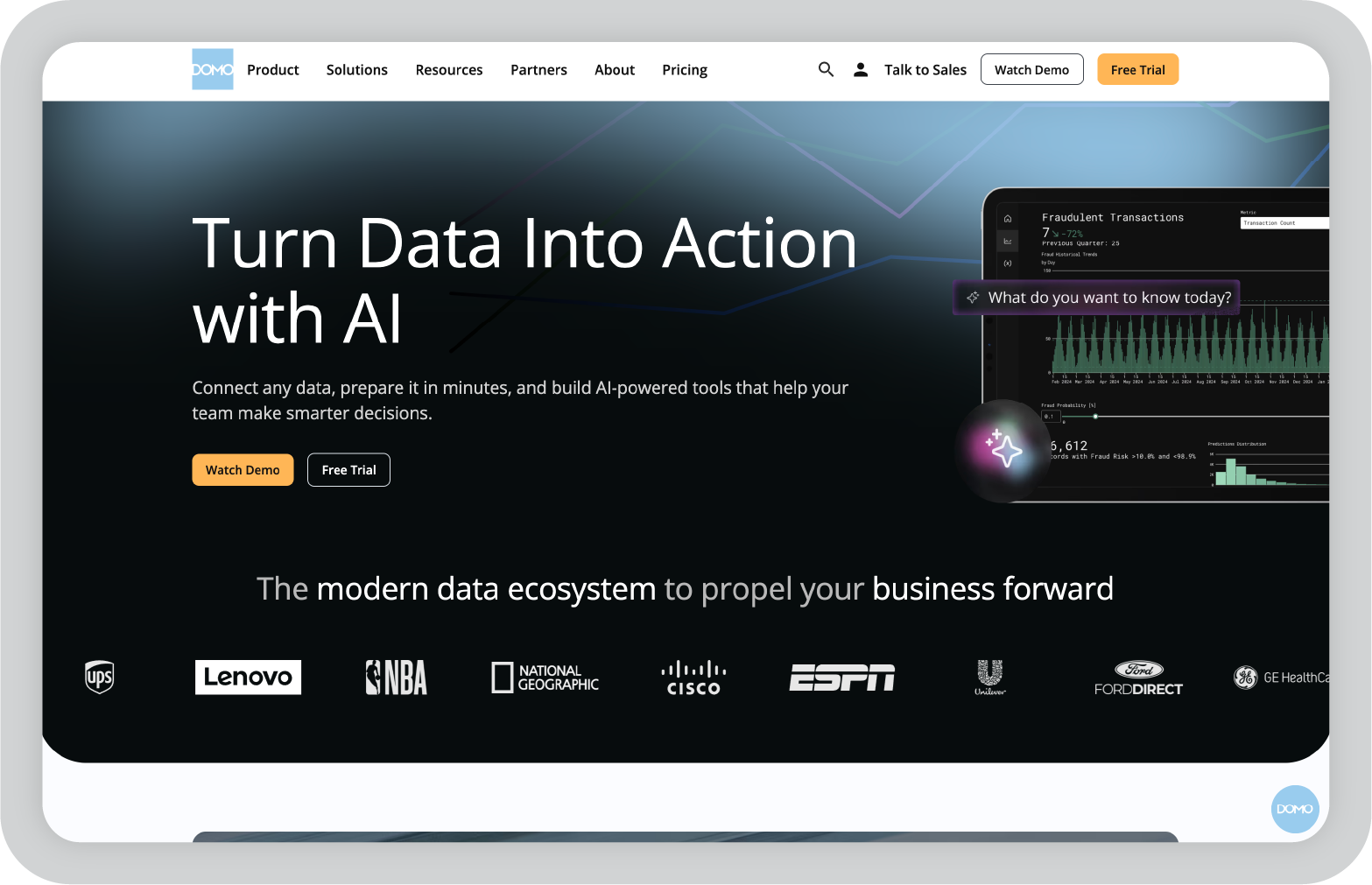
Domo is very powerful, but the platform can feel overwhelming when you first start exploring it because there are so many features and integrations available.

Pricing can also be harder to estimate upfront since many enterprise deployments are customized.

7. Zoho Analytics: Best for small and midsize businesses that want affordable AI reporting

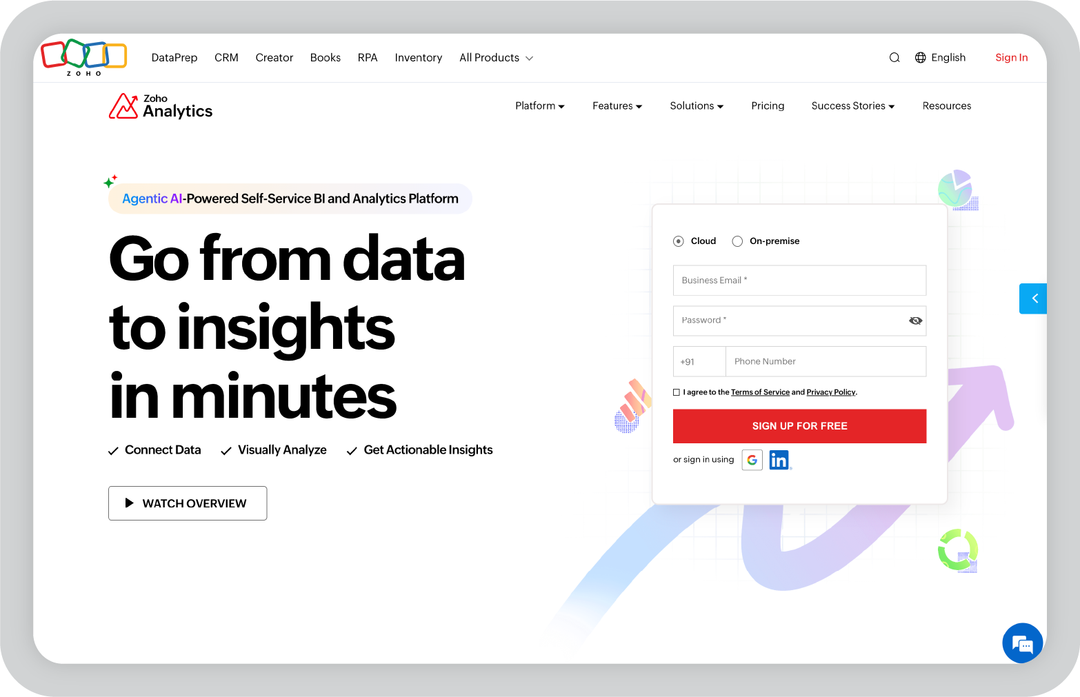
Zoho Analytics is one of the tools I usually look at when a team wants strong reporting capabilities without the complexity or cost of enterprise BI platforms.

When I explored it, what stood out was how approachable the platform feels. You can connect data sources, build dashboards, and generate reports without needing deep technical expertise. For smaller teams or companies already using Zoho products, it fits naturally into the workflow.

Zoho has also added AI features through its assistant, which can help generate reports, surface insights, and answer questions about your data. For teams that want analytics without a heavy setup process, that kind of automation can be helpful.

Key features of Zoho Analytics

  • AI-powered assistant that can answer questions about your data, generate reports, and surface insights using natural language queries.
  • Broad integration support that allows teams to connect spreadsheets, databases, cloud storage platforms, and many third-party applications.
  • Drag-and-drop dashboard builder that makes it easier to create visual reports without advanced technical skills.
  • Automated data syncing that keeps dashboards updated as connected data sources change.
  • Pre-built templates and visualization tools that help teams quickly create charts, dashboards, and performance reports.
  • Collaboration features that allow teams to share dashboards, schedule reports, and work together on analytics projects.

My favorite things about using Zoho Analytics

  • The interface is approachable and easier to learn than many enterprise analytics tools.
  • The AI assistant can help generate quick insights without needing to build complex queries.
  • Pricing is more accessible for smaller teams compared to many BI platforms.

What I wish Zoho Analytics had

While Zoho Analytics is powerful for its price range, it may feel more limited when dealing with extremely large datasets or complex enterprise analytics workflows.

Organizations with very advanced data infrastructure may eventually need a more specialized analytics platform.

8. Qlik Sense: Best for exploring complex data relationships

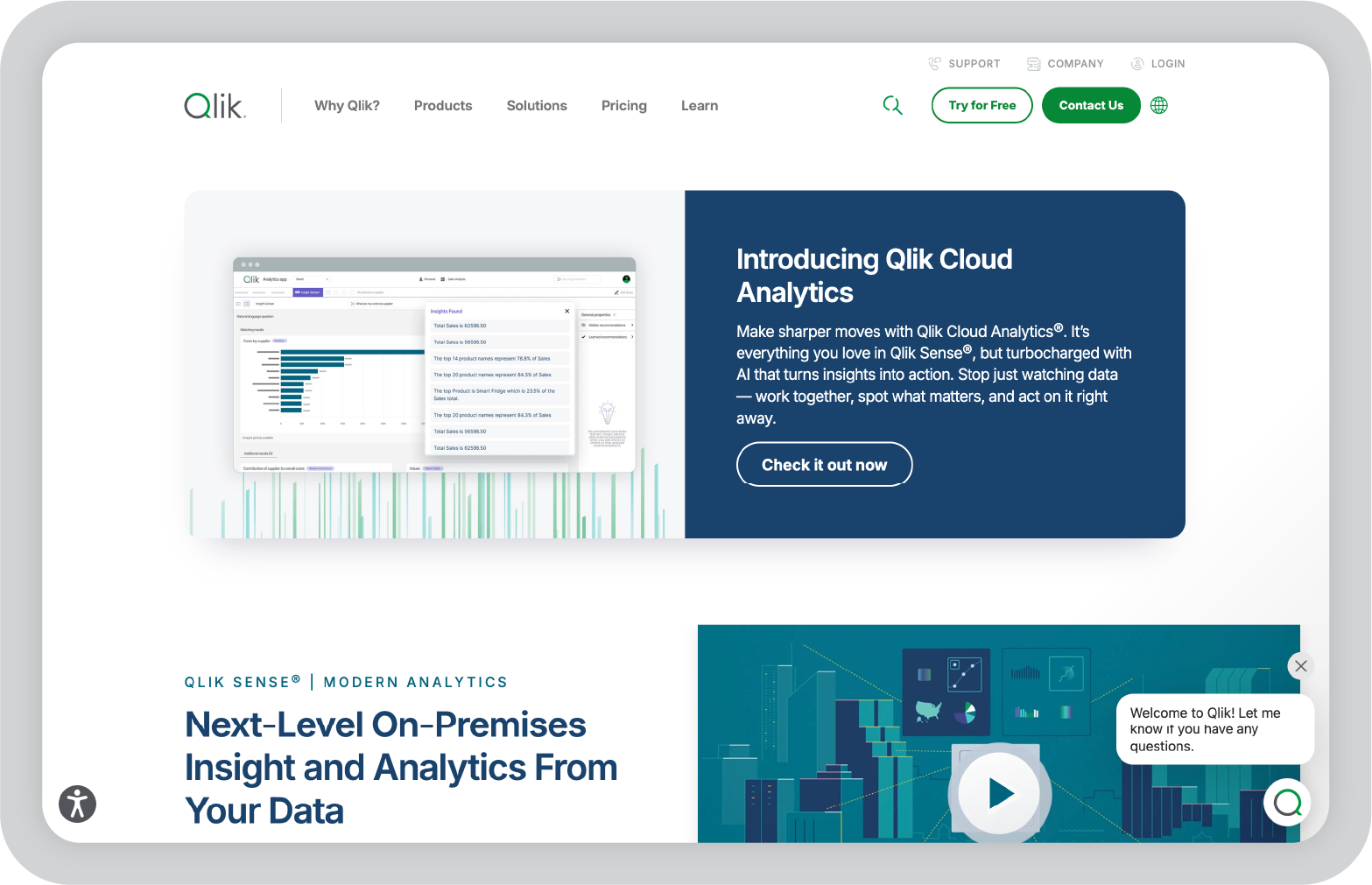
Qlik Sense is a tool I explored while researching platforms known for deeper data exploration. One thing that makes it stand out is its associative data engine, which allows users to explore relationships between datasets in a more flexible way.

Instead of relying on fixed dashboards, Qlik Sense lets you interact with data more freely. You can click into fields, filter different dimensions, and discover patterns that may not be obvious in traditional reports.

For teams that need to analyze complex datasets or uncover hidden relationships between metrics, that type of flexibility can be very useful.

Key features of Qlik Sense

  • Associative data engine that allows users to explore relationships across datasets without predefined query paths.
  • AI-powered insights that suggest correlations, trends, and patterns within large datasets.
  • Interactive dashboards that allow users to filter, drill down, and analyze data dynamically.
  • Extensive data integration capabilities that support databases, cloud platforms, and enterprise systems.
  • Self-service analytics tools that allow non-technical users to explore data without writing queries.
  • Enterprise governance and security features designed for organizations managing large data environments.

My favorite things about using Qlik Sense

  • The associative data model makes it easier to explore relationships between different metrics.
  • The platform is very powerful for teams working with complex datasets.
  • Interactive dashboards make it possible to analyze data from multiple angles.

What I wish Qlik Sense had

Qlik Sense can take some time to learn, especially if you’re new to BI tools or data modeling concepts.

Because of its depth and flexibility, the platform may feel more complex than simpler reporting tools designed for basic dashboards.

9. ThoughtSpot: Best for search-driven analytics

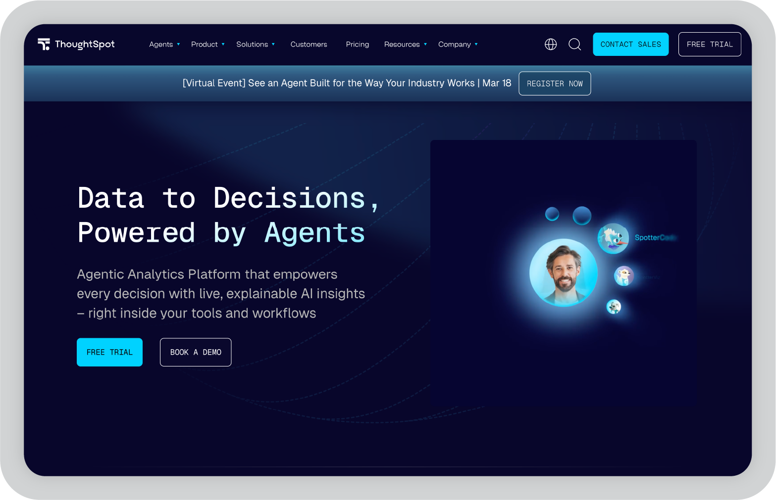
ThoughtSpot is one of the more interesting analytics tools I explored because it approaches reporting differently from most BI platforms. Instead of building dashboards first, it lets you start by asking questions about your data.

When I tested it, the search-based interface felt surprisingly natural. You can type something like “revenue by region last quarter,” and the platform automatically generates a visualization based on the query. For teams that want quick insights without building complex reports, that approach can be very helpful.

ThoughtSpot also focuses heavily on AI-driven analytics, helping surface trends, patterns, and anomalies automatically. That makes it easier for non-technical users to explore data without needing deep analytics expertise.

Key features of ThoughtSpot

  • Search-driven analytics interface that allows users to ask questions in natural language and instantly generate visualizations.
  • AI-powered insights that automatically surface patterns, trends, and anomalies across datasets.
  • Interactive dashboards that allow users to explore data, filter metrics, and drill down into specific segments.
  • Cloud-native architecture designed to work with modern data warehouses and large datasets.
  • Embedded analytics capabilities that allow organizations to integrate insights directly into applications.
  • Collaboration features that enable teams to share insights, dashboards, and data discoveries.

My favorite things about using ThoughtSpot

  • The search-based interface makes exploring data feel much more intuitive.
  • Non-technical users can find insights quickly without needing to build dashboards from scratch.
  • AI insights help surface trends that might otherwise take time to uncover.

What I wish ThoughtSpot had

While the search interface is powerful, teams still need well-structured datasets for it to work effectively. If the underlying data isn’t organized properly, the insights generated may be limited.

It can also take some time for teams to adjust to a search-first analytics workflow compared to traditional dashboard tools.

10. Klipfolio: Best for KPI dashboards and agency reporting

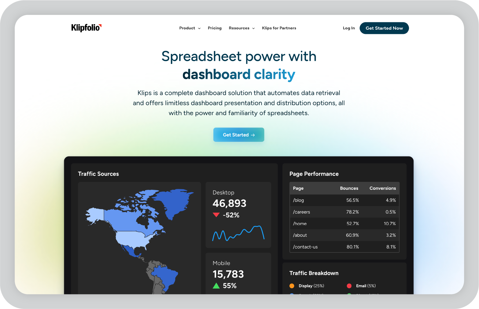
Klipfolio is a tool I came across frequently when researching reporting platforms used by agencies and marketing teams. It’s particularly focused on building KPI dashboards that track performance metrics in real time.

When I explored it, what stood out was how quickly you can build dashboards that combine data from multiple sources. Agencies often need to monitor metrics across different tools like marketing platforms, CRMs, and analytics software, and Klipfolio makes it easier to bring that data together in one place.

The platform also includes a range of templates designed specifically for tracking business metrics, which can speed up the reporting process.

Key features of Klipfolio

  • Real-time KPI dashboards that allow teams to track key performance metrics across multiple data sources.
  • Extensive integration options that connect marketing tools, CRMs, databases, and cloud platforms.
  • Customizable dashboard builder that allows users to create tailored visualizations for different reporting needs.
  • Pre-built templates designed for marketing, sales, and operational reporting.
  • Client sharing features that allow agencies to provide dashboards directly to customers.
  • Automated reporting capabilities that help teams keep stakeholders updated on performance metrics.

My favorite things about using Klipfolio

  • The platform makes it easy to track KPIs across multiple tools in a single dashboard.
  • Templates help speed up the process of building marketing and performance reports.
  • Client sharing features are useful for agencies that need to report results to multiple stakeholders.

What I wish Klipfolio had

Klipfolio works very well for KPI dashboards, but it may feel more limited when you need deeper analytics or complex data modeling.

Organizations that require advanced analytics capabilities may eventually need a more comprehensive BI platform.

11. IBM Cognos Analytics: Best for enterprise reporting and governance

IBM Cognos Analytics is one of the more established platforms in the business intelligence space, and I explored it while looking at tools designed for large organizations with strict reporting requirements.

What stood out to me is how comprehensive the platform is. Cognos combines dashboards, reporting, and AI-assisted analytics in a single environment. Teams can create detailed reports, explore data through visual dashboards, and automate certain parts of analysis using AI features.

Because it’s designed for enterprise environments, the platform also places a strong emphasis on governance, security, and structured reporting workflows. That makes it especially useful for organizations where reporting accuracy and compliance are critical.

Key features of IBM Cognos Analytics

  • AI-assisted analytics that helps identify trends, patterns, and anomalies within large datasets.
  • Enterprise reporting tools that allow teams to create detailed reports, dashboards, and scheduled reporting workflows.
  • Data preparation features that help combine and organize multiple data sources for analysis.
  • Interactive dashboards that allow users to explore metrics and drill down into specific data segments.
  • Governance and security controls designed to manage access, permissions, and compliance requirements.
  • Integration capabilities that connect the platform with databases, enterprise systems, and cloud environments.

My favorite things about using IBM Cognos Analytics

  • The platform is extremely comprehensive and supports complex enterprise reporting needs.
  • Built-in governance and security features make it well suited for regulated industries.
  • AI insights can help highlight patterns within large datasets.

What I wish IBM Cognos Analytics had

Cognos is powerful, but it can feel complex when you first start working with it. The interface and setup process may require training, especially for teams that are new to enterprise BI platforms.

For smaller teams with simpler reporting needs, the platform may feel heavier than necessary.

12. SAP Analytics Cloud: Best for organizations using the SAP ecosystem

SAP Analytics Cloud is another platform I looked into while researching enterprise reporting tools, particularly those used by organizations already running SAP systems.

What I found interesting is that the platform combines analytics, planning, and forecasting in one environment. That means teams can analyze performance data while also building financial forecasts and operational plans.

For companies already using SAP tools for ERP or data management, this integration can simplify reporting workflows and help keep analytics connected to the broader business systems.

Key features of SAP Analytics Cloud

  • Integrated analytics and planning capabilities that allow teams to analyze performance while building forecasts and budgets.
  • AI-powered insights that help identify trends, anomalies, and predictive patterns within business data.
  • Interactive dashboards that allow users to visualize metrics and explore performance across departments.
  • Deep integration with SAP products and enterprise data systems.
  • Collaboration features that allow teams to work together on dashboards, planning models, and reports.
  • Enterprise-grade governance and security controls designed for large organizations.

My favorite things about using SAP Analytics Cloud

  • Combining analytics and planning in one platform can simplify reporting workflows.
  • The integration with SAP systems is very helpful for organizations already using that ecosystem.
  • Predictive analytics features can help teams look beyond historical reporting.

What I wish SAP Analytics Cloud had

The platform is most valuable for organizations already using SAP tools. For teams working with other data ecosystems, setup and integration may require additional effort.

Like many enterprise platforms, it can also take time to fully understand all the available features.

13. Yellowfin: Best for automated insights and data storytelling

Some reporting tools focus mainly on building dashboards. Yellowfin takes a slightly different approach by emphasizing automated insights and data storytelling.

Instead of requiring teams to constantly explore dashboards to find patterns, the platform analyzes datasets and highlights important changes automatically. This can be useful for teams that want alerts and insights without manually digging through reports every day.

Yellowfin also includes built-in storytelling features that allow teams to combine charts with narrative explanations. In practice, this helps turn raw analytics into reports that are easier for business stakeholders to understand.

Key features of Yellowfin

  • Automated insights that continuously analyze datasets and surface trends, anomalies, and performance changes.
  • Interactive dashboards that allow teams to explore metrics and drill into specific data points.
  • Data storytelling features that combine visualizations with contextual explanations.
  • Data integration tools that connect with databases, cloud systems, and enterprise data sources.
  • Collaboration features that allow teams to share insights, dashboards, and reports across departments.
  • Alerting systems that notify teams when key metrics change or thresholds are reached.

My favorite things about using Yellowfin

  • Automated insights reduce the time spent manually searching for trends.
  • Storytelling features make reports easier for stakeholders to understand.
  • The platform balances analytics and reporting fairly well.

What I wish Yellowfin had

Yellowfin works well for automated insights and storytelling, but teams working with very complex data models may want more advanced customization options.

14. Chartio: Best for SQL-based analytics for startups

Many startups rely heavily on product and marketing data, which often lives in databases rather than spreadsheets. Tools like Chartio are designed specifically for that environment.

Chartio focuses on making SQL-based analytics easier to work with. Analysts can write queries directly, while non-technical users can explore the same data through visual dashboards and query builders.

For SaaS companies tracking product usage, marketing funnels, and revenue metrics, that mix of flexibility and accessibility can make reporting much easier.

Key features of Chartio

  • SQL-powered analytics that allow analysts to write queries directly against connected databases.
  • Visual query builder that helps non-technical users explore data without writing SQL.
  • Data connectors that integrate with databases, cloud platforms, and SaaS tools.
  • Custom dashboards that allow teams to track product, marketing, and operational metrics.
  • Collaboration features that make it easier to share dashboards and insights across teams.
  • Visualization tools that turn query results into charts and reports.

My favorite things about using Chartio

  • The combination of SQL access and visual dashboards gives teams flexibility.
  • The platform works well for product and SaaS analytics.
  • Dashboards make it easier to centralize data from different systems.

What I wish Chartio had

Chartio works best for teams comfortable with structured datasets and SQL workflows. Organizations looking for deeper AI-driven analytics or automated insights may prefer more advanced BI platforms.

15. Mode Analytics: Best for data teams that combine SQL, Python, and reporting

When I looked into tools built specifically for data teams, Mode Analytics kept coming up in conversations around modern analytics workflows.

What I like about Mode is that it brings analysis and reporting into the same environment. Instead of switching between multiple tools, teams can write SQL queries, run Python or R notebooks, and turn the results into dashboards and reports.

For data teams that already work heavily with code and data warehouses, this kind of workflow can make reporting much more efficient. Analysts can explore data, run deeper analysis, and share insights with stakeholders without moving everything into a separate BI tool.

Key features of Mode Analytics

  • Integrated SQL editor that allows analysts to query databases directly and build reports from query results.
  • Python and R notebook support that enables deeper analysis, modeling, and data exploration.
  • Interactive dashboards that turn analysis results into shareable visual reports.
  • Native integrations with modern data warehouses like Snowflake, BigQuery, and Redshift.
  • Collaboration tools that allow teams to share queries, reports, and insights across the organization.
  • Scheduled reports and automated updates that keep stakeholders informed as new data becomes available.

My favorite things about using Mode Analytics

  • The combination of SQL, notebooks, and dashboards makes it powerful for technical data teams.
  • Analysts can move from exploration to reporting without switching tools.
  • The platform works well with modern cloud data warehouses.

What I wish Mode Analytics had

Mode Analytics is clearly designed for analysts and data teams. If your team isn’t comfortable working with SQL or code-based workflows, the platform may feel more technical than other reporting tools.

From AI reporting to clearer decision-making

AI reporting tools have made it much easier to collect data, build dashboards, and uncover patterns that might otherwise go unnoticed. Many platforms now automate parts of the reporting process, from data preparation to insight generation.

But the best reporting tool really depends on how your team works with data.

Some organizations need deep analytics and complex dashboards. Others want quick reporting and easy ways to track performance metrics. And many teams simply want to reduce the time spent manually building reports.

In my experience, the most valuable tools are the ones that simplify reporting workflows and make insights easier to understand.

If your team is also responsible for presenting those insights to leadership or clients, it may be worth exploring tools like Prezent.ai that help turn analytics into structured, business-ready presentations.

You can try Prezent.ai for free or book a demo to see how it fits into your reporting and presentation workflow.

FAQs about AI reporting tools

1. What are AI reporting tools?

AI reporting tools are platforms that use artificial intelligence to automate parts of the reporting process. They can help collect data, analyze patterns, generate insights, and create dashboards or reports without requiring as much manual work.

2. How are AI reporting tools different from traditional BI tools?

Traditional BI tools focus mainly on data visualization and manual analysis. AI reporting tools add capabilities like automated insights, anomaly detection, natural language queries, and AI-assisted report generation, which can speed up the reporting process.

3. What should I look for in an AI reporting tool?

When evaluating AI reporting tools, I usually look at factors like data integrations, ease of use, visualization capabilities, automation features, collaboration options, and whether the platform can scale as data volume grows.

4. Are AI reporting tools suitable for small businesses?

Yes. Many AI reporting tools offer affordable plans or free tiers that work well for small teams. Platforms like Google Looker Studio or Zoho Analytics can provide strong reporting capabilities without the complexity of enterprise BI tools.

5. Can AI reporting tools replace data analysts?

Not really. AI tools can automate parts of the reporting workflow, but analysts are still needed to interpret the data, ask the right questions, and translate insights into meaningful business decisions. AI typically helps analysts work faster rather than replacing them.

Ready to create impactful presentations?

Try for free

About the author

Niyati

Niyati is a Content Marketing Specialist with over 5 years of experience creating product-led content that drives conversions. She focuses on building high-intent, search-driven content that aligns closely with product value and turns traffic into users. Having worked with several SaaS and AI-first companies, she specializes in bridging content strategy with measurable growth.

Connect with her on LinkedIn.

No items found.
No items found.

Related resources

BLOG
Niyati Mahale
March 16, 2026
11 Best Presentation Design Services I Recommend
Explore the best presentation design services. Compare agencies that help teams create polished slides, improve storytelling, and design clearer presentations.
BLOG
Niyati Mahale
March 16, 2026
Visme review: Features, pros, cons & pricing for 2026
Explore Visme’s features, AI slide generator, pricing plans, pros, and cons in this in-depth review to see if it’s the right tool for presentations.
BLOG
Tony Colon
March 11, 2026
Why I am joining Prezent AI’s senior executive board: Empowering storytelling in the age of AI
Tony Colon shares how his career shaped his belief in clear communication and why he chose to support Prezent AI’s mission.
BLOG
Supriya Sarkar
March 10, 2026
Claude for PowerPoint: How it works, setup, limitations, and enterprise solutions
Claude for PowerPoint guide: learn step-by-step setup, AI presentation creation, workflow best practices, and the limitations enterprise teams should consider.
BLOG
Supriya Sarkar
March 2, 2026
How to choose the best AI presentation maker: A practical buyer’s guide for modern teams
Find the best AI presentation maker for your team. Learn how to compare AI presentation generators, templates, brand control, and integrations before choosing the right tool.
BLOG
Anoob PT
March 2, 2026
What is an AI presentation maker? Capabilities, limitations & use cases
Cut deck time by 80% with AI presentation makers. This enterprise guide covers must-have features, proven ROI, and a PowerPoint comparison, plus real-world use cases for proposals, QBRs, and RFPs.
BLOG
Anoob PT
February 26, 2026
Best Canva alternatives: AI presentation tools from free to enterprise
Looking for a Canva alternative for presentations? Compare AI tools, free and paid plans, workflows, and features across small business and enterprise platforms.
BLOG
Anoob PT
February 24, 2026
7 Best Google Slides alternatives: Best presentation software for business teams
Google Slides alternatives ranked for business. Compare AI presentation tools, enterprise features, pricing, and collaboration options to find the right fit for your team.
BLOG
Supriya Sarkar
February 20, 2026
14 Best Visme alternatives: Free, AI-powered, and enterprise presentation tools compared
14 Best Visme alternatives: Compare 14 AI presentation platforms like Prezent, Canva, and Piktochart by pricing, templates, storytelling, and content creation features.
BLOG
Anoob PT
February 18, 2026
Prezent AI Expands Senior Executive Board with CX Leader Tony Colon
Tony Colon joins Prezent AI’s Senior Executive Board to advance global enterprise adoption and customer-centric AI innovation.
BLOG
Anoob PT
February 16, 2026
Prezent vs Gamma: Which AI presentation tool is best for your business?
Choosing between Prezent vs Gamma? Compare features, pricing, ROI, and brand control to find the right AI presentation tool for your team.
BLOG
Anoob PT
February 10, 2026
Best Slideshow Presentation Software in 2026: Tested & Reviewed
Find the best slideshow presentation software for 2026. We tested top presentation apps including PowerPoint, Google Slides, and Prezent AI to create slideshows.
Free 14-Day Trial*

Customized On-Boarding*