No items found.
No items found.

Great presentations don’t just inform—they captivate, persuade, and resonate long after the final slide. Imagine pitching a groundbreaking idea, teaching a complex concept, or delivering a game-changing keynote with visuals that not only enhance your message but make it unforgettable. The right graphics aren’t just accessories; they’re the backbone of your story, turning abstract ideas into vivid, memorable experiences.
In this guide, we’ll unlock the secrets to selecting and crafting presentation graphics that elevate your slides from ordinary to extraordinary. Packed with actionable strategies and practical examples, you’ll be equipped to design visuals that captivate your audience and amplify your impact, no matter the setting or subject.
In a world where attention spans are shrinking, visuals are your secret weapon to captivate, clarify, and connect. The research underscores the power of visuals:
Great graphics aren’t just decorative—they’re transformative. They make your ideas not just seen, but understood, remembered, and felt. Here’s how they work their magic:
The right visuals don’t just support your message—they amplify it, turning ordinary slides into extraordinary storytelling tools. Let’s explore how to make your graphics work smarter, not harder.
Graphics can elevate your presentation from mundane to memorable, but success hinges on more than just aesthetics. To create visuals that truly resonate, you need a strategy rooted in understanding your audience and your message.
Graphics have the power to transform your presentation from forgettable to unforgettable—but only if they resonate with your audience. A well-chosen visual can simplify complex ideas, captivate attention, and drive your message home. However, the key to achieving this lies in tailoring your graphics to fit the unique needs and preferences of your audience. Here’s how:
Corporate teams: Opt for clean, professional visuals like graphs, charts, and infographics that highlight data and insights. Keep the design minimalist to align with a formal tone.
Students or trainees: Leverage vibrant, dynamic visuals like diagrams, illustrations, and animations to foster engagement and make learning interactive.
General public: Use straightforward, relatable visuals and metaphors that bridge the gap between abstract ideas and everyday experiences.
But that’s not all—to know your audience, context matters just as much as content. Think about cultural nuances, your audience’s familiarity with the topic, and their expectations. A generic, one-size-fits-all approach rarely delivers the impact you’re aiming for. Instead, choose graphics that align with your audience’s communication style and ensure your visuals truly speak their language.

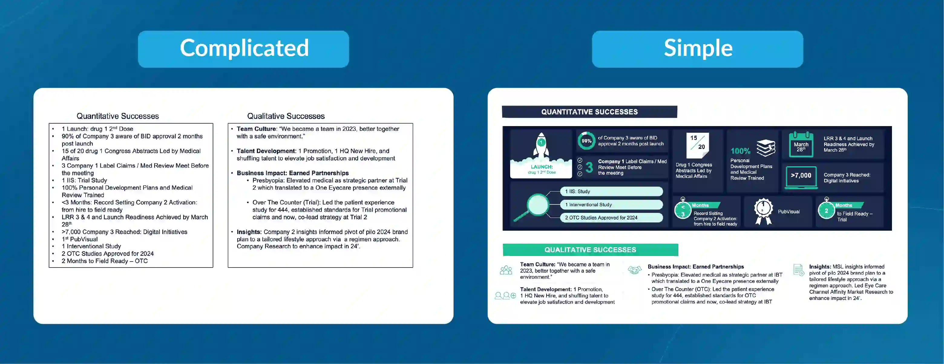
Simplicity isn’t just a design choice—it’s a communication strategy. In presentations, less is often more, as clarity and focus help your audience grasp and retain your message effortlessly. Here’s how to embrace simplicity without sacrificing impact:
One message per slide: Overloading slides with multiple ideas dilutes their effectiveness. Stick to one core idea per slide to maintain focus and keep your audience engaged.
Limit text: Long blocks of text can bore or overwhelm viewers. Instead, let visuals like images, icons, or charts convey your message in a more engaging and digestible way.
White space is your friend: Empty space isn’t wasted space. It enhances readability, draws attention to key elements, and ensures your slides feel clean and professional.
When your slides are uncluttered, your audience can focus on what truly matters—your message. By keeping your design simple, you ensure your visuals amplify your points rather than competing with them.
When it comes to presentation design, the quality of your visuals can make or break the impact of your slides. Low-resolution images or generic clip art are distractions that can lose your audience's attention. Instead, aim for graphics that not only look professional but also align with the theme of your PowerPoint templates, Google Slides themes, or custom slide designs. Here’s how to ensure your visuals work seamlessly in your next presentation:
Use royalty-free stock images: Platforms like Unsplash and Pexels provide editable, high-quality stock images that enhance your slides without stretching your budget.
Choose vector graphics for flexibility: Vector images, widely used in templates for PowerPoint and Google Slides, maintain clarity when scaled, making them ideal for any presentation size or screen.
Avoid overused and clichéd visuals: Instead of commonly seen graphics like a "thumbs-up businessman" or "businesswoman pointing at a chart," explore retro-inspired templates, 3D designs, or fully customizable graphics to engage your audience in unique ways.
By leveraging premium features and templates with extensive design tips, you'll not only illustrate your key points but also visualize your ideas in a way that aligns strategically with your workflow, leaving a lasting impression.
Data tells a story, but without the right presentation, that story can get lost in a sea of numbers. Data visualization transforms complex information into compelling visuals, helping your audience grasp key insights quickly and effectively. Use:
Bar graphs: Perfect for comparing categories, such as sales performance across regions or growth over time.
Pie charts: Ideal for illustrating proportions, such as market share or budget allocation.
Heat maps: Highlight intensity, trends, or distribution patterns at a glance, commonly used in fields like marketing or demographics.
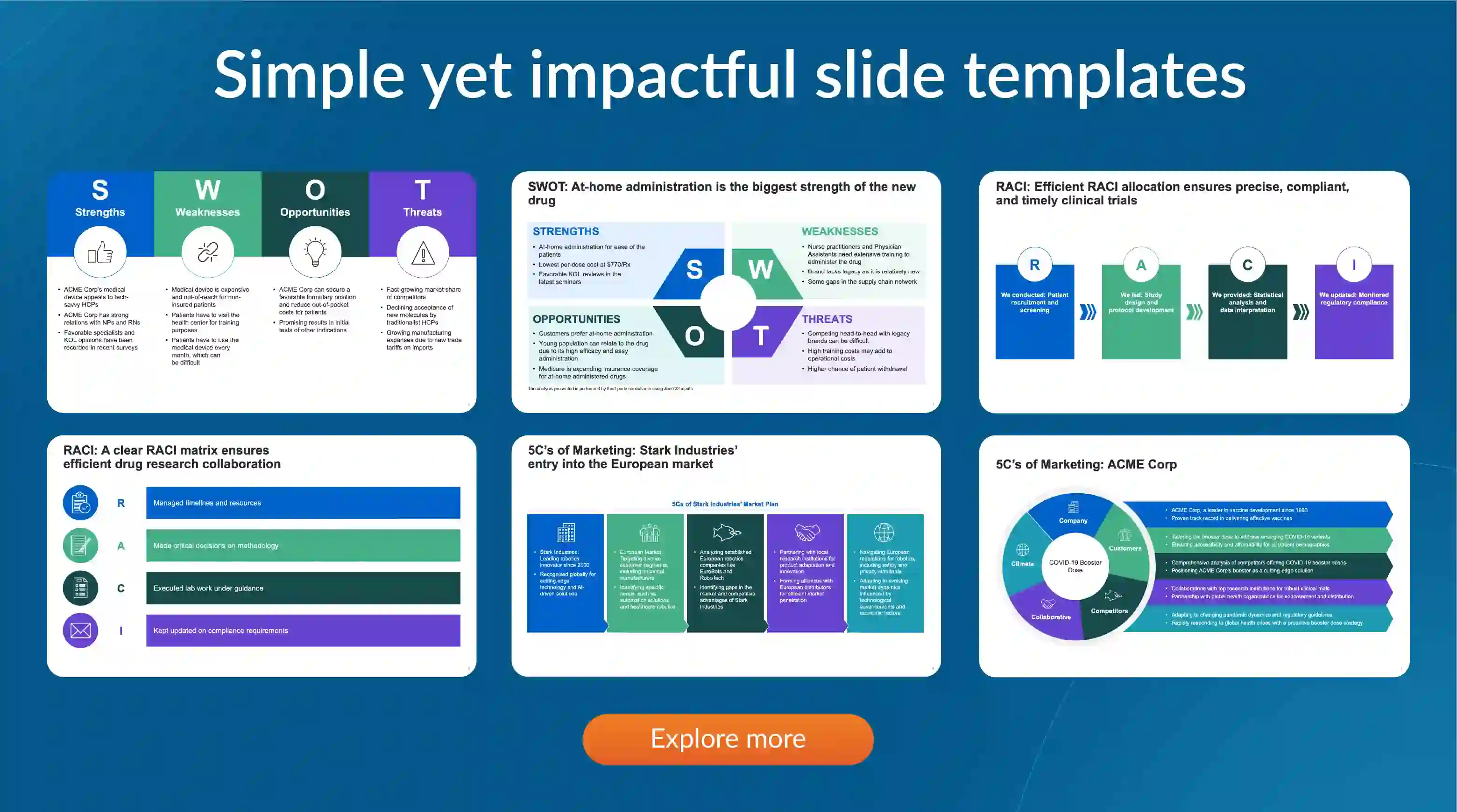
Infographics: Combine images, icons, and text to summarize detailed workflows, processes, or key statistics in a visually engaging way.
Consistency is the cornerstone of a polished and professional presentation. A cohesive design not only elevates your slides but also ensures your audience stays focused on the message rather than the mismatched visuals. Whether you’re creating a businesswoman’s presentation, a marketing pitch, or a tutorial, maintaining consistency is a strategic step in impactful slide design.
Stick to a unified color palette and font style: Choose a background and font combination that complements your topic.
Use consistent icon styles: When designing with icons or vector graphics, ensure they share a uniform look. For example, avoid mixing flat and 3D styles unless the theme is deliberate, such as in a retro-inspired businesswoman template.
Align elements neatly: Utilize tools like gridlines, alignment options, or predesigned layouts available in slide templates to structure your slides. Tools such as the alignment guides in PowerPoint or the left corner of the window rulers in Google Slides help create a professional flow.
Great slides aren’t just visually stunning—they’re universally understandable. Accessibility ensures that every audience member, regardless of visual or cognitive abilities, can engage with and benefit from your presentation. In an era where inclusivity is essential, designing accessible slides is a strategic and impactful step that demonstrates your attention to every detail.
Here’s how to make your presentation accessible without compromising style:
Use high-contrast colors: A high contrast between your text and background ensures readability, even in a dimly lit room or on smaller screens.
Avoid relying solely on color: Differentiating data solely by color can leave colorblind viewers in the dark. Instead, combine colors with patterns, shapes, or labels to clarify distinctions. For example, in a 6-step flow chart, use icons or annotations alongside colors.
Ensure text legibility: Select fonts that are easy to read and size them appropriately for the room. For in-person presentations, test your slides by standing at the back of the room to confirm visibility. Slide design tools allow you to tailor font sizes and styles across all slides for consistency.
The right type of graphic depends on your presentation's goals. Here’s a breakdown:
Best for: Simplifying concepts or explaining processes.
Best for: Presenting numbers and statistics.
Best for: Engaging audiences and explaining abstract ideas.
Best for: Building emotional connections or providing real-world context.
Best for: Adding dynamic elements to your presentation.
Crafting impactful presentation graphics involves more than just aesthetics—it’s about enhancing clarity, engagement, and retention. Here are actionable tips to design visuals that captivate and communicate effectively:
Every graphic should serve a distinct role in your presentation. Ask yourself:
If a visual doesn’t fulfill one of these purposes, consider omitting it to maintain focus.
Guide your audience’s eyes to what matters most with an intentional structure:
Color isn’t just decorative—it’s a powerful communicator. Choose the best colors:
Subtle animation can enhance your slides without overwhelming your audience:
Preview animations with tools like PowerPoint’s preview button to ensure they are smooth and purposeful.
Preparation is key to delivering a seamless presentation:
Creating engaging slides that effectively communicate your message can be challenging, especially if design isn't your strong suit. Prezent is an **AI presentation maker for executives** that simplifies the presentation design process, enabling you to produce professional, on-brand slides tailored to your audience. By integrating seamlessly with platforms like PowerPoint and Google Slides, Prezent enhances your presentation capabilities.
1. AI-driven design assistance: Prezent utilizes artificial intelligence to analyze your content and suggest optimal layouts, graphics, and designs, enhancing clarity and engagement.
2. Extensive slide library: Access over 35,000 professionally curated slides that align with your company's branding, providing a solid foundation for your presentations.
3. Story builder: Choose from more than 1,000 expert-curated storylines to construct presentations such as business plans or project updates efficiently.
4. Auto generator: AI to generate personalized, on-brand decks in minutes using simple prompts, streamlining the creation process.
5. Template converter: Convert your slides into any of your brand templates with a single click, ensuring 100% brand compliance.
6. Collaborative tools: Share, anonymize, and collaborate on presentations with colleagues effortlessly, promoting consistency and teamwork.
7. Learning modules: Enhance your business communication skills with bite-sized, gamified learning modules available within the platform.
Prezent streamlines the presentation creation process, offering AI-driven tools and a vast library of resources to help you craft compelling, on-brand slides. Its seamless integration with PowerPoint and Google Slides ensures that you can design and present with confidence, regardless of your design expertise. Try it today with a free account or connect with our experts for a detailed demo at your own time.

.png)