blog
October 25, 2024

How to create Harvey Balls in PowerPoint for your next presentation

Learn how to create Harvey Balls in PowerPoint to enhance your presentations. Use these tips to display project status and captivate your audience.

When it comes to workplace presentations, effectively communicating complex data and status updates is essential. A lot of people have often overlooked the simplicity and effectiveness of using Harvey Balls in presentations.

When used effectively, symbols can help communicate your message effectively and create a lasting impression within your organization. This article delves into how these unassuming symbols can transform the presentation and interpretation of information in a corporate context.

What are Harvey Balls?

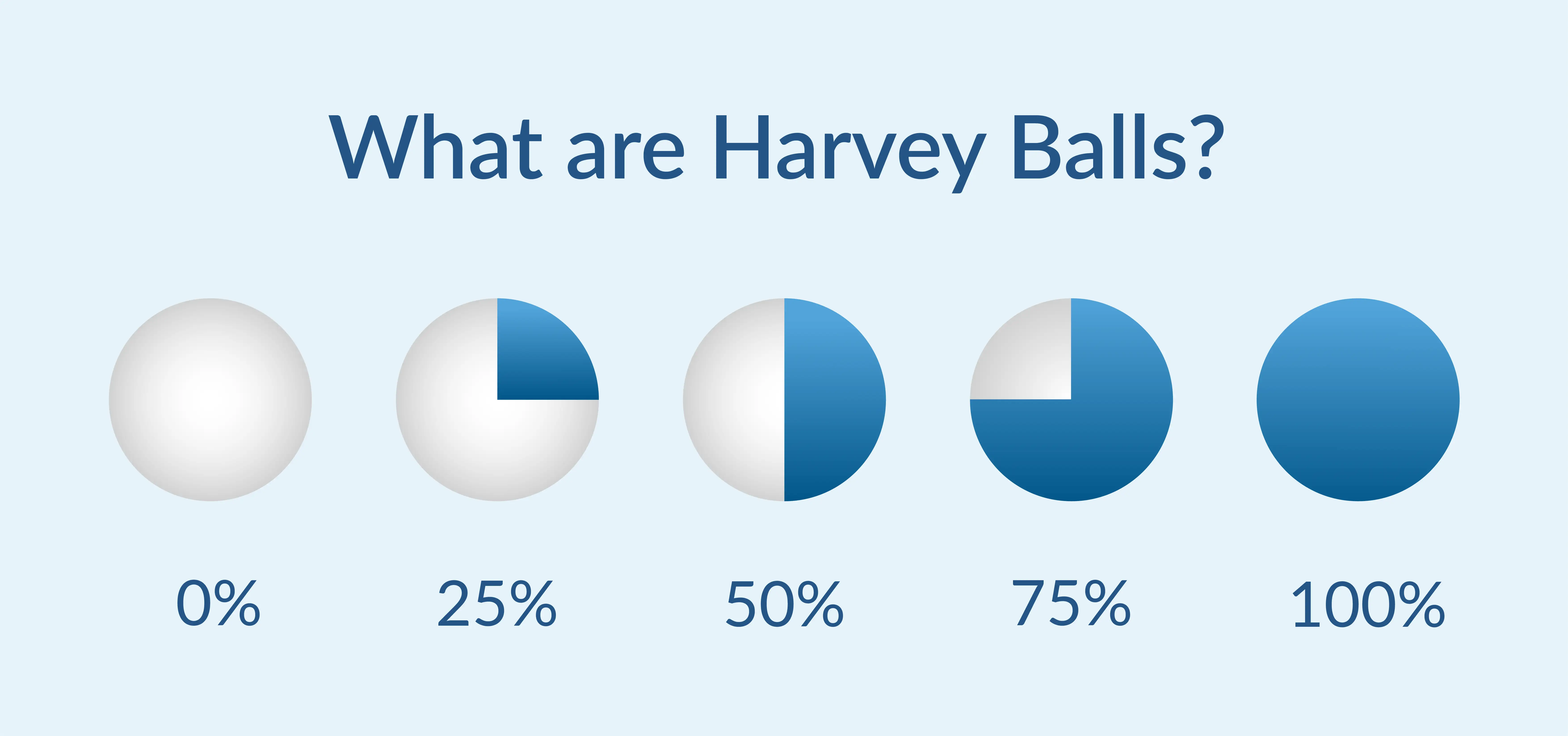
A Harvey Ball is a circular graphic divided into segments representing varying degrees of completion or comparison. Developed by Harvey Poppel, it has become a popular tool for visual communication in business and project management.

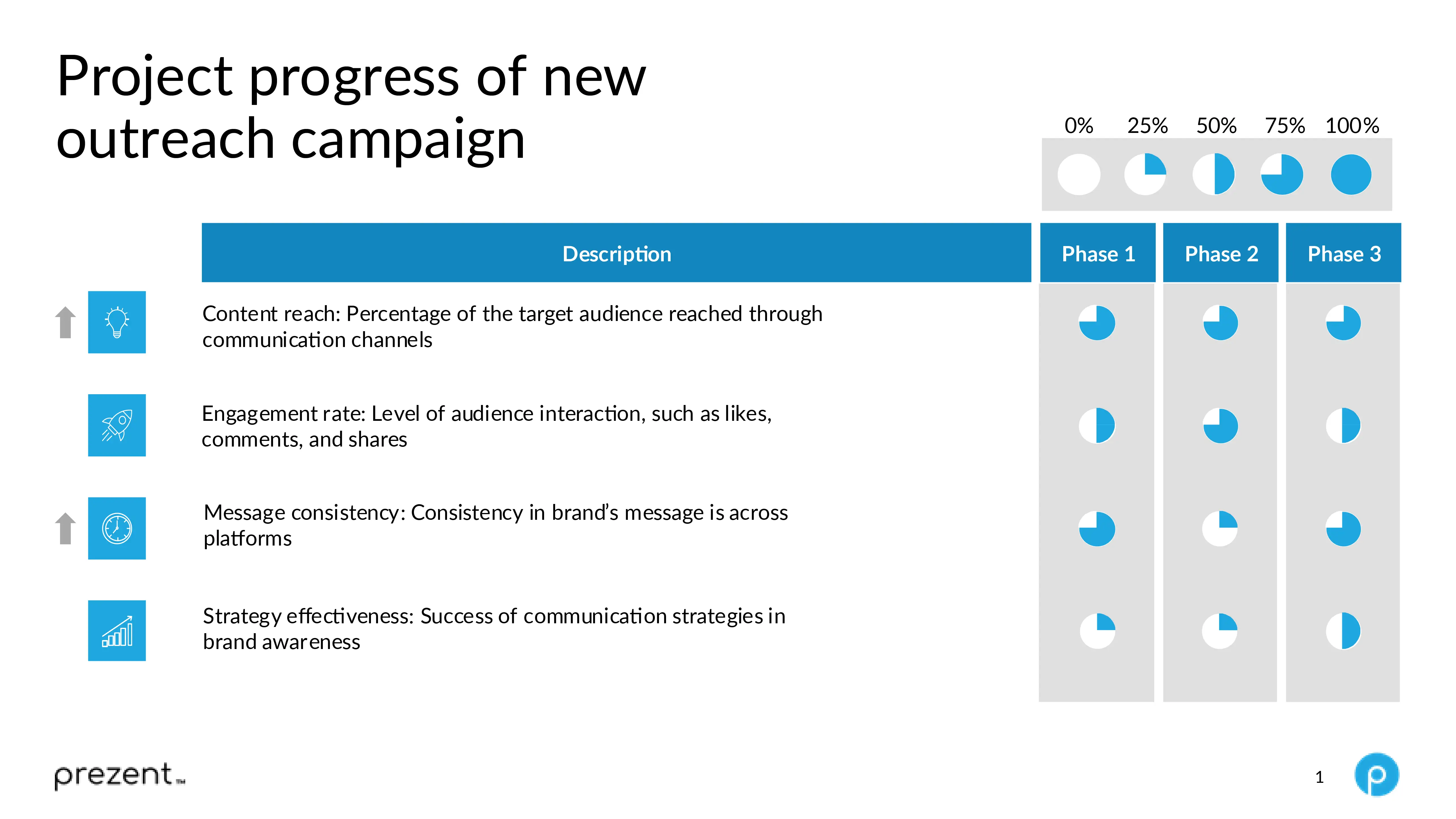
Each Harvey Ball represents a certain percentage of completion or satisfaction, ranging from empty (0%) to filled (100%). For example, a Harvey Ball filled halfway represents 50% completion or fulfillment.

Harvey Balls' simplicity and versatility make them a go-to option for presenting information concisely and clearly.

Benefits of using Harvey Balls in presentations

Incorporating Harvey Balls into presentations offers numerous benefits that can significantly enhance the delivery of complex information. Here are some of the key benefits:

  1. Provides a visual summary and saves time: Harvey Balls allows employees to convey their data visually, enabling audiences to grasp the message effectively. It also allows individuals to communicate complex information quickly, reducing the need for lengthy descriptions. This is mainly useful in business and project management presentations where the status of multiple projects or product features needs to be summarized.
  2. Enhances audience engagement: Using graphical elements like Harvey Balls makes presentations more engaging. Visual aids catch and retain the audience’s attention better than text-heavy slides, ensuring the key message is communicated effectively.
  3. Improves aesthetic appeal: Incorporating well-designed Harvey Balls into presentations can significantly enhance the aesthetic appeal of the slides. This also makes the slides look more professional and polished. This visual upgrade can help make the presentation more appealing and lead to a better reaction from the audience.
  4. Facilitates comparison: Harvey Balls provides a straightforward method for comparing multiple items across various parameters. For example, when comparing products, services, or strategies, Harvey Balls can visually represent where each item stands concerning different attributes.
  5. Enables customization: Harvey Balls can be easily customized in presentations to fit the theme, including color, size, and degree of completion. It provides flexibility and ensures the Harvey Balls align with the presentation’s design.
  6. Encourages conciseness: Harvey Balls's nature encourages employees to distill information into essential points. This prevents information overload for the audience, making presentations more effective and enjoyable.
  7. Interpretation across language barriers: Harvey Balls conveys information visually, making it understandable regardless of the audience's language skills. This universality makes them particularly useful in presentations to international or diverse audiences.

Using Harvey Balls is a great way to make your slides more attractive and easily understood. They help to show comparisons and different levels of information clearly, making your presentations more effective no matter what you're talking about.

How to create Harvey Balls in PowerPoint

Creating Harvey Balls in PowerPoint can be done in a few different ways. Here are some steps to quickly create Harvey Balls for presentations:

Method 1: Using PowerPoint's built-in icons

  1. Open PowerPoint and go to the slide where you want to add the Harvey Balls.
  2. Go to the "Insert" tab in the ribbon.
  3. Click on "Icons" and then search for "Harvey Balls" or "Circles." (Depending on the version of PowerPoint, you might find Harvey Balls directly or create your own Harvey Balls using circular shapes).
  4. Select the icon that resembles a Harvey Ball or a circle.
  5. Insert the icon onto the slide and align the Harvey Balls.
  6. Customize the color to match your presentation theme.

Method 2: Creating custom Harvey Balls

  1. Open PowerPoint and go to the slide where you want to create the Harvey Balls.
  2. Go to the "Insert" tab on the top and click on "Shapes."
  3. Select the “circle” shape and draw it on the slide.
  4. Right-click the circle and select "Format Shape."
  5. Fill the circle with a solid color or gradient to create a semi-filled or quarter-filled look.
  6. Copy and paste the circle as needed, and adjust the fill percentage to create different levels of completion (e.g., 25%, 50%, 75%).

Additionally, to save time, you can use ready-made Harvey Balls slides by Prezent that can be easily customized or pre-made templates from PowerPoint resources or third-party websites.

Effective ways to incorporate Harvey Balls in PowerPoint presentations

Understanding how to utilize Harvey Balls can be daunting for individuals or employees. Explore the points below to determine if you should include these circular symbols in your presentations:

1. Clarify the objective: Understand if you need to add Harvey Balls in PowerPoint. Are you comparing items, displaying progress, or visually presenting qualitative data? Identifying the purpose will help in their placement and design.

2. Organize and arrange your data: Gather all pertinent data you plan to exhibit using Harvey Balls. Arrange the data clearly to understand what you are comparing or demonstrating. This step ensures readiness to present the information accurately.

3. Customize the design:

  • Size and color: Customize the size and color of Harvey Balls to match the presentation's theme and make them visually appealing. Ensure they are large enough to be visible from a distance.
  • Degree of completion: Adjust the fill of each Harvey Ball to accurately represent the degree of completion, satisfaction, or comparison. PowerPoint provides easy customization options, so utilize this flexibility.
  • Consistency: Maintain a consistent design of Harvey Balls across slides. Consistent visual elements help reinforce the message and retain the audience's attention.

4. Strategically incorporate them into slides: Place Harvey Balls strategically within your slides. Ensure they complement the text and other visual elements.

💡Pro tip: Avoid overcrowding the slide or diverting the audience's attention from essential information.

5. Provide a legend or key: If your Harvey Balls represent specific data ranges or categories, include a legend or key on your slide. A brief explanation ensures that all audience members can understand what each Harvey Ball represents, enhancing the clarity of your presentation.

6. Pair with concise text: While Harvey Balls visually summarize data, supplementing them with straightforward, meaningful text can enhance understanding. Brief labels or captions can clarify what each Harvey Ball represents, providing context and making your presentation more informative.

7. Rehearse your delivery: Familiarize yourself with the data represented by the Harvey Balls and practice how you will explain each visual element during your presentation. A smooth delivery keeps the audience engaged and effectively conveys the message.

8. Seek feedback: Assess the effectiveness of Harvey Balls in conveying your message after your presentation. Gather feedback from audience members. Feedback can be invaluable for refining future presentations and making them even more impactful.

9. Utilize PowerPoint features: PowerPoint offers various features, such as animations, grouping, and alignment tools, to enhance Harvey Balls' presentation. Experiment with these features to see how they can best complement your presentation style and information layout.

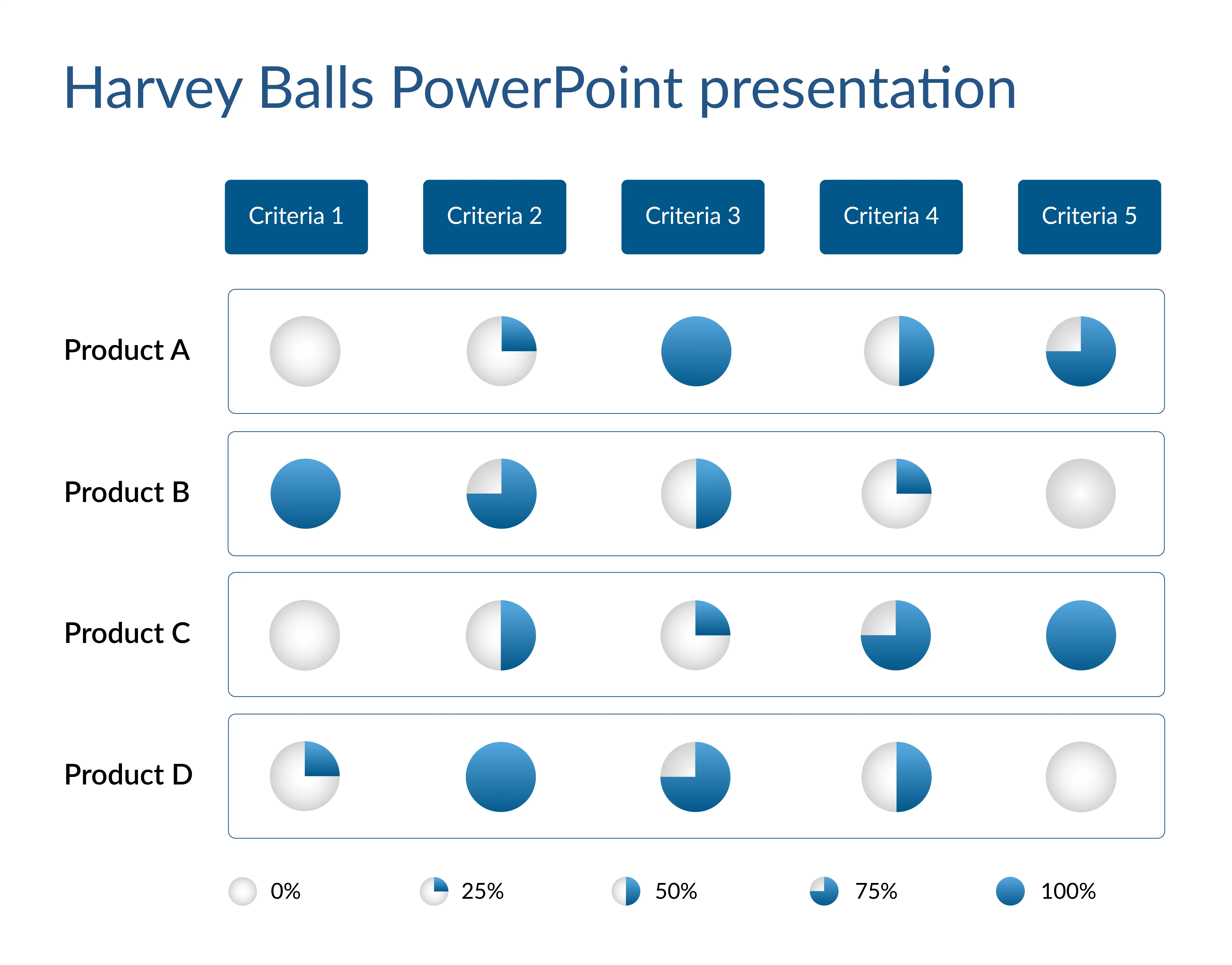
Harvey Balls are used in PowerPoint decks to compare products, track project status, show performance ratings, represent product development progress, and display client feedback.

Based on feedback and your observations, continuously seek ways to improve how you use Harvey Balls in presentations. Adapting your approach to suit different audiences or types of information can significantly enhance the effectiveness of your communication. Following these detailed steps makes it easier to master the art of integrating Harvey Balls into your presentations and making complex data engaging for your audience.

Tips to make perfect Harvey Balls in your presentations

Perfecting the use of Harvey Balls in presentations is important as they are a powerful visual communication tool that effectively conveys complex information. Here are some tips to make Harvey Balls consistent and maximize their impact:

  1. Choose the correct number of segments: Decide how many levels or segments you need for your Harvey Balls. A common choice is four or five levels (e.g., 0%, 25%, 50%, 75%, and 100%), but you can adjust based on your presentation's requirements.

💡Pro tip: Avoid using too many segments, as they can make the Harvey Balls harder to interpret. Keep it simple.

  1. Keep consistent sizes and alignment: Ensure all Harvey Balls are the same size and align them consistently across your slide or table. This helps your presentation look polished and professional, allowing the audience to compare different Harvey Balls easily.
  2. Use contrasting and meaningful colors: Choose contrasting colors to differentiate filled and unfilled portions of the Harvey Balls. This visual distinction helps convey information more effectively without additional text.

        For example, use a bold color (like blue or green) for the filled portion and a neutral color (like grey) for the unfilled part.

💡Pro tip: If you're using multiple Harvey Balls for different categories, consider color-coding them for added clarity—green for positive metrics, yellow for neutral, and red for areas that need improvement.

  1. Maintain simplicity in design: Avoid complex designs in your Harvey Balls. Simplicity ensures clarity and prevents confusion. Clean, straightforward designs are easier for your audience to interpret at a glance, especially in summary tables or comparisons.

💡Pro tip: Use simple designs in your Harvey Balls presentations to ensure user-readability.

  1. Label your Harvey Balls: Always include labels, such as percentages or descriptions, to indicate what each Harvey Ball represents. Labels are crucial for ensuring your audience understands the meaning of the different levels or segments.
  2. Provide supporting text: If using Harvey Balls to show progress or completion, arrange them logically, from 0% to 100%. Group your Harvey Balls with brief explanations or a legend to clarify each level's representation, especially in complex comparisons. This makes sure your audience can follow the context more easily.
  3. Test for readability and avoid overuse: Make sure your Harvey Balls are large enough and have sufficient contrast to be easily readable from a distance. Testing on a projector or large screen ensures clarity. Avoid overusing Harvey Balls; too many can clutter your slides and reduce their impact.

💡Pro tip: Insert Harvey Balls in presentations selectively, like in summary tables or status updates.

  1. Use PowerPoint tools to create symmetrical shapes: Use PowerPoint's built-in shape tools to ensure your Harvey Balls are perfectly round and consistently filled.
    • Hold down the "Shift" key while dragging to create a perfect circle.
    • Use the "Format Shape" options to adjust the fill and outline for symmetry.
  1. Leverage templates: Save time and ensure consistency by using or creating templates with pre-made Harvey Balls. You can find free templates online or on the Prezent platform. You can also choose to design your own to reuse throughout your presentation. Templates help maintain uniformity across different slides.
  2. Consider animation for emphasis: Use simple animations to gradually reveal Harvey Balls or fill them progressively as you present. For example, you can animate each Harvey Ball to fill as you discuss each project phase. This can emphasize buildup or progression and engage your audience more effectively.

Pros and cons of using Harvey Balls in presentations

Harvey Balls are a simple yet powerful visual tool for conveying information in presentations. However, like any tool, they have their strengths and limitations. Here are the pros and cons of using Harvey Balls in presentations:

Pros of using Harvey Balls in presentations:

  1. Simple visual representation: Harvey Balls offers a clear, at-a-glance visual to show progress, completion, or comparison, making complex information more digestible.
  2. Compact and space-saving: They are a concise way to present data, requiring less space than traditional charts or text, which keeps slides clean and uncluttered.
  3. Quick comparisons: Harvey Balls allow for easy side-by-side comparisons of items or metrics, helping the audience understand relationships quickly.
  4. Versatility: They can be used for various purposes, such as indicating status, levels of achievement, or percentages in contexts such as project updates, product evaluations, or process progress.
  5. Customization: You can easily adjust the number of segments, colors, or animation to suit your specific needs or audience.

Cons of using Harvey Balls in presentations:

  1. Limited detail: While they provide a quick visual cue, Harvey Balls doesn't offer in-depth information, and the audience often needs additional context or explanation.
  2. Interpretation issues: Unclear labeling or insufficient information may need to be clarified for the audiences, leading to misinterpretation of different levels or segments.
  3. Not ideal for large data sets: Harvey Balls summarizes a few key points well, but using them for large data sets can reduce the clarity of the message.
  4. Customization complexity: While Harvey Balls can be customized, creating consistent, visually balanced ones in tools like PowerPoint might be time-consuming if you don’t use templates or specialized tools.
  5. Overuse can lead to clutter: Including too many Harvey Balls on a single slide can make the presentation more complex, diminishing its effectiveness.

Overall, Harvey Balls helps clarify complex processes, but they should be used judiciously to avoid clutter and ensure the audience can easily interpret the information.

FAQs

1. What is the difference between Harvey Balls and pie charts in presentations?

Harvey Balls are round, simple symbols used to show progress, status, or comparison, while pie charts display the proportion of a whole in percentages. Harvey Balls are ideal for quick visual comparisons, whereas pie charts are better for showing detailed data distribution.

2. When should I use Harvey Balls instead of other visuals like pie charts or progress bars?

Harvey Balls are best for quickly showing qualitative comparisons or compact status updates. They are ideal for situations where space is limited and you need a simple visual to indicate levels of completion or progress.

3. What is the most effective way to incorporate Harvey Ball symbols in presentations?

Harvey Balls are best used to show progress, completion, or ratings across different categories. They work well in summary tables, making comparisons easier and quicker for your audience. Keep the design simple, use clear labels, and limit the number of segments for clarity.

4. What tools can you use to easily create Harvey Balls in presentations?

You can create Harvey Ball icons using PowerPoint slides and Google slides. Prezent also offers ready-made slide templates with Harvey Balls that are easy to customize. These templates save time and ensure consistency across your presentation.

5. What’s the ideal number of segments for a Harvey Ball?

Typically, four or five segments (0%, 25%, 50%, 75%, and 100%) work well to keep Harvey Balls simple and easy to understand. Adding more segments can make them harder to read at a glance.

How can Prezent help create a Harvey Balls PowerPoint presentation?

Creating a presentation from scratch can be difficult, and building Harvey Balls in PowerPoint can be even more challenging. It can take an individual employee hours to create an effective presentation. Yet with Prezent, you can save time with AI-powered features.

Creating visually appealing presentations with Harvey Balls is effortless with Prezent’s professionally designed templates.

🔷Prezent simplifies the process, allowing you to focus on delivering your message while ensuring your slides look polished and consistent.

Prezent’s professionally designed slides ensure that your Harvey Balls are perfectly aligned and sized, giving your presentation a sleek, professional appearance.

The Harvey Balls PowerPoint templates are built for easy customization, allowing you to quickly adjust colors, segments, and other elements to suit your specific needs without hassle. This level of customization helps you tailor the presentation to your audience, ensuring the message is clear and impactful.

By using Prezent, you can effectively personalize your presentation to different audiences. This helps you keep information relevant to your audience, ensuring that they are engaged throughout the presentation.

The clean, concise design of the Harvey Balls keeps your presentation focused and allows viewers to grasp key information quickly. Here’s an example of one of Prezent’s Harvey Ball templates, designed to streamline the presentation creation process and enhance the overall visual appeal.


Harvey Balls are a powerful tool to communicate effectively and with Prezent, you can take your PowerPoint presentations to the next level with ease. Create brand-aligned, visually compelling presentations and leave a lasting impression on your audience.

Using Prezent, you can sharpen your presentation skills, make complex information accessible, and ensure your message is impactful and clear. You can check these features live through a free trial or connect with our experts for a demo suited to your time.

Ready to create impactful presentations?

Try for free

Related resources

BLOG
Rashmi Priya
September 4, 2025
Prezent Lite: Bringing enterprise-grade AI presentation tech to every team
Unlock the power of contextually intelligent AI for your presentations with Lite, designed for every team.
BLOG
Lydia Abbot
September 1, 2025
Adele Trombetta joins Prezent AI’s Senior Executive Board to help redefine business communication
Adele Trombetta joins Prezent AI’s Senior Executive Board to help redefine business communication with AI-powered innovation and global leadership experience.
BLOG
Sahul Hameed
September 1, 2025
Unlocking the potential of AI in business presentations: Crafting impactful content with intelligent tools
Discover how AI in business presentation boosts speed, personalization, and impact with Prezent’s intelligent tools for on-brand, engaging decks.
BLOG
Lydia Abbot
August 28, 2025
Mark Huber's playbook for presenting impact to your board
UserEvidence VP of Marketing, Mark Huber, dives deep into actionable strategies and best practices for giving better presentations to your board.
BLOG
Rashmi Priya
August 26, 2025
Meet the Articulate 2025 speakers
Join us at The St. Regis in San Francisco on September 25th for Articulate—an exclusive conference where enterprise leaders converge to explore how AI is revolutionizing business communication.
BLOG
Bharti Jain
August 21, 2025
Top 8 AI solutions for pharma companies in 2025
See how leading AI solutions for pharma improve drug discovery, compliance, and data reporting - empowering teams to deliver results faster.
BLOG
Supriya Sarkar
August 20, 2025
Best AI sales tools: Top 7 AI sales assistant software for 2025
Discover the best AI sales tools for 2025 to improve your sales process and help your team close deals faster.
BLOG
Bharti Jan
August 19, 2025
Top 8 AI tools for finance in 2025
Explore 8 leading AI tools for finance teams that automate processes, improve risk management, and transform complex data into clear reports.
BLOG
Supriya Sarkar
August 14, 2025
How to master executive communication skills to accelerate your career
Explore how real leaders build trust, drive results, and shift from blame to ownership.
BLOG
Rashmi Priya
August 13, 2025
Best AI tools for business growth
Choose the best AI tools for your business. Explore our top picks and learn how to automate, optimize, and present smarter with advanced solutions.
BLOG
Bharti Jain
August 12, 2025
10 leading enterprise generative AI tools in 2025
Discover 10 best-in-class generative AI tools that tackle a range of enterprise productivity challenges—from presentations to coding and collaboration.
BLOG
Lydia Abbot
August 7, 2025
Welcoming Mike Arntz to Prezent’s Senior Executive Board
Prezent welcomes SaaS veteran Mike Arntz to its Senior Executive Board. Learn about his vision for scaling AI-powered business communication with clarity and impact.