No items found.
No items found.

There is a moment right before you step onto the stage or click “Share screen” when your heart beats a little faster. I see it all the time.
You start wondering:
I work closely with the team behind Prezent, a platform used by large companies to standardize and improve presentations at scale.
After helping thousands of professionals, from junior analysts to Fortune 500 CEOs, craft their stories, I have learned that how to make a good presentation is often misunderstood.
It is not about memorizing a script or picking a fancy template. It comes down to mastering three core pillars: the story, the slides, and the stage.
Ignore any one of them, and the presentation falls apart.
In this guide, I walk you through the exact framework I use to turn average presentations into clear, confident ones that drive action.
You will learn how to plan your presentation, design slides, and speak with confidence in person or in a virtual meeting.
This framework works whether you are learning how to make a good presentation for work, for students, or for online use.
The expertise behind this guide
This guide draws on the collective experience of the Prezent team, including experts who have shaped communication strategies for companies like Cisco, GBT and many Fortune 500 companies. We do not guess what works.
We analyze patterns across millions of real business slides to understand what actually keeps an audience engaged, where attention drops, and what leads to decisions.
That combination of hands-on experience and real-world data is what shapes the framework you will see throughout this guide.
A good presentation starts long before you open PowerPoint or Google Slides. The story is where you decide what matters, what to cut, and what you want the audience to do.
When the story is clear, everything else becomes simpler. When it is not, even beautiful slides will feel confusing.
Before I start creating slides, I pause and define the purpose of the presentation. This step creates alignment and saves time later.
I ask one simple question: what do I want my audience to do or think differently after this presentation?
I write the answer as a one-sentence goal in plain language, such as:
This sentence becomes the anchor for the entire presentation. It guides what I include and makes it easier to remove content that does not support the outcome.
When the goal is clear, the presentation naturally becomes more focused and effective.
At the enterprise level, audience awareness makes the difference between a presentation that informs and one that drives a decision.
Before I shape the story, I take time to understand who the audience is and how they listen.
Executives, for example, often operate under tight time constraints. They want to quickly understand the impact and know what decision is being requested.
I ask myself:
When I present to senior leaders, I lead with the outcome and work backward. When I present to cross-functional teams, I spend more time aligning on assumptions and next steps.
The content may be similar, but the framing adapts to how decisions are made in each setting.
Pro-tip- Tools like Communication Fingerprint help me quickly understand how different stakeholders prefer to communicate, making it easier to tailor the message and story.
A clear narrative structure helps the audience stay oriented and engaged. It makes the message easier to follow and supports faster understanding in executive conversations and decision-making.
I rely on a simple, repeatable structure for business storytelling that mirrors how leaders naturally absorb information:
For example, in a business update, the problem might be missed targets, and the insight might be a specific driver behind them.
In a strategic proposal, the opportunity might be growth, and the plan might be a phased rollout. The structure stays the same, even as the content changes.
Once the story is clear, I translate it into a lean outline. This step turns ideas into a presentation that is easy to follow and easy to discuss. For many teams, especially under tight timelines, support from the best AI presentation Makers helps accelerate this step by converting raw ideas into structured outlines that are already aligned with business storytelling best practices.
For a 15 to 20-minute executive conversation, a 10-slide outline is often enough:
A clear outline creates a focused narrative, with backup slides ready for deeper questions. This keeps the main discussion clear while supporting confident decision-making.
Once the story is structured, slides serve as visual tools to reinforce it. Compelling visuals make complex ideas easier to understand and faster to absorb.
They support the speaker and help the audience stay focused on what matters most.
Clear slides lead to clear conversations. When each slide focuses on one main idea, the audience immediately knows where to focus.
This makes the message easier to follow and keeps discussions aligned.
When I design slides, I make sure the main takeaway is clear from the headline alone. A simple visual or a short line of text supports that takeaway without competing for attention.
The slide sets the direction. The explanation comes from the speaker.
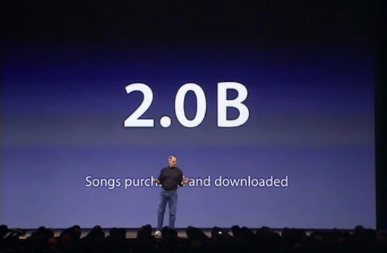
Steve Jobs’ presentations at Apple are a good reference point. Apple keynotes are known for their clean, minimalist slides, often using a single phrase or image instead of bullet lists. The slide created focus, and Jobs used his voice, pacing, and gestures to bring meaning to it. The slide did not try to explain everything.
Most business presentations still rely on bullet points, and that is fine. The key is being intentional. Only include what truly supports the message on that slide. When too many ideas appear at once, it becomes harder for the audience to stay engaged.
I approach slide design with a clear goal: make the message easy to grasp at a glance so the conversation can stay focused on decisions.
Slide design rules that work:

I also apply a simple check before moving on. If I step back from the screen and cannot read or understand the key point in a couple of seconds, the slide needs to be simplified.
Pro tip: Keep detailed explanations, edge cases, and supporting data in backup slides or supporting documents. This keeps the live presentation focused while still enabling deeper discussion when needed.
Well-designed slides feel calm, intentional, and easy to read. When fonts and colors are chosen thoughtfully, the audience can focus on the message instead of decoding the layout.
I follow simple, readable font and text standards:
Color plays a supporting role in the design. I apply it sparingly and follow a few simple rules:
This approach keeps slides visually consistent and helps important information stand out without overwhelming the audience.
Visuals are most effective when they help the audience understand the message faster than text alone. Each chart or image should serve a clear purpose and support the point of the slide.
When I add a chart or image, I ask a simple question: Does this help someone understand the message more quickly?
Here are data visualization rules that work:
If a visual makes the slide feel crowded, I split the content into multiple slides. Clarity always beats density. The focus should stay on the insight, not the graphic itself.
A strong story and well-designed slides set the foundation, but delivery is what brings the presentation to life. This is where clarity turns into confidence and where a good presentation becomes memorable.
Delivery is also where many presenters feel the most pressure, especially in meetings with senior leaders.
The first minute sets expectations for everything that follows. A strong opening helps you earn attention quickly and positions the presentation as purposeful and relevant.
I use a simple structure to start well:
Example:
“In the last quarter, we missed our delivery targets three times. Today, I will explain why that happened and walk through the three changes that can fix it.”
This approach creates clarity early and helps the audience stay engaged from the start.
Engagement comes from relevance and pacing. When the audience clearly sees how the information applies to them, attention follows naturally.
I keep people engaged by:
These are practical business presentation techniques that work across most settings. In virtual meetings, I plan short interaction moments throughout the presentation to maintain energy and focus.
Confidence grows through preparation. Most presenters feel noticeably more comfortable after practicing out loud a few times, especially when they rehearse transitions and key messages.
I encourage presenters to:
These habits help presenters feel grounded, focused, and composed, even in high-stakes meetings with senior leaders.
Body language plays a quiet but powerful role in how a message is received. It helps build trust with the audience and reinforces your confidence as a speaker.
I focus on a few simple presentation body language practices:
Small adjustments in body language can quickly make you feel more confident and help the audience stay engaged with what you are saying.
Q&A is a natural extension of the presentation and often where trust is reinforced. It gives the audience space to engage more deeply with the message and the recommendation.
My approach is straightforward:
I also keep backup slides with supporting data or additional details. This allows me to respond confidently when leaders want to go deeper into numbers, risks, or assumptions without losing the flow of the conversation.
The closing is what people remember most. It is your final opportunity to reinforce the message and turn the conversation into action.
I end by:
After delivering the final line, I pause and give the room a moment to absorb the message. This pause signals confidence and makes it clear that the presentation has led to a decision point, not just more discussion.
After working through the story, the slides, and the stage, it helps to anchor everything in a simple rule of thumb.
One benchmark I return to often is Guy Kawasaki’s 10–20–30 guideline. It is not a rigid rule, but it is a useful way to keep presentations focused and disciplined.
Here is how I use it in practice:
This guideline works because it reinforces the same principles behind all three pillars. It keeps the story tight, the slides simple, and the delivery centered on conversation rather than content overload.
When in doubt, it is a reliable way to check whether a presentation is designed to inform, engage, and drive action.
The real test of this framework is whether teams can use it when time is tight and expectations are high. At that point, speed and consistency matter as much as individual skill.
What makes the difference is systems that reduce manual work and make strong presentation habits easy to follow.
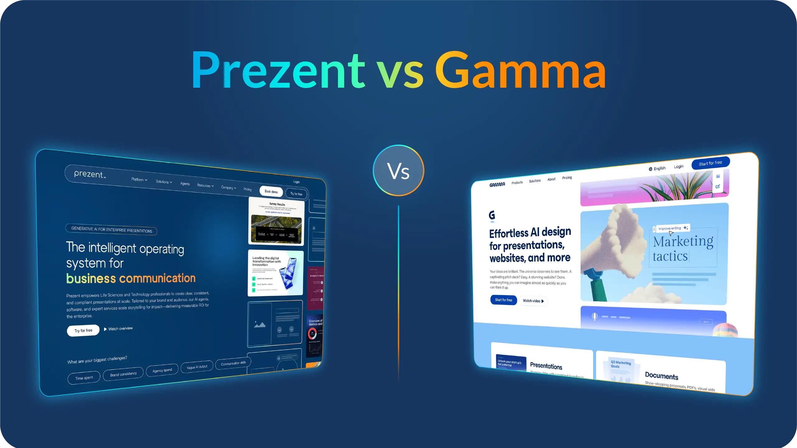
Prezent is designed to do exactly that. It helps teams move from a blank page to a polished, audience-ready deck faster, while maintaining quality and consistency.
Here is how Prezent supports the process:
The result is a faster, easier presentation process that still feels thoughtful and intentional.
Teams spend less time formatting and rebuilding slides and more time refining the story and preparing for the conversation.
You can experience these capabilities firsthand by starting a free trial or scheduling a demo with our experts at your convenience.
A good presentation has a clear goal, a simple story, and a delivery style that keeps the audience engaged. It is designed around what the audience needs, not what the presenter wants to say.
Clean slides and a confident close make it easier for people to remember the message and act on it.
The core principles stay the same, but the emphasis changes based on the audience and setting.
For short talks, such as five to ten minutes, I compress the structure. I focus on one key idea, one strong example, and one clear next step.
Even experienced presenters run into patterns that weaken otherwise strong presentations. Addressing these improves clarity and impact quickly. Common mistakes I see:
Slide count is a planning guideline, not a rule. Here is a helpful guide:
.jpg)
Anoob is the Head of Content at Prezent with over 16 years of experience in marketing and content. He has worked with leading startups such as SocialPilot, Writesonic, BigBasket, FreshMenu, GupShup, and SimplyHired. Passionate about social media and digital tools, Anoob enjoys testing new platforms to help businesses make better marketing decisions. You can connect with him on LinkedIn.

.png)