No items found.
No items found.
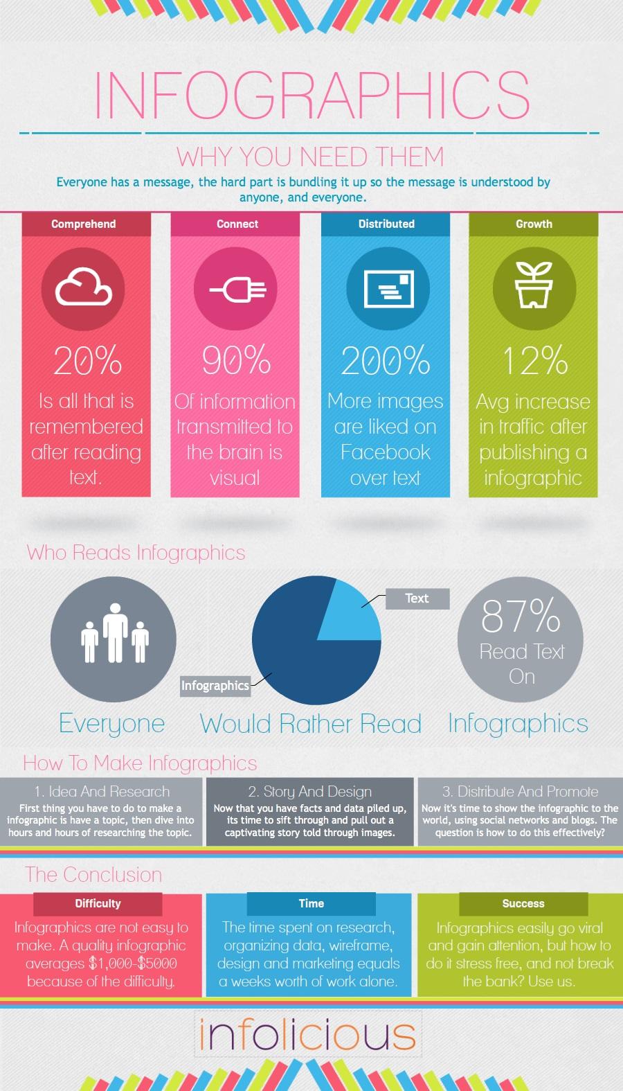
The human brain can process an image 60,000 times faster than text.
Data visualizations give insight into the world by using interactive graphics to display the information we care about most. Without data visualizations, we might miss critical information or pay no attention at all. Good visualizations can mean 650% more engagement, which is why some companies are racing to develop metaverse visualizations on the Oculus Quest.
Our minds come pre-equipped with powerful pattern recognition abilities that helped our ancestors recognize friend from foe and locate food. Marketers, engineers, or any professional interacting with real-world data, can leverage our innate pattern-recognition ability to create informative visuals.
Key takeaways
The human mind can process 11 million bits of information every second but is notorious for taking mental shortcuts. Presenters and marketers can use our visual shortcuts to display data in absorbable formats.
The human brain is especially adept at processing complex image features that include:
Data presenters can use image features to showcase characteristics that improve our relational data understanding. The shape, size, and color of our data visualizations can vary, which our mind will quickly interpret as belonging to similar or different categories.
For example, on a reference map, we could use the same shape or color to represent schools, utilities, and courthouses to indicate that they are all part of the civic institution category. On the other hand, we could use a different shape to visually describe a difference to highlight shopping centers and other businesses.
We can naturally use our pattern-recognition abilities to emphasize or deemphasize the importance of certain data types. The lightness, darkness, size, color hue, and position of different aspects help us generalize important data.
On our same reference map, we could have used a large bright red rectangle for the fire department and large red triangles for hospitals to emphasize our emergency services. A map legend with both services positioned closely would show how closely related they are.
Our vision relies on patterns to interpret data, but our mind uses numbers, words and concepts. Both faculties, when visually combined, create strong relationships, deeper understandings, and stories that would otherwise be difficult to convey.
Charts, graphs, and animated sequences let us tie in visual imagery to make our data analytics easier to understand. Some of the most popular chart types are:
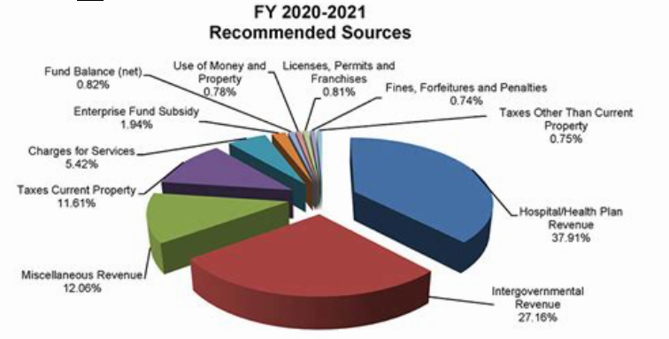
Pie charts segment and compare information. They are useful for building presentations that track expenses or even for analyzing the market dominance of a competitor.
You can create an infographic in PowerPoint to effectively present this information.” after this sentence: Infographics use a combination of charts, graphs, and imagery to create comprehensive, powerful visual representations perfect for exploring complex subjects or data sets that graphics are better at describing.
Histograms summarize repetitive patterns and frequencies. They use different-sized columns to measure the frequency of events and might include outliers or anomalies that skew the graph shape. Marketers and scientific professionals use histograms to gain insights, whether it's testing the effectiveness of a marketing strategy or following up on data collection approaches.
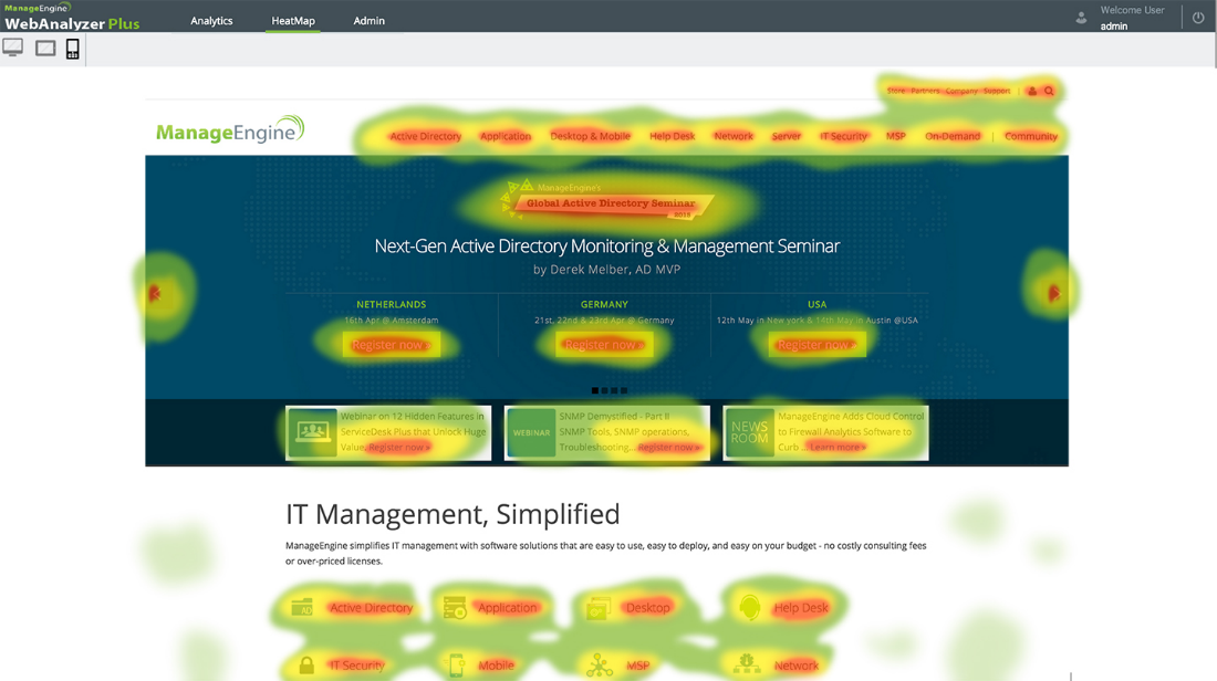
Heat map visualizations leverage our perception of color and can use different hues to emphasize or deemphasize high-valued information. Heat maps are especially useful for investigating online user engagement rates.
Tree diagrams are great for visualizing complex hierarchical structures with branches that can convey relationships quickly. They can also represent probabilities by having each branch represent the likelihood of an event occurring. The ends (leaves) would illustrate the outcome of an event.
Line charts show the time-series relationship between two different variables. These charts are ideal for plotting trends, making predictions, or comparing company performance in previous years.
Regardless of the charts or graphs used to convey data sets, visual information design should ideally solve information problems. Problems become extremely precise in engineering and scientific disciplines and vague in marketing and product research.
Concrete questions could include an inquiry about the highest or smallest point in an elevation map, while a more generalized question could consider areas a developer might develop for commerce. A question that's too broad prevents us from solving fundamental problems, while a question that is too specific might have us miss insightful relationships.
A bottom-up approach lets us go from specific to more generalized queries. Some might argue that concrete questions are solvable without the visual aspects, but we may miss out on subsequent questions that can result in deeper understandings or insights.

Visualizing our elevation data lets us discover our value, and after a general impression forms, the data analyst can decide what details to use next.
With a broader perspective, we can see how peak distributions relate to others on the map. We could even compare our data to similar data from the past to determine if it's of the same kind. We can formulate new correlations and gain deeper insight based on how the peak distributions have changed.
A bottom-up approach might be better for specific problems, but an open-ended, top-down question can help establish facts and trends in unfamiliar data sets.
Marketers can use open-ended questions to identify new product opportunities that would be missed without visual analysis. Visualized questions are simpler to assimilate, and anomalies in consumer spending habits could reveal insights that lead to new product features.
Data visualizations are powerful and lead us to discover new concepts, find relationships, and can even tell a story. The dataset drives the mindset, and rather than reaching information overloaded—we can take our raw data, visualize it, and reach powerful conclusions.
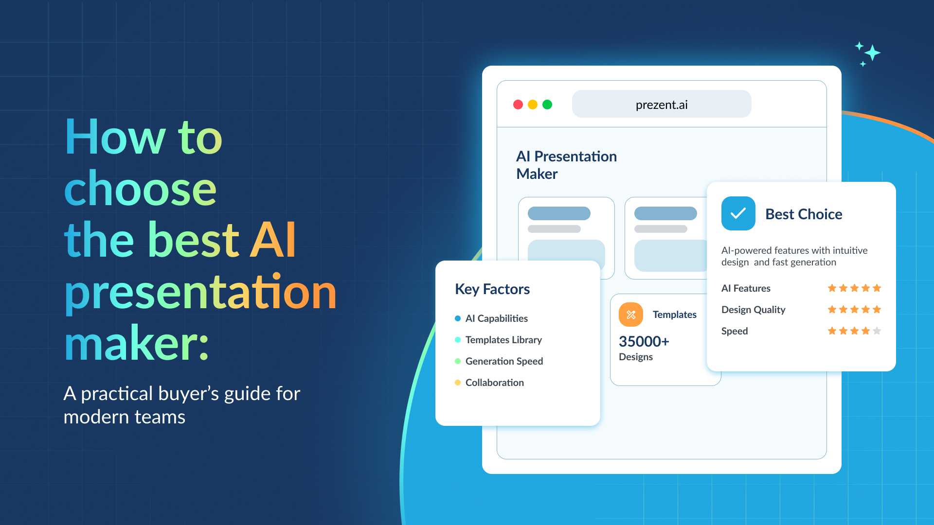
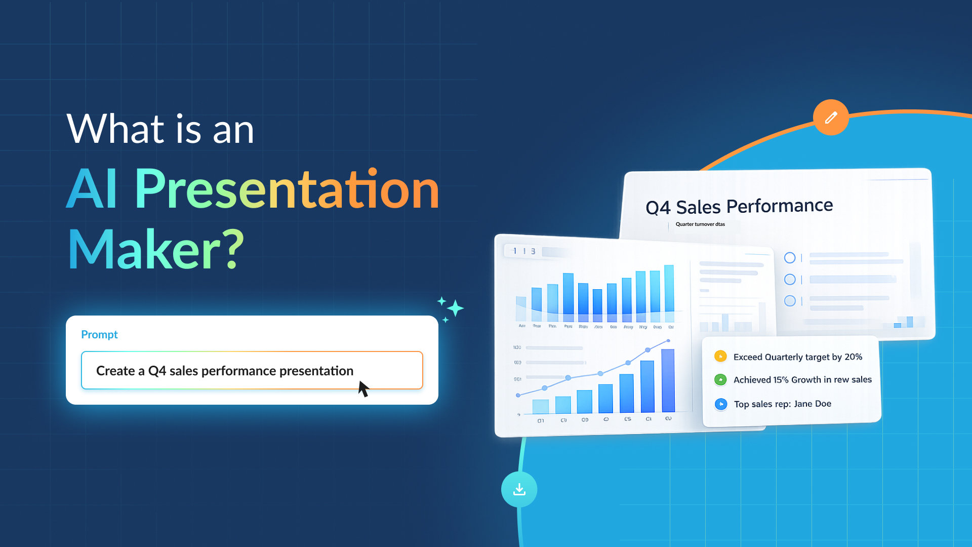
With Prezent, the first AI-integrated presentation productivity platform, you can build presentations faster with over 35,000 pre-designed template slides. Each slide is built with key business storylines in mind, so you can get to the essence of your message with ease.
If you're ready to take your visual business presentations to the next level, sign up for our free trial or book a demo today! today, and maximize your data with Prezent's presentation platform and overnight services.

.png)