No items found.
No items found.

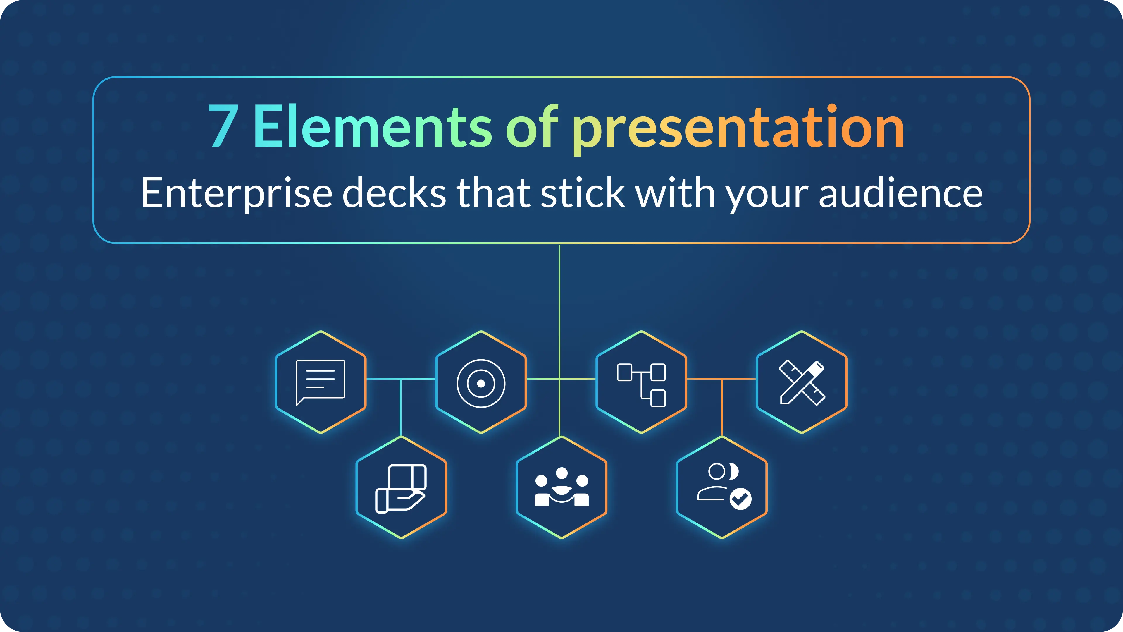
When I discuss the elements of presentation, I’m talking about the seven building blocks that make a talk clear, engaging, and persuasive. This applies whether it’s a high-stakes sales pitch, a weekly team update, or a conference keynote.
When these elements click, you stop simply “going through slides” and start leading the room toward a decision.
You do not need to be a natural entertainer to command a room; you just need to master the mechanics. I have refined this approach over a decade of working on high-stakes enterprise presentations.
I wrote this guide to break down each element of presentation and simplify it for you. If you want to build real presentation skills that make you a great presenter, these principles will help you turn a stressful meeting into a clear opportunity to lead the room and get results.
When people ask me what makes a good presentation, I always return to seven core elements that appear in every strong talk I watch. I do not treat these as just a list of boxes to check. Instead, I view them as a connected system. When these parts work together, the presentation feels natural, and the message actually sticks.
The seven elements of presentation I use are:
For me, every effective presentation begins with one sharp message that fits into a single spoken sentence. If your audience cannot repeat your main point after the meeting, the rest of your effort is wasted, no matter how beautiful your slides are.
I keep my core message simple by:
Example: If I am selling a product, my message might be: “This tool cuts your reporting time in half, so your team can spend more time deciding and less time formatting.” That single line shapes the data I show, the stories I tell, and how I close the talk.
One of the highest-impact presentation skills I ever learned is this: design the talk for them, not for me. I treat knowing the audience as a non-negotiable rule. I know that if I do not speak directly to their needs, they will tune out because the message feels irrelevant to them.
Before I outline a single slide, I ask myself:
Then I adapt my approach:
Real-life example: If I am presenting a data platform to senior executives, I lead with “faster, more confident decisions with less manual reporting,” rather than technical schema diagrams. The content is the same, but tuning it to the audience turns a generic deck into an effective presentation.
I often see professionals sitting on a treasure trove of data, but they struggle to turn those raw facts into a narrative that flows. To solve this, I use a clear formula to simplify the storytelling process. I rely on simple, reusable frameworks.
Three structures I use constantly:
I use these because they create a clear purpose and logical flow. I make the structure obvious by:
If you analyze famous talks, like the specific examples in HBR’s “How to Give a Killer Presentation,” you will see this pattern: problem, turning point, solution, result. That structure is not an accident; it is a deliberate element of presentation design.
I have seen too many presentations where the audience is busy reading the screen instead of listening to the speaker. I believe your slides should support you rather than compete with you. I follow a few simple rules to keep my visuals clean and audience-friendly.
For visual elements of presentation, I:
I also:
Real-life example: If I am presenting quarterly results, I might use one slide with a single big number and the text, “Revenue up 18 percent year-over-year,” instead of a dense spreadsheet. The detailed table moves to the appendix for those who want to dig deeper.
I have learned that even the perfect slide deck falls flat if I do not sound sure of myself. The audience needs to trust the messenger before they accept the message. In my experience, confident delivery, body language, and voice are key elements of an effective presentation.
When I deliver, I focus on:
I practice these skills by:
A simple test I use: If I can talk through my deck smoothly without reading from the screen, I am in good shape. That is the line between “reading slides” and delivering a genuinely effective presentation.
We have all sat through presentations that felt like a long, one-way lecture. I know that if I just talk to the audience, they will eventually tune out. Modern guides list interaction as a key element of a good presentation, and I treat it as a core part of the plan rather than an afterthought.
To build an engaging presentation, I:
In virtual settings, I:
These simple moves turn elements of presentation like structure and visuals into a live, two-way experience, which is where effective presentation skills really come alive.
Most presentations end with a Q&A session, completely missing the opportunity to drive action afterwards. For me, the real measure of an effective presentation isn’t the applause; it is what changes in the days that follow.
I always plan:
After the presentation, I review:
This follow-through turns a one-off talk into ongoing change, which is exactly what business audiences expect from a high-stakes, effective presentation.
In enterprise teams, the real challenge isn’t doing one effective presentation, but creating dozens of solid decks across functions and time zones. That is where AI-powered tools like Prezent become a practical part of your strategy.
Here is how I fold tools into my process:
The benefit is simple: the more the platform handles the structure and visual elements of presentation, the more time I can spend on audience insight, story, and delivery, the human parts that truly drive results.
See the difference for yourself. Schedule a demo to have an expert walk you through the features, or start a free trial to try it on your actual work. Either way, you will see immediate results in your workflow.
When people search this phrase, they typically expect a list that includes purpose, structure, visuals, engagement, and delivery. I combine that thinking into the seven elements of presentation I walked through: message, audience, structure, design, delivery, engagement, and follow-through.
If I had to choose just one, I would say the audience-centered message. A clear message aimed at the right people shapes all the other elements. Without that, even the best slides and strongest delivery turn into noise instead of a useful, effective presentation.
For executive presentations, I like to start with the conclusion and then show the path: “Here is my recommendation, here is why it matters, and here is the evidence.” This style matches what many leadership-focused guides suggest for “executive presentation skills” and respects their limited time.
People often obsess over slide count, but pacing matters more. You can have a terrible 5-slide presentation and a riveting 50-slide talk. Instead of counting slides, I focus on time. A good rule of thumb is two minutes per slide for a standard pace. If you have 10 minutes, aim for 5 key slides.
The biggest mistake is reading directly from the slides. It tells the audience, “I don’t know my material,” and it forces them to choose between reading and listening. Another common error is a lack of eye contact. If you are looking at your notes or the screen the whole time, you break the connection that makes a presentation persuasive.
The core elements stay the same, but the energy requires an upgrade. In virtual settings, you have to work harder to keep attention because distractions are just a click away. I use simpler visuals (since screens might be small), speak with 10% more energy than usual, and use engagement tools like polls or chat prompts every 3-5 minutes.
You do not need to be a graphic designer, but you do need to understand clarity. The goal is communication, not art. If you can align text, use high-quality images, and keep plenty of white space, you are ahead of most people. Today, using AI tools can also bridge the gap, handling the design heavy lifting so you can focus on the message.


.png)