blog
November 15, 2024

Best blue color palettes for presentations: Make your next project stunning

Discover beautiful blue color palettes on color hunt for impactful corporate branding— Curate unique designs with shades like navy and turquoise.

Color, in corporate branding, is not only for aesthetic purposes; it is an excellent tool that can help put across messages, invoke emotions, and give the target audience that feeling of trust; out of the countless hues of colors, blue stands atop the list of frequent colors for corporate branding. Whether you are a technologically driven company or perhaps one of the finance industries or healthcare, blue can tell stories of professionalism, trustworthiness, and reliability.

Let's explore the use of beautiful blue color palettes in branding, including hex codes, warm tone variations, and gradients, with practical examples and template ideas to create a consistent and impactful brand identity.

The psychological power of the blue color palette in branding

Before discussing the specific color palettes, it is important to understand why blue is such a dominant choice in branding.

According to color psychology, blue has successfully influenced human behavior; it has a soothing and stabilizing effect on people’s minds. It's perfect to add a touch to your creative project. The blue color scheme conveys a sense of:

  • Trust and reliability: Blue shows trust and dependability, so it’s the go-to choice for industries that rely on customer confidence, particularly in banks and insurance companies. When it comes to finances, individuals are highly cautious, seeking stability, security, and a sense of reliability. By using blue in branding, companies subtly reassure their customers that their money, data, and personal details are safe and well-handled.
  • Calm and serenity: Lighter blue has a distinctly calming effect. This is why healthcare providers, wellness brands, and even mindfulness apps often incorporate softer blues into their branding. Discover beautiful lighter blues which are associated with peace, tranquility, and healing, which makes them ideal for industries focused on the well-being of consumers.
  • Technology and innovation: Darker blues symbolize superiority, brains, and advancement. This is a great choice for high-tech and innovation industries, where firms must project the capability to be ahead, strong, and visionary for tomorrow. Companies in the tech industry, such as IBM and Intel, have utilized darker blue in their logos and branding to represent knowledge and know-how. This is not about stimulating intelligence but more about projecting power and leadership.

How to incorporate the best blue color palettes into your branding presentation

Blue is versatile in branding. It works across various industries, web design, interior design, and graphic design. Shades of color blue can be easily adapted to communicate different aspects of business only by keeping few things in mind.

Choosing the right blue color palette for your brand identity

A great color palette will ensure the design remains consistent with the brand. There are many shades of blue, such as midnight blue, true blue, blue ocean, cyan, clear blue sky, royal blue, aquamarine, cool tones, neutral tones, etc. Find a beautiful blue for your brand. Here are three of the most common blue palettes for the next design project and how they can be used to achieve different branding objectives:

a. Classic blue palette

Classic Blue, known for its timeless appeal, is a deep, rich shade that is associated with professionalism and reliability. It is ideal for understated industries where trust is crucial, such as finance, law, food, etc.

Example: Pepsi, American Express

Hex codes:

  • Primary color: #0D3B66 (Classic blue)
  • Accent color: #7F9DB1 (Dusty blue)
  • Complementary color: #B4D6E3 (Soft)

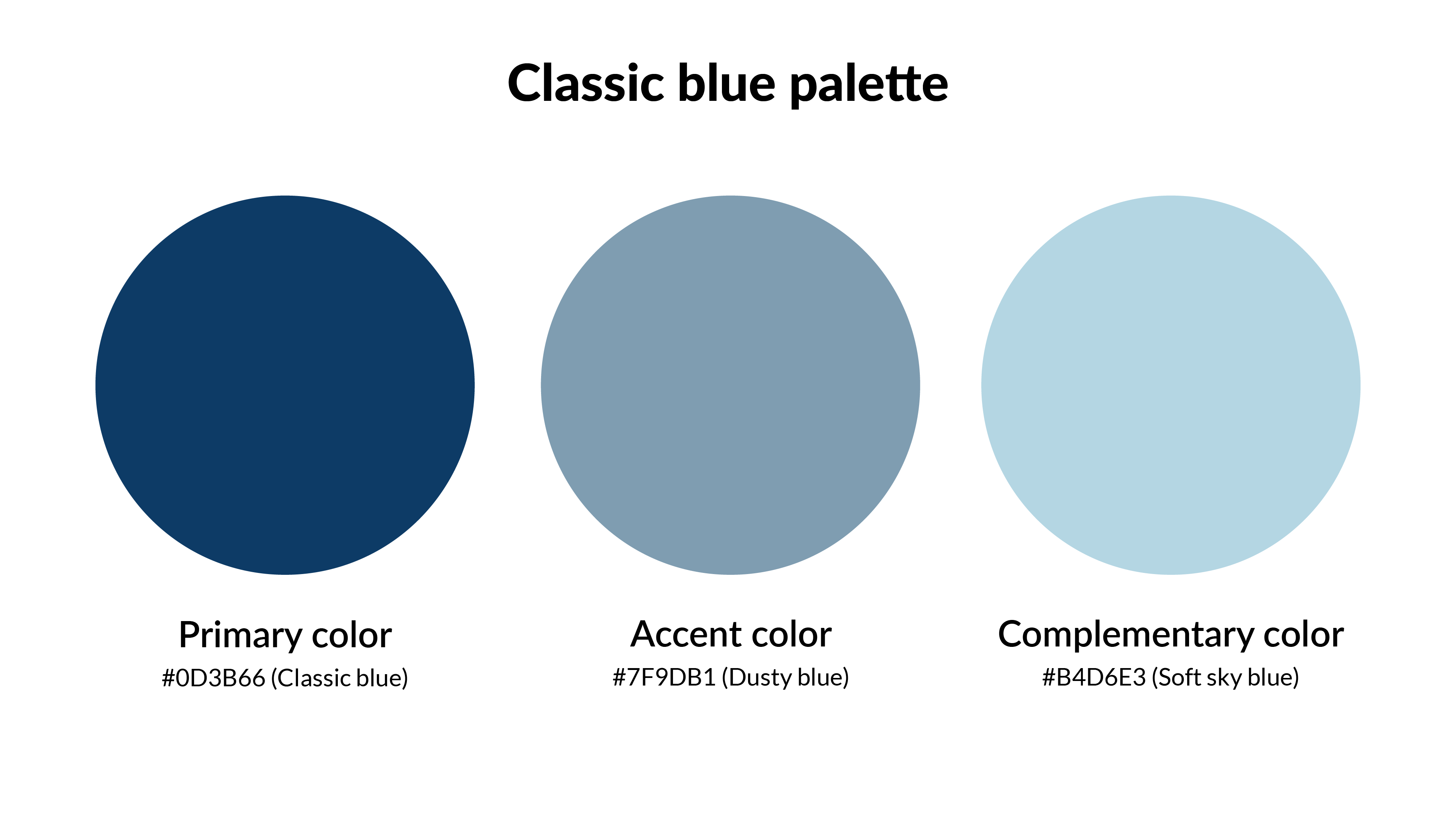
To maintain clarity and professionalism, use classic blue as the primary brand color with white text or neutral color. Pair this with a lighter accent color, like soft blue, for buttons or call-to-action elements.

b. Pastel blue palette

Pastel colors are lighter, softer shades of blue can create calmness, serenity, and a more approachable feeling. This palette works well for brands in the wellness, NGO, healthcare, and beauty sectors. It also appeals to brands that want to project a sense of calm and innovation without being too formal.

Examples: Tiffany & Co, UNICEF

Hex codes:

  • Primary color: #A7C6ED (Pastel blue)
  • Accent color: #8BC3E6 (Light blue)
  • Complementary color: #BFE5F0 (Powder blue)

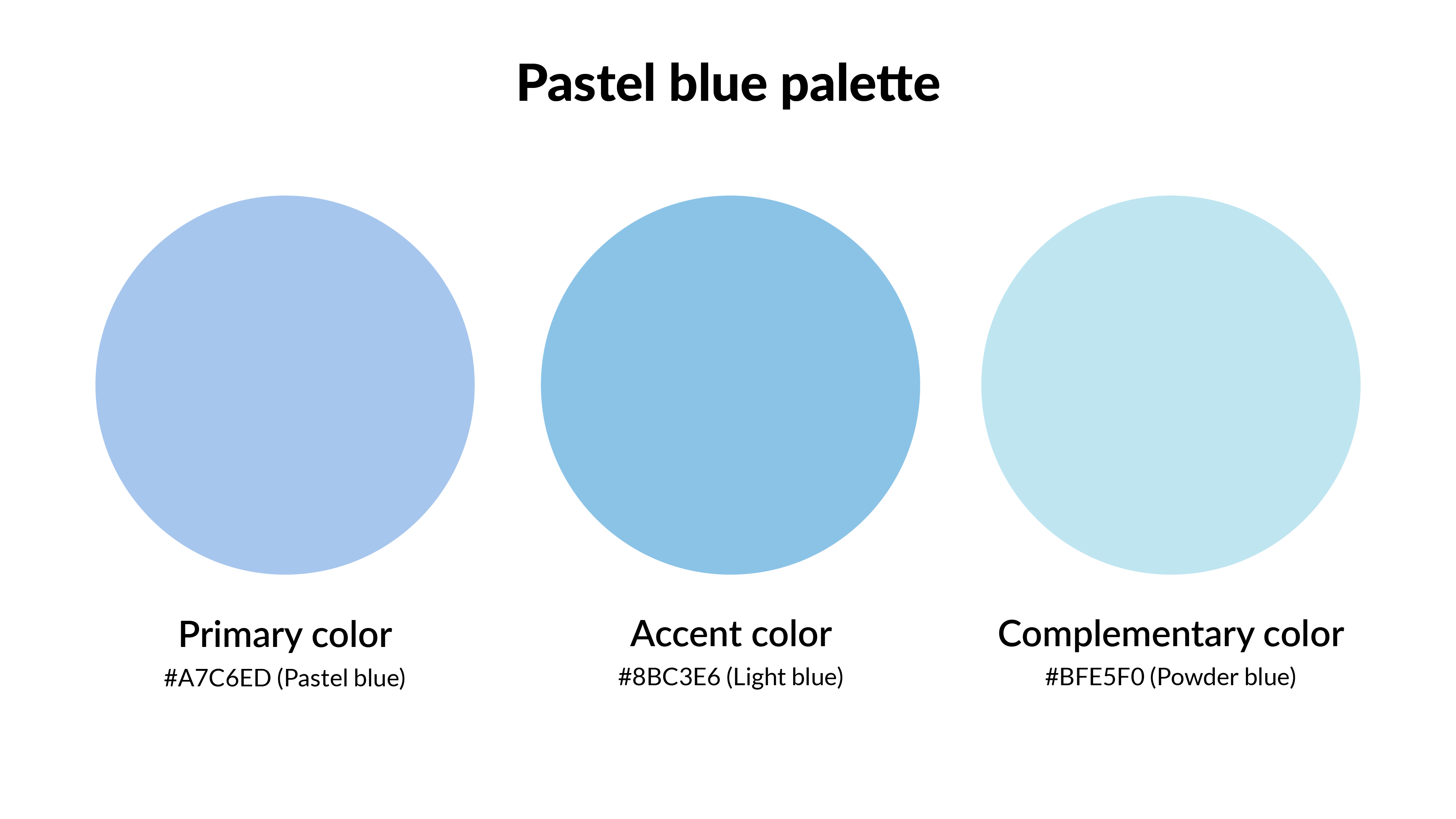
Pastel blue works wonderfully in designs that need to feel fresh and modern. For a marketing brochure or digital flyer, use Pastel Blue as the background with clean white or silver text. Accent with Light Sky Blue buttons and subtle colors to add depth without overwhelming the viewer.

c. Blue gradient palette

In branding, it creates a sense of movement, dynamism, and innovation. This stunning blue color palette is trendy in technology and creative industries, reflecting progress, forward-thinking, and adaptability.

Example: Facebook, Hyundai

Hex codes:

  • Primary color: #4D6A92 (Steel blue)
  • Accent color: #5A8FA0 (Light steel blue)
  • Complementary color: #A2C6E9 (Light sky blue)

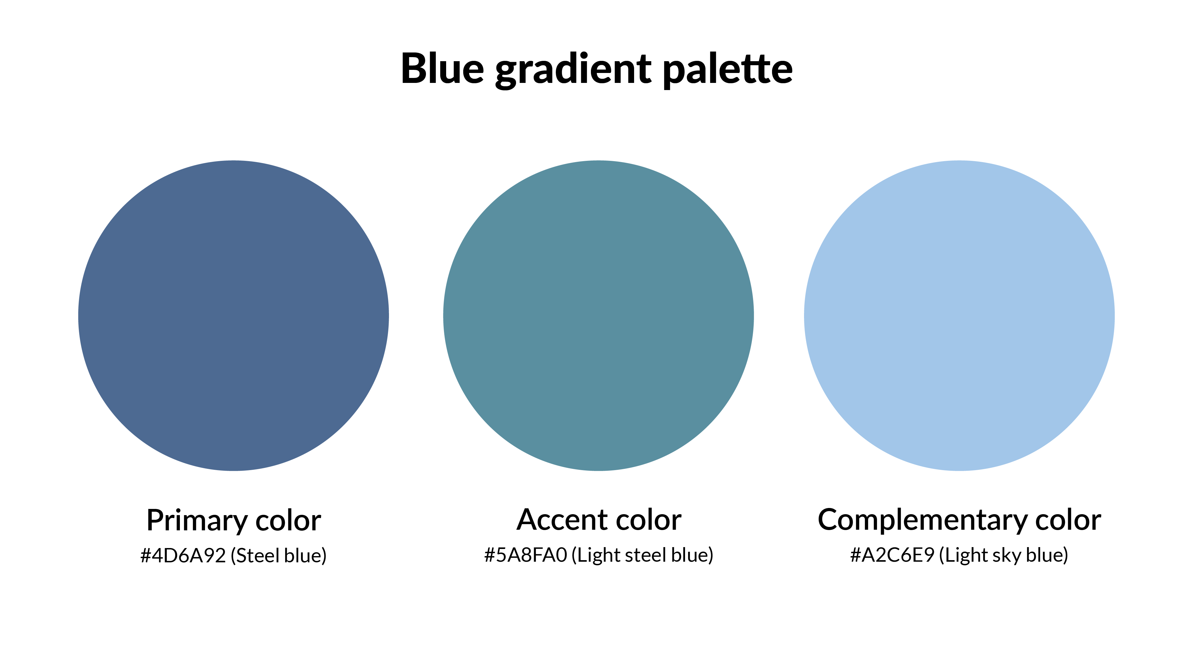
Use the gradient as a background element for a landing page or app interface to give your branding a modern edge. Employ a soft blue where the colors seamlessly flow into one another to draw attention to key content or CTAs. Combine it with white text or icons to maintain readability and keep the design clean.

💡Tip: When selecting a shade of blue, test it against different backgrounds and in various lighting conditions to see how it maintains its integrity.

Designing your presentation with a stunning blue color

Once you have found the ideal blue for the presentation design, it's time to use it. How you add blue can influence how the audience reacts to the content.

  • Background color: Blue can provide a calming effect. Lighter blues are best for backgrounds as they won't overwhelm the content, while darker or royal blues work well for headings and key highlights.
  • Text and font colors: To convey professionalism, use dark blue or navy for headlines and important points. For body text, use white or light grey to ensure that the slides are easy to read. Consider highlighting key phrases or points in blue or a complementary color to guide attention. This helps to break up the content and draw the viewer’s attention to important takeaways.

Best practices for blue in presentations:

When incorporating blue into your branding presentation, following certain best practices to ensure the color enhances the overall design without overwhelming your audience is essential. Maintaining a balance is very important. Here are some key best practices to keep in mind when using blue in the slides:

  • Consistency: Use blue consistently for elements like headers, icons, and callouts. This helps tie everything together and gives the presentation a unified, professional look.
  • Contrast: Keep a good contrast with the text to ensure that blue elements pop. If the background is dark blue, go for lighter text so it’s easy to read and stands out.
  • Subtlety: Blue is a powerful color, but less is often more. Use it to emphasize key points or highlight essential elements, but try not to overuse it. A little blue goes a long way in creating a memorable, balanced presentation.

Corporate presentation templates for your next design project

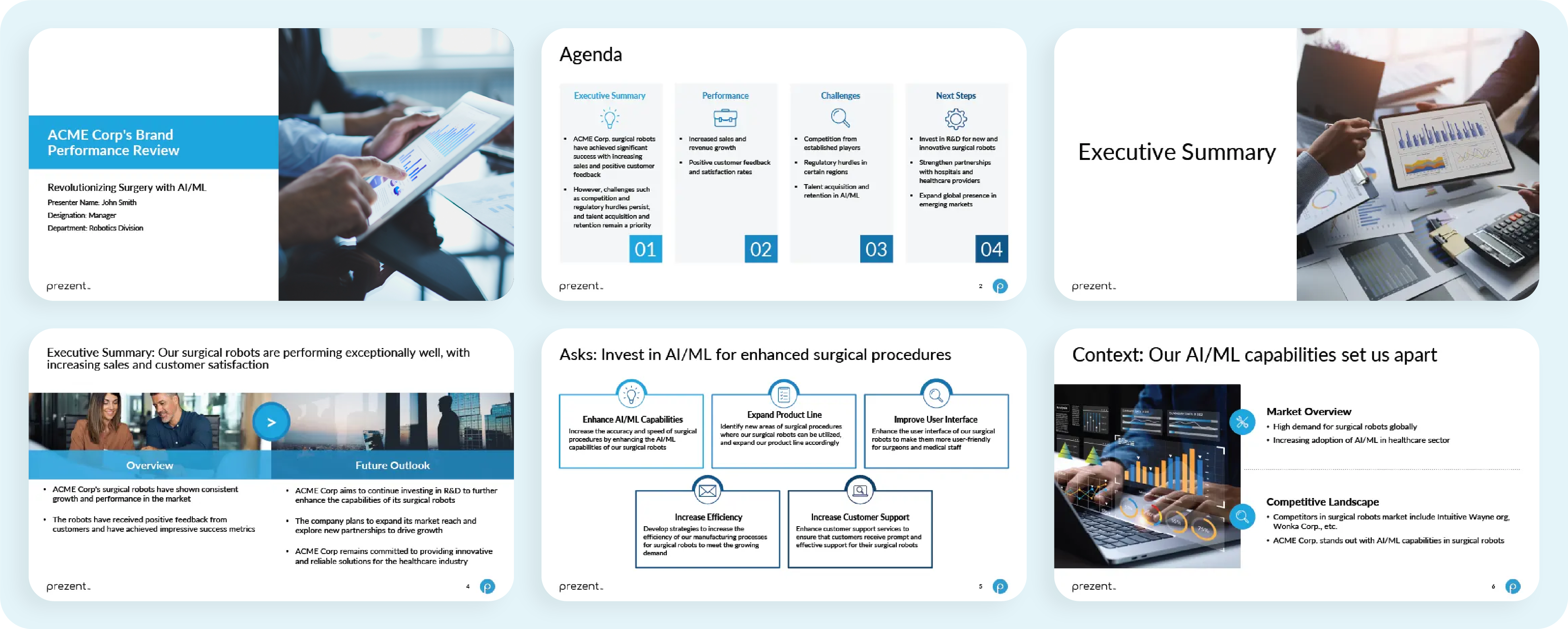
Corporate branding templates are essential tools for businesses to maintain consistency and professionalism across all marketing materials. Here are some examples:

Example 1: Brand performance review template

A comprehensive brand performance review, or brand reporting, serves as a vital tool for evaluating the effectiveness of marketing and branding efforts. The detailed analysis provided in this template not only helps identify the improvement areas but also plays a crucial role in measuring performance.

Example 2: Digital experience design template

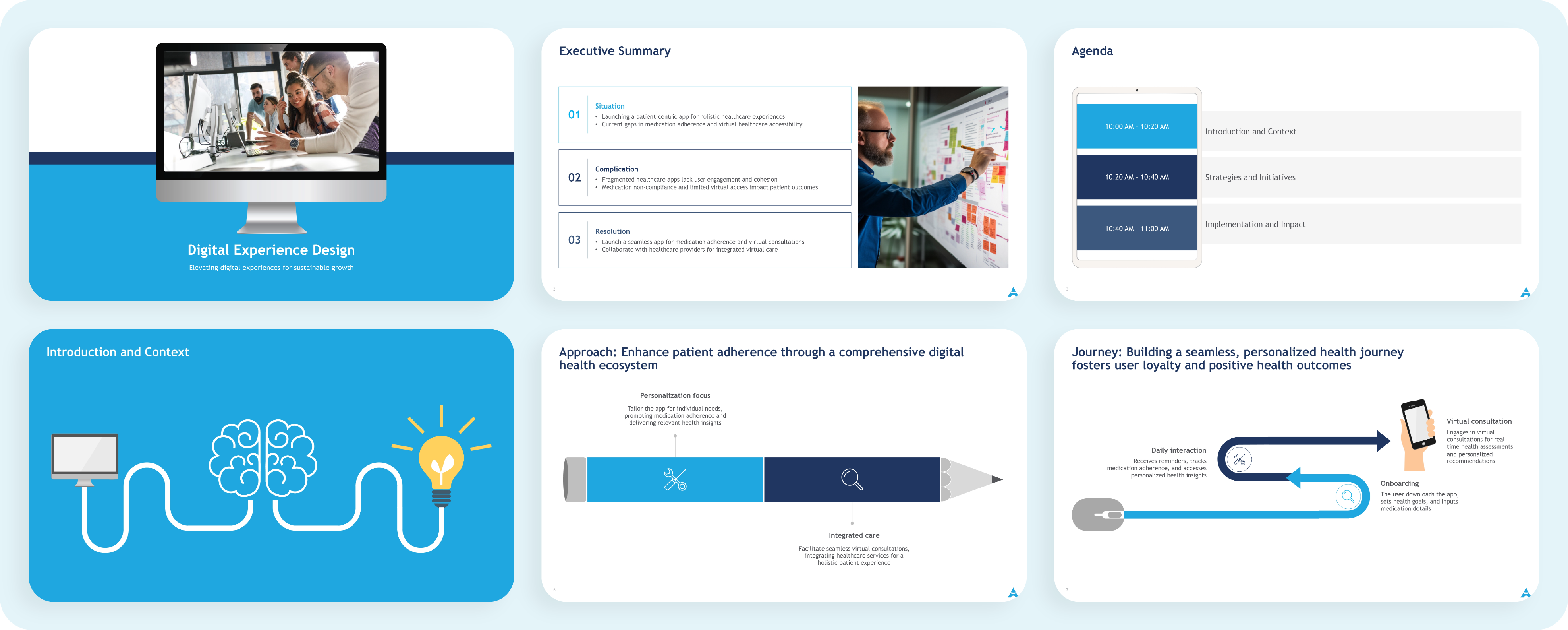
A digital experience design presentation visually outlines how websites, apps, and other digital platforms are crafted to provide users with seamless and intuitive experiences. It's crucial because it ensures that users find digital products easy to use and engaging.

How Prezent helps you use your favorite color perfectly in your brand presentation:

Prezent offers an intelligent suite of tools to streamline the presentation creation process, ensuring that brand identity is consistent, polished, and impactful. Prezent’s suite of tools can help you integrate these colors into your design effortlessly. Here's how Prezent can help you harness the power of blue in your next presentation:

  1. Efficient generation of slides- It uses AI to create personalized and brand-aligned presentations in minutes. It generates a draft that automatically incorporates brand tones throughout the presentation. This feature saves valuable time, allowing you to focus on content.
  2. Curate compelling storylines—The Story Builder feature helps structure the presentation around a coherent narrative. This feature helps organize the slides in a logical, impactful way, ensuring the message flows seamlessly from one point to the next. Prezent ensures that your content is both visually appealing and strategically organized, all while maintaining color harmony and brand tone.
  3. Bring quick consistency to existing presentations- It is an extensive collection of brand-approved templates that can be customized to fit all needs. Customize slides with content, text, images, and even color schemes to create a fully personalized presentation. With Prezent, you can customize each element of your presentation to suit your preferred color tones. Prezent makes it simple to apply the perfect blue to every element of your presentation. This flexibility helps ensure your slides look professional and polished while keeping the design aligned with your brand’s color identity.

Learn more about Prezent’s features and functions by scheduling a demo at your convenience, or explore the platform using the free trial today!

Ready to create impactful presentations?

Try for free

Related resources

BLOG
Lydia Abbot
September 1, 2025
Adele Trombetta joins Prezent AI’s Senior Executive Board to help redefine business communication
Adele Trombetta joins Prezent AI’s Senior Executive Board to help redefine business communication with AI-powered innovation and global leadership experience.
BLOG
Sahul Hameed
September 1, 2025
Unlocking the potential of AI in business presentations: Crafting impactful content with intelligent tools
Discover how AI in business presentation boosts speed, personalization, and impact with Prezent’s intelligent tools for on-brand, engaging decks.
BLOG
Lydia Abbot
August 28, 2025
Mark Huber's playbook for presenting impact to your board
UserEvidence VP of Marketing, Mark Huber, dives deep into actionable strategies and best practices for giving better presentations to your board.
BLOG
Rashmi Priya
August 26, 2025
Meet the Articulate 2025 speakers
Join us at The St. Regis in San Francisco on September 25th for Articulate—an exclusive conference where enterprise leaders converge to explore how AI is revolutionizing business communication.
BLOG
Bharti Jain
August 21, 2025
Top 8 AI solutions for pharma companies in 2025
See how leading AI solutions for pharma improve drug discovery, compliance, and data reporting - empowering teams to deliver results faster.
BLOG
Supriya Sarkar
August 20, 2025
Best AI sales tools: Top 7 AI sales assistant software for 2025
Discover the best AI sales tools for 2025 to improve your sales process and help your team close deals faster.
BLOG
Bharti Jan
August 19, 2025
Top 8 AI tools for finance in 2025
Explore 8 leading AI tools for finance teams that automate processes, improve risk management, and transform complex data into clear reports.
BLOG
Supriya Sarkar
August 14, 2025
How to master executive communication skills to accelerate your career
Explore how real leaders build trust, drive results, and shift from blame to ownership.
BLOG
Rashmi Priya
August 13, 2025
Best AI tools for business growth
Choose the best AI tools for your business. Explore our top picks and learn how to automate, optimize, and present smarter with advanced solutions.
BLOG
Bharti Jain
August 12, 2025
10 leading enterprise generative AI tools in 2025
Discover 10 best-in-class generative AI tools that tackle a range of enterprise productivity challenges—from presentations to coding and collaboration.
BLOG
Lydia Abbot
August 7, 2025
Welcoming Mike Arntz to Prezent’s Senior Executive Board
Prezent welcomes SaaS veteran Mike Arntz to its Senior Executive Board. Learn about his vision for scaling AI-powered business communication with clarity and impact.
BLOG
Lydia Abbot
August 6, 2025
It all starts with ‘why’: Outlever Co-Founder Melissa Rosenthal’s strategies for curing blank-slide syndrome
Borrowing from her experiences speaking to large audiences and pressure-packed board rooms, Outlever Co-Founder Melissa Rosenthal shares her top strategies and frameworks for creating impactful presentations from the start.