No items found.
No items found.

Did you know using the correct data visuals can make your presentation 70% more memorable?
Welcome to the world of data visualization, where you can enhance audience retention, improve problem-solving effectiveness by 19%, and achieve 22% higher results in 13% less time. Impressive. Isn’t it?
Data visualization has significantly evolved. You’ll notice increased visuals such as storyboards, graphs, and maps in modern presentations. Even adding colors to charts can elevate the overall impact of your presentation. In this article, we will explore data visualization and how, when used effectively, it can make your presentations more powerful and impactful, driving the results you desire from your audience.
Using data visualization in presentations makes complex information easier to understand and improves business processes. Here are key reasons to include data visualization in your presentations:
Visuals can turn complicated data into easy-to-understand images, helping the audience quickly grasp the key points. Instead of going through dense tables or long text, viewers can instantly understand visuals like graphs or infographics. Charts and graphs highlight important patterns, outliers, and trends that might be missed in the text.
For example, a line graph can clearly show a trend over time, while a bar chart can compare different sets of data side by side.
Research shows that humans can process images 60000 times faster than text. Therefore, your audience is more likely to remember information presented visually. Well-designed visuals can leave a lasting impression, ensuring that key messages are remembered and acted upon.
Visuals are more engaging than text. They draw the audience's attention and keep them interested throughout the presentation. By using images, you can prevent your audience from losing interest. Data presented visually is more compelling and persuasive.
For example, an infographic or a dynamic chart can impact more than words alone. Visuals can evoke emotions and effectively reinforce your message, helping persuade your audience.
Clear and concise visuals help in making informed decisions. When executives, stakeholders, or clients see well-visualized data, they can understand the implications more quickly and accurately. This helps decision-makers analyze and interpret the information better, leading to more accurate and effective outcomes.
Take a look at this interesting video explaining the beauty of data visualization. It will help you understand the true power of data when presented in a visual format.
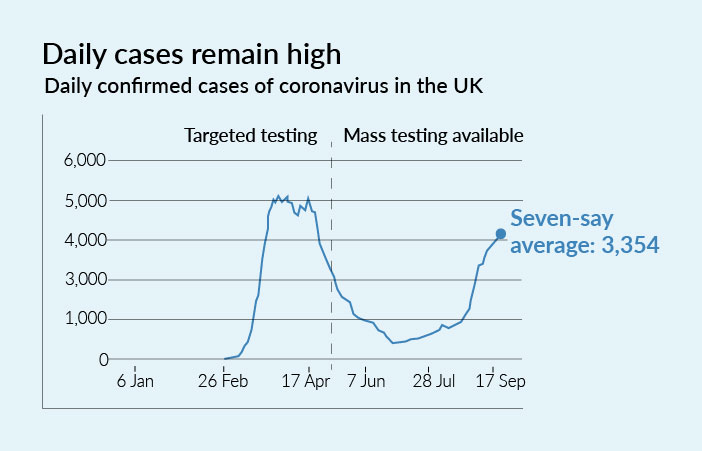
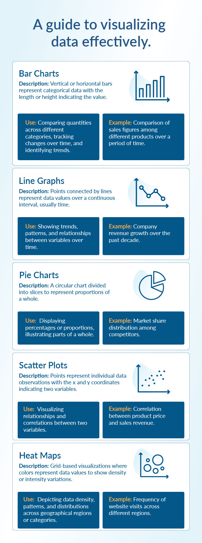
A line graph is perfect for showing trends over time. It uses points connected by straight lines to represent changes in data, making it ideal for highlighting trends, patterns, and fluctuations. This type of graph is particularly effective in showing how variables evolve over periods such as days, months, or years.
For example, the line graph below shows the severity of the recent pandemic. Such visuals helped the public and policymakers make informed decisions quickly. During the pandemic, many organizations used data dashboards to show the spread of the virus, recovery rates, and vaccination progress.
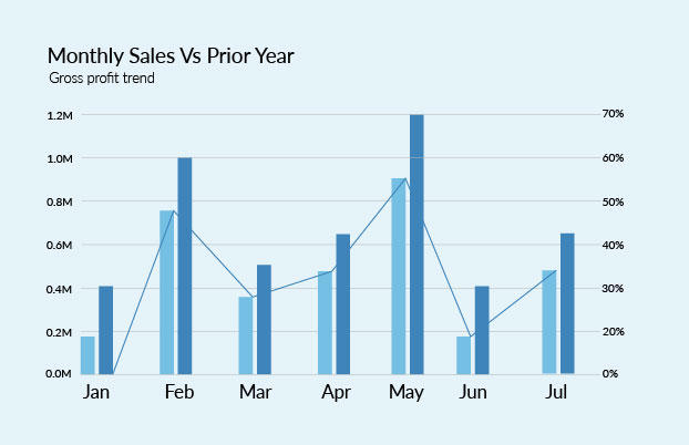
Bar charts are ideal when comparing quantities across categories. Each bar represents a category, and the height of the bar correlates with its value, making it easy to see how different categories compare at a glance.
For example, a bar chart can compare the sales figures of different products. The data visual below displays a Business Performance Dashboard, where the current year's sales are compared with last year's sales, while the line graph depicts the percentage of Gross Profit.
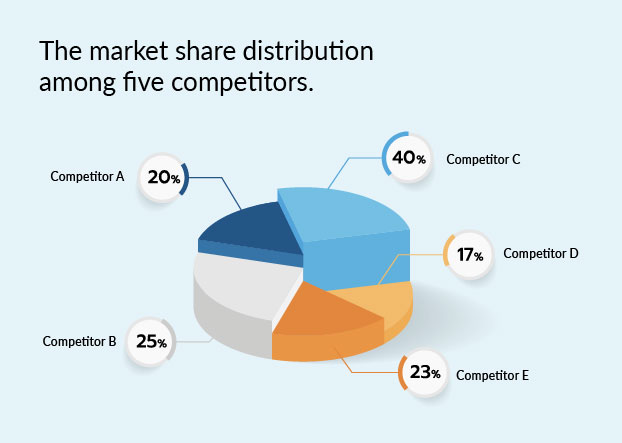
A pie chart helps show proportions and percentages. It makes it easy to visualize the relative size of each part compared to the whole. Each slice of the pie represents a category's contribution to the total, and the size of the slice corresponds to its percentage share. Whether analyzing market share, budget allocations, or survey results, pie charts provide clear, immediate insights.
For example, it can illustrate the market share distribution among competitors, as shown in the image below.
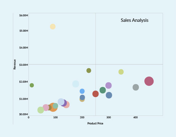
Scatter plots are versatile and insightful tools for visualizing relationships between two variables. When used correctly, they reveal patterns and trends and provide actionable insights that drive better decision-making across various fields.
For example, a scatter plot graph can show the correlation between product price and sales revenue. This can uncover valuable correlations for a business, which can inform pricing strategies and market segmentation.
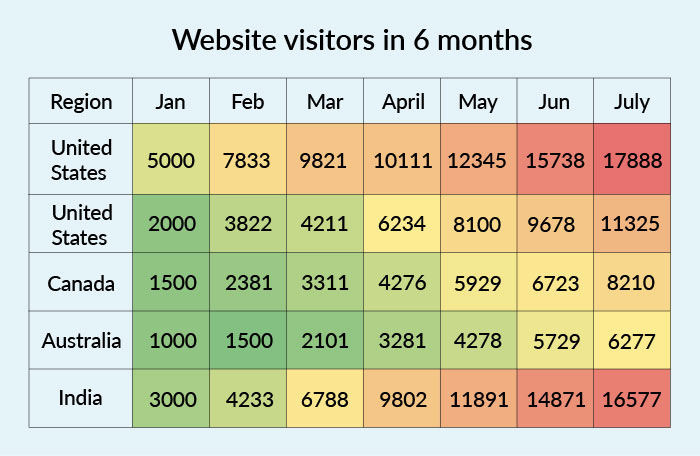
Heat maps effectively visualize data density and variations across different areas. Heat maps make it easy to identify patterns, trends, and anomalies at a glance by using color gradients to represent data values. This form of visualization is particularly useful when dealing with large datasets and geographic information, enabling users to spot areas of interest or concern quickly.
For example, consider a scenario where a business wants to analyze the geographical distribution of its website traffic. A heat map can effectively display this data, highlighting regions with high and low visitor frequencies.
Infographics combine various visual elements to tell a complete story. By integrating multiple visual elements, such as charts, icons, and illustrations, infographics can effectively present complex information in a clear, engaging, and easily digestible format. They are particularly effective for explaining intricate topics, such as the impact of a new policy, because they can convey a comprehensive story at a glance.
Data isn't just numbers; it's the cornerstone of success and better decision-making. For instance, performance reports from ad campaigns reveal which messaging, products, or strategies are effective. Sales analysis shows when your sales peak and which demographics to target for higher profits. However, data becomes effective only when you identify and present each audience with valuable, relevant information.
Therefore, data storytelling bridges the gap between excessive information and meaningful correlation. Giving numbers and figures context and meaning to turn data visuals into a compelling narrative and support better decision-making.
Data visualization is like one piece of a giant puzzle: the storyline. Data stories are composed of a broader story that relies on industry details, team expertise, and the audience you will be addressing. Therefore, assembling these elements is essential for creating a captivating narrative that effectively answers crucial questions: what, why, who, and how.
Determine what your data set tells you:
Begin by thoroughly analyzing your data set to understand its narrative. Identify trends, patterns, anomalies, and critical insights from the data.
For instance, if you're analyzing sales data, identify which products are top sellers, which periods see the highest sales, and any recurring patterns in customer behavior.
Consider your audience and relevant data points:
Tailor your analysis to your audience's needs and preferences. Determine which data points are most relevant to them for analysis and decision-making. This ensures that your narrative resonates with the audience and provides actionable insights.
For example, if you're presenting to marketing executives, focus on metrics like return on investment (ROI), customer acquisition cost (CAC), and conversion rates. Tailor your analysis to provide actionable insights relevant to your audience's decision-making process.
Find meaning in the data:
Look into the relevant data to extract meaningful insights. Analyze the data to uncover insights that would be valuable and impactful to your audience. This step is crucial for deriving actionable conclusions from the data.
For example, if you notice a sudden spike in website traffic, investigate the cause—was it due to a marketing campaign, a seasonal event, or a viral social media post?
Choose the right charts and graphs:
Different data visualizations serve various purposes. Select the most effective visualization techniques to present your data insights clearly and understandably. Choose visuals that best represent your data and convey your message effectively, whether it's bar charts, line graphs, pie charts, or heat maps.
For example, suppose you want to show the revenue growth over a significant period. In that case, a line graph depiction will be more appropriate than a bar chart because it effectively highlights trends and patterns over the specified period. Conversely, if you need to compare sales figures across different product categories, a bar chart would be more suitable due to its precise, side-by-side comparison of discrete data points.
Merge context and data insights:
Contextualize your data insights within the broader business reality and any other relevant information your audience may not know. By framing the data within a meaningful context, you make it more relatable and impactful for your audience.
For example, if you're discussing a decrease in customer satisfaction scores, contextualize it with market trends, competitive analysis, or changes in company policies.
Structure your storyline:
Craft a compelling storyline with a captivating introduction, engaging story-building, and a climactic resolution. Present problem statements or challenges your audience can relate to, and then provide insights or solutions that address these challenges. This narrative structure captivates your audience and aids in information retention and comprehension.
Keeping a few pointers in mind is essential when creating data visualizations.
To ensure that data visualizations are accurate and trustworthy, it is essential to gather data from reliable sources and accurately present the same without manipulating or distorting the details. Additionally, provide context and explanations to help the audience understand the data's limitations and potential biases.
To choose the correct graphical representation for your data analysis, use the following steps:
There are many data visualization tools available, ranging from simple spreadsheet software like Microsoft Excel to more advanced tools like Tableau, Power BI, and Adobe Illustrator. Platforms like Prezent AI allow you to seamlessly integrate storylines based on various business scenarios, giving you the extra edge to make your data presentation more impactful and efficient. Choose a tool that best suits your needs and level of expertise.
Prezent has two exclusive features dedicated to supporting data visualization in presentations. Since numerous teams and presentations are data-driven, Prezent understands the need to efficiently and effectively communicate relevant data personalized to different audiences.
Slide library-
The slide library offers over 35,000 brand-approved designs tailored for various business scenarios, ensuring you have the right slide for any context. You can search for the desired business case slide using filters for the number of messages, types of graphics (icons, images), or specific layouts (funnels, bars, histograms). This efficiency allows you to focus on refining your presentation rather than searching for the correct elements.
Story builder-
The story builder feature enables you to create custom storylines tailored to your context and audience. With access to over 1,000 expert-curated storylines, it helps you quickly build a new presentation shell, ensuring a professional and cohesive narrative. This feature seamlessly integrates your data into the narrative, making your powerpoint presentation more engaging and memorable and helping you drive the desired results.
Find out more about Prezent AI features by scheduling a demo call today. Our experts can help you understand how Prezent can streamline the process of creating effective presentations, saving time, and ensuring that your visualizations are clear, relevant, and tailored to your audience. You can also take a free trial to explore the platform yourself.