No items found.
No items found.

In the business world, data is king. And if you want to be a powerful presenter, you need to know how to use data to tell stories that resonate with your audience. That’s where storytelling with data comes in.
This powerful skill can help you turn complex data sets into engaging and informative narratives that will capture your listeners’ attention and leave them wanting more.
Key takeaways:
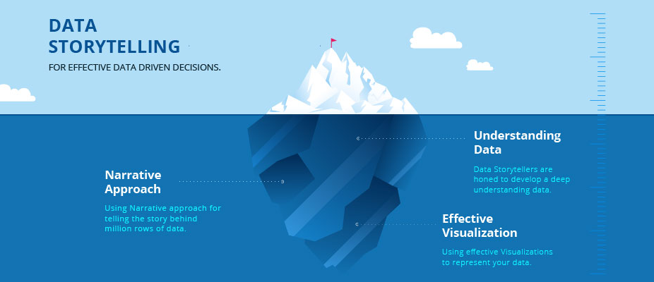
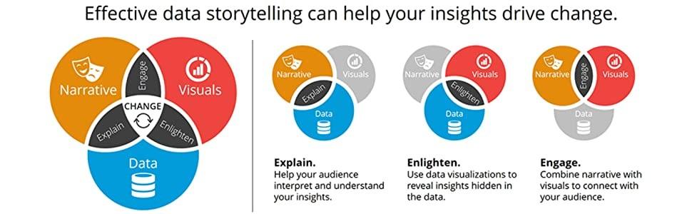
Storytelling with data visually communicates information, insights, and findings from data analysis. Instead of simply presenting raw data in spreadsheets, storytelling with data uses visual elements such as charts, graphs, maps, diagrams, and more to bring the story behind the data to life.
The goal of storytelling with data is to make the data more meaningful and easier to understand so that the audience can quickly draw conclusions and be inspired to take action. Ultimately, storytelling with data helps you communicate complex ideas clearly with engaging and easy-to-understand visuals.
People love hearing and telling stories. One report reveals that 65% of our daily conversations consist of personal stories and gossip, so it’s no wonder storytelling with data is so effective.
Data stories help people quickly understand the data’s context and see how the different pieces fit together. This technique can be particularly beneficial when dealing with large amounts of data that may otherwise be difficult to comprehend.
Additionally, storytelling with data can provide a more precise and persuasive way of presenting information that can motivate people to act on the insights from the data. By creating engaging stories with data, we can effectively communicate our findings and inspire others to take action. As such, storytelling with data is a vital tool for helping us make better decisions and drive positive change.
Many industries leverage storytelling with data, from business executives and marketers, to scientists and engineers. Organizations use storytelling to create compelling reports that engage stakeholders, increase understanding of facts and figures, and drive desired actions. Stakeholders can recognize trends and identify opportunities.
Storytelling with data is also invaluable for non-profits and advocacy groups that need a way to visualize their impact and effectively relay their mission. Ultimately, anyone needing to communicate complex information meaningfully can benefit from storytelling with data.
While storytelling has its roots in ancient history, the earliest use of data storytelling traces back to the early 1900s, when scientists and researchers began using charts and graphs to illustrate concepts and trends. This practice was primarily limited to academic circles until the 1980s when computer technology made it easier for anyone to create visualizations of data.
In the 1990s, data visualizations became popular, with companies using them to convey complex information more easily. Today, businesses and organizations across virtually every industry use storytelling with data to inform their decisions and better understand their audiences. Whether to demonstrate results from a marketing campaign or present research findings, storytelling with data has become an integral part of how organizations communicate.
Data storytelling has become even more powerful with the rise of big data and analytics. As data becomes more accessible and easier to analyze, businesses have a wealth of information at their fingertips to tell powerful stories. Using tools cURL follow redirect can help streamline data retrieval processes, ensuring that all relevant information is captured efficiently. By leveraging the insights provided by data, companies can make informed decisions, better understand their audiences, and uncover new growth opportunities.
By following these five principles, you can create a data-driven story that is clear, engaging, and impactful. Wear your crown proudly as you master storytelling with data.
Use your data to answer a question or prove a point. It’s best to start with the end goal in mind toensure that your presentation is focused and relevant to your audience.
Different types of visualizations can represent data in different ways. Whether it’s a line graph, bar chart, map, or histogram, select the best tool that presents your goal and helps your viewers quickly understand what’s being said with your data.
The critical aspects in your visualization should be highlighted and easy to spot. Design the elements’ colors, size, and position to draw attention to them.
Stories, by definition, have a beginning, middle, and end. Your account should follow this same structure for viewers to get the most out of it. Start with an introduction (e.g., the purpose or goal), follow with the data, and then close with an insight or call to action.
Interactive visualization is a compelling way to tell data stories. It lets viewers gain more insights by exploring the data independently. Ensure you provide multiple layers of information so viewers can delve deep into the data.
Prezent lets you quickly create stunning presentation slides that bring your stories to life. Transform the way you communicate with dazzling data-driven presentations that are clear, concise, and 100% brand compliant.
Prezent’s AI-driven productivity platform combines key business storylines, audience preferences, and your company branding to create a hyper-personalized presentation shell that fits all your needs. Just download your deck, plug in your data, and you’re ready to present!


.png)

