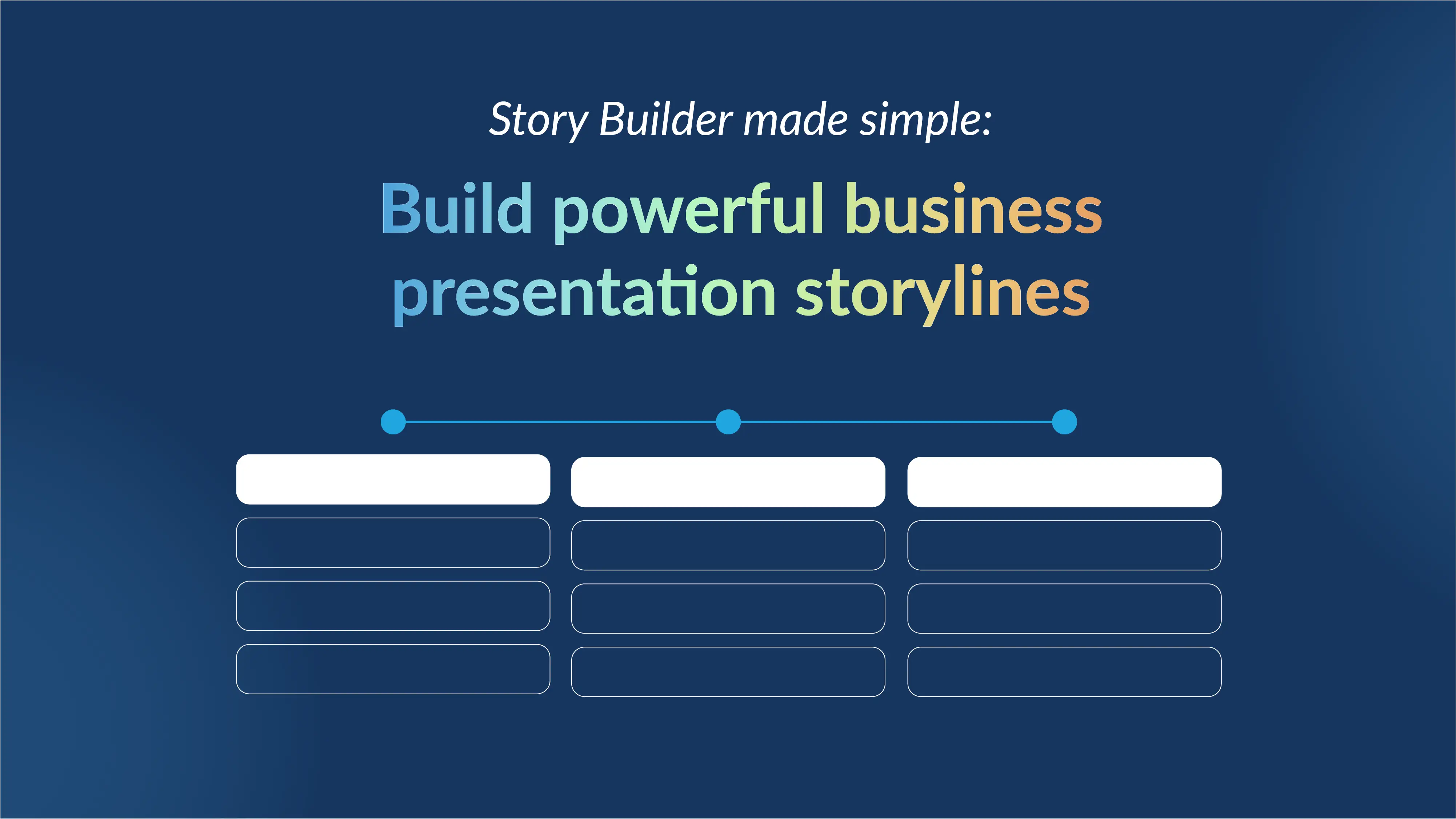
Understanding the emphasis principle of design in presentations


Have you ever sat through a presentation with visually appealing slides but struggled to focus on the key points? This highlights the importance of design principles. Too often, we focus on making our slides look good without understanding the design principles.
In this guide, we’ll explore one of these essential principles, the “emphasis” principle of design, and how it can make your presentation slides both impactful and engaging.
Understanding the basics: What is emphasis as a design principle?
To understand the emphasis of design, it's essential to understand the broader principles of design first. These foundational concepts guide designers in structuring and organizing visual elements effectively. They dictate how components like color, shape, space, and texture are arranged to achieve aesthetic appeal and communicate a message clearly. The basic principles of design include balance, contrast, movement, rhythm, unity, white space, proportion, emphasis, hierarchy, repetition, and variety.
Emphasis is a key design principle that directs the viewer’s attention to the most essential elements within a design. By establishing a focal point, emphasis draws the eye to specific details or areas, ensuring that critical information is easily recognized and understood. This principle enhances the overall impact of the design and makes it more engaging and effective in conveying its message.
Why is emphasis important in slide design?
In slide design, emphasis plays a crucial role in guiding the audience’s attention. Emphasis helps to highlight critical points, such as key data or takeaways, making slides more impactful and memorable. Using emphasis elements, like contrast and negative space, effectively prevents information overload by creating an order of importance. Emphasis enhances user experience by improving clarity and flow and supports a strong visual hierarchy, ensuring that viewers focus on the core message before moving on to secondary details.
Understanding design elements to create emphasis in design:
Look at the image below and note where your attention goes first:
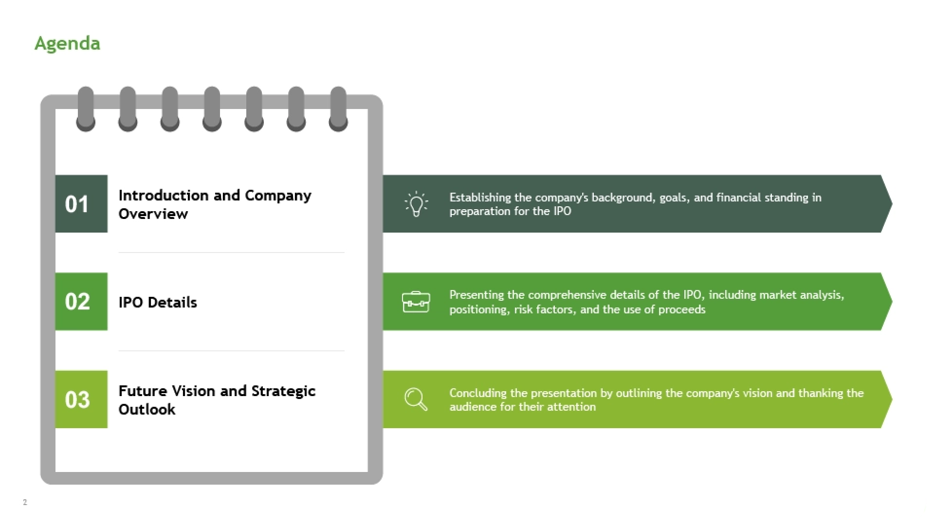
In this introductory slide, the eye is naturally drawn to the first bullet point, then moves in sequence to the second and third. This isn’t due to any set order; rather, the intentional use of color shades creates a visual hierarchy. The slide immediately communicates which point is most important by highlighting the first bullet in a bolder color and muting the others. Adding emphasis to one element or subtly muting surrounding elements can effectively guide viewers’ focus.
To apply this strategy, start by defining the primary information (the key focus), followed by secondary and tertiary details. This approach helps ensure your audience absorbs content in the intended order, making your presentation clear and impactful.
Once you've identified your focal point, you can emphasize it in your slides using a range of design elements. There’s no one-size-fits-all approach; different elements can achieve emphasis in unique ways. Let’s explore some of these elements with example slide templates to see how they can be applied effectively.
Size:
One of the most universally effective ways to create emphasis is through size. Think of sale ads displaying attractive offer prices. The price is often shown in larger, bold text to instantly catch the viewer’s attention. This technique highlights key information, making it both memorable and easy to spot.
Movement:
Movement is a powerful design element that is used to create a natural flow, guiding the viewer’s eye smoothly from one detail to the next. By strategically arranging elements in a sequence or giving directional cues, such as arrows or visual lines, you can lead the audience through your narrative in a controlled and engaging way. This technique allows you to build a logical progression of information, keeping viewers focused on the story you want to convey.
Color:
Color is an engaging tool for directing audience focus and creating emphasis. By using a consistent color palette or strategically placed contrasting shades, you can make key text or sections stand out. This approach not only highlights essential information but also ensures a visually cohesive and engaging design that naturally guides the viewer’s eye.
Contrast:
Contrast is another effective method of creating visual distinction. By using contrasting colors, you can naturally guide the viewer’s eye to specific areas, effectively highlighting important relationships or differences. This technique helps make key information stand out, allowing viewers to grasp focal points and connections within the slide quickly.
White space:
White space helps create a consistent flow, allowing key content to stand out. Just like the background in a book or a gallery of wall-mounted photos, white space frames and highlights visuals naturally guide the viewer's attention. When you increase white space strategically, it breaks the visual flow, catching the audience's eye on critical elements.
Examples of emphasis principles in slide design:
Here are some examples to demonstrate how to apply emphasis principles in your slide designs. These methods will help you craft a compelling storytelling experience that smoothly guides your audience through the narrative, keeping their focus on key points along the way.
Size: Creating visual hierarchy-
In this pricing plan slide example, size establishes a clear visual hierarchy. The largest pricing option on the far right highlights the highest-priced plan with the most benefits, while the smallest, least-featured option is placed on the far left. This layout immediately communicates the intended order of importance at a glance.

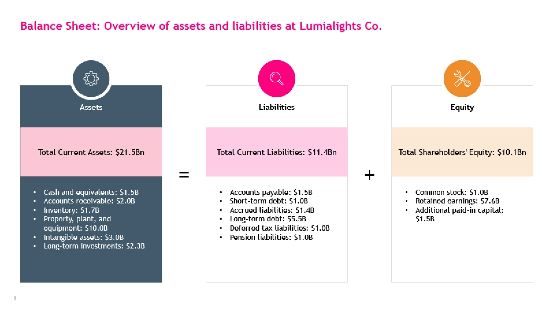
Colors: Guiding audience’s focus-
The balance sheet slide below highlights the assets section when the presenter discusses it, drawing attention to it without distractions from other sections. This use of color keeps the audience’s focus where it's intended.
Contrast: Creating a clear visual distinction-
In this financial slide template, contrasting colors are used to differentiate expenses and revenue. This allows the audience to immediately identify that revenue surpasses expenses without needing to read detailed data, enhancing clarity and understanding at a glance.
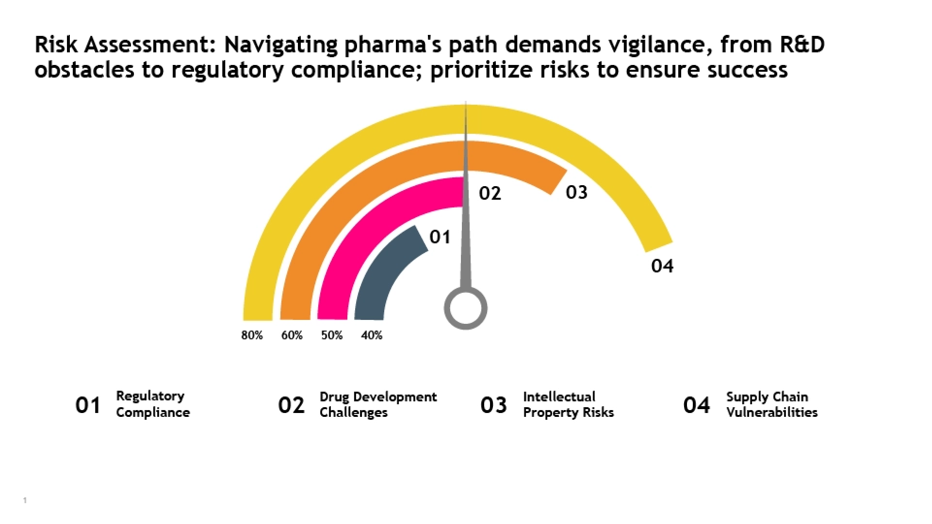
White space: Enhancing focus and flow-
The ample white space around the speedometer in the following risk assessment template immediately draws attention to the graphic, allowing viewers to interpret its meaning even before reading the accompanying description.
Tailoring design emphasis to your audience:
An effective way to make your presentation impactful is by tailoring the design emphasis to the specific audience. Identify the core message or takeaway for your audience. This will help you to determine what information is most critical for understanding or decision-making and design your slides to highlight those elements. Imagine you’re presenting a new product strategy:
- For the Marketing Head: Emphasize aspects like campaign reach, target demographics, and engagement rates. Design elements could highlight these metrics, using bold text or vibrant colors to direct attention to engagement stats and marketing outcomes.
- For the Product Head: Shift the focus to features, benefits, and development timelines. Here, the emphasis could be on showcasing product specs, user experience, or key differentiators through visuals and charts that stand out.
How Prezent helps you implement the emphasis principle of design:
Prezent makes it easy to create slides that are visually appealing and purposefully designed to enhance clarity and engagement by guiding the audience’s attention where it matters most. The features that will help you achieve this majorly include:
- Templates with built-in focal points: Prezent offers templates with pre-designed focal points, making it simple to start with a slide structure that effectively directs viewer attention. Each template applies design principles that naturally draw the eye to the most important information, making it easy to add content without losing emphasis.
- Audience-centric customization: Prezent helps you tailor designs to meet your audience's specific needs and preferences. The platform assists with selecting visuals, colors, and focus points that resonate best with your target audience, ensuring your slides are both impactful and relevant.
- Consistent branding across slides: Prezent integrates your brand elements, such as logos, colors, and fonts, into every presentation. With just a click, you can align new slides or update existing decks with brand consistency, maintaining a cohesive look and feel that reinforces your identity.
Enhance your presentation experience with Prezent by scheduling a demo with our team. Try out our free trial to see how effectively Prezent’s design elements and AI-powered features streamline the creation of engaging, on-brand presentations.
Related resources


.png)