Not all AI presentation tools are created equal: A benchmarking deep dive
AI presentation tools are everywhere. From Canva to Gamma to Beautiful AI, they all promise faster slide creation, fewer headaches, and more impact.
But here’s the problem: most of them deliver pretty decks, not business-ready communication. In high-stakes scenarios, like an investor pitch, an FDA submission, or a quarterly board update, "pretty" won’t cut it. You need outputs that are accurate, on-brand, tailored to the audience, and ready to present now.
That’s why we ran a head-to-head benchmark of six AI presentation tools, measuring performance against the criteria that matter most for enterprise teams. The scoring used Prezent’s proprietary LLM agents and an independent compliance checker to evaluate ~50 outputs from different platforms for factual accuracy, storyline, brand alignment, and diversity in layouts. The results speak for themselves.
The benchmark: Measuring what matters
Before we dive into the results, we want to share exactly what we were measuring. To get a clear understanding of the overall usefulness of these AI presentation tools, we went beyond analyzing how “pretty” the slides look. We evaluated each tool against five levels of Contextual Intelligence.
Each level represents a layer of capability, starting with core accuracy and building toward full enterprise readiness. This approach gives us a true measure of how useful these tools really are in high-stakes business communication, where small mistakes can have big consequences.
Here’s what we found, with a breakdown of exactly what this means below:
The results: How AI presentation tools stack up
We compared Prezent’s AI, Astrid, with five other AI presentation tools: Gamma, Beautiful.ai, PopAi, Canva, and CoPilot using a set of nine different criteria as our scoring framework to best understand the capabilities of each.
The goal wasn’t to crown a winner for style points. It was to see which tools could consistently produce presentations that meet enterprise-grade standards for accuracy, structure, brand alignment, compliance, and audience fit.
L1 – Core content accuracy & flow
If the storyline is confusing or the facts aren’t right, the whole deck falls apart. Many AI tools stumble here—they generate slides that look fine at first glance but take hours to clean up. Accuracy and flow are the foundation of a business-ready presentation.
What we measured:
- Relevancy – Does the content directly answer the prompt?
- Storyline – Is the narrative logical and easy to follow?
Benchmark results:
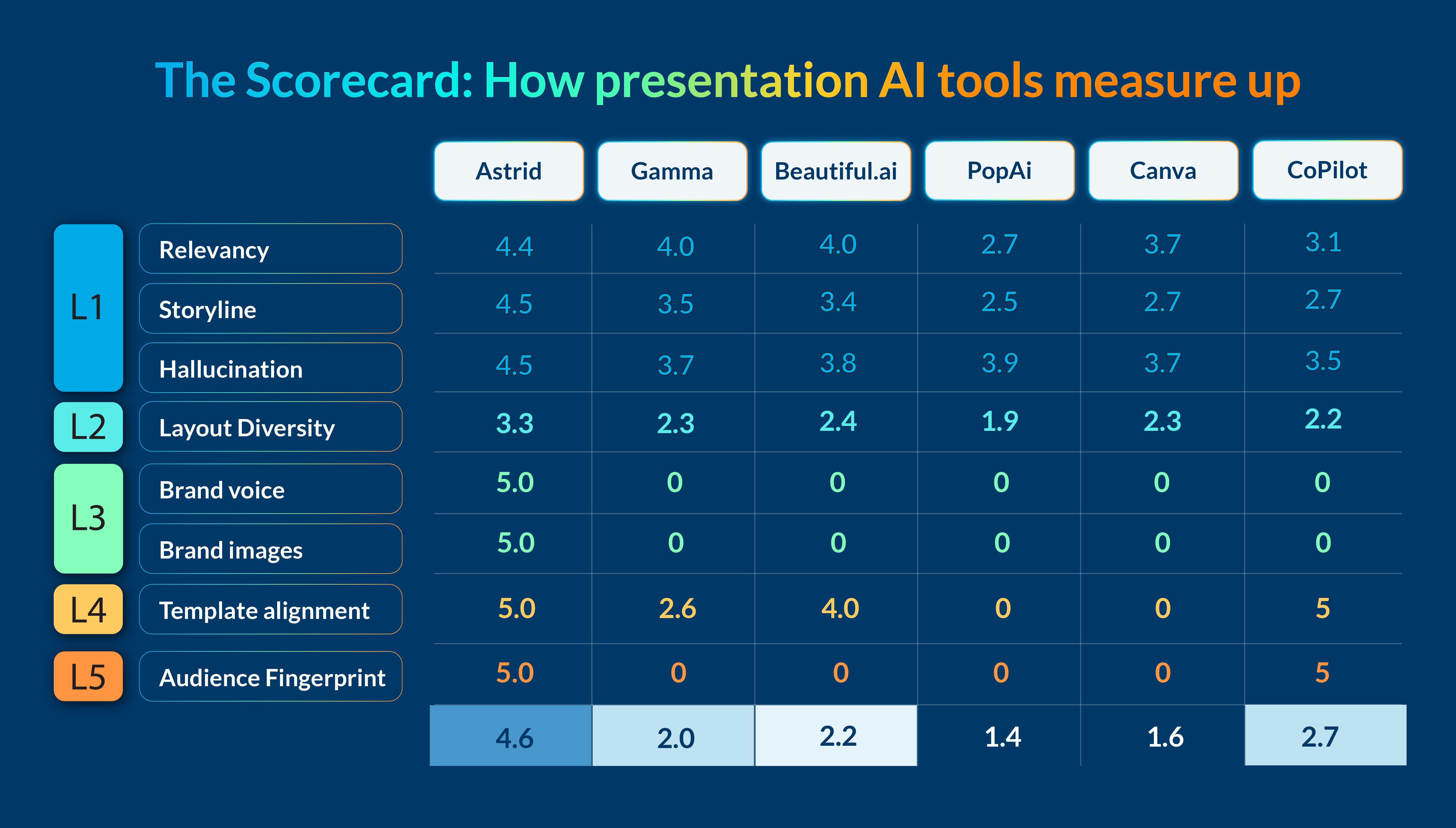
- Highest score: Astrid: 4.4 relevancy, 4.5 storyline, 4.5 hallucination (highest combined performance)
- Runner-up: Beautiful.ai (3.7–3.8 range) and Gamma (3.5-3.7 range)
- Lowest score: PopAi (2.5–2.7 range)
L2 – Functional fit & layout quality
Even if the content is accurate, it needs the right structure. Where a technical audiences might expect detailed diagrams, a sales leader might be looking for comparison charts. Most tools rely on generic layouts that don’t fit these needs or take the audience into account, forcing teams to rebuild slides from scratch.
What we measured:
- Layout diversity – Are there enough layouts to match industry and functional best practices (e.g., technical architecture diagrams, clinical trial charts)?
Benchmark results:
- Highest score: Astrid (3.3)
- Runner-up: Beautiful.ai (2.4)
- Lowest: PopAi (1.9)
L3 – Brand alignment & compliance
Every presentation reflects your brand. Fonts, colors, tone, and visuals all send a signal about professionalism and credibility. When those elements are inconsistent, trust takes a hit. Many tools misplace logos or use off-brand imagery, leaving slides that need to be reworked before they can be shared.
What we measured:
- Brand Voice – Does the language match your organization’s tone, terminology, and style?
- Brand Images – Are visuals on-brand in style, color, and usage?
Benchmark results:
- Highest score: Astrid (5.0 across all three measures)
- All other tools: 0
L4 – Company-level compliance
For regulated industries, staying on brand isn’t just about polish—it’s a requirement. Yet most AI tools can’t reliably enforce corporate template standards. That creates unnecessary risks and last-minute cleanup when decks go off-brand.
What we measured:
- Template Alignment – Does the AI apply the correct company templates and branding consistently?
Benchmark results:
- Highest score: Astrid (5.0) and CoPilot (5.0)
- Runner-up: Beautiful.ai (4.0)
- Lowest score: PopAi and Canva (0)
L5 – Audience personalization
Not every audience wants the same story, but most AI tools create one generic deck for all. Astrid is the only tool that adapts to different audiences so the message resonates every time.
What we measured:
- Audience Fingerprint – Can the AI adapt slides to specific audience archetypes, whether they prefer data-heavy detail or high-level summaries?
Benchmark results:
- Highest score: Astrid (5) – the only tool with this capability.
- All others: 0
By scoring tools at each of these five levels, we can identify which are capable of producing accurate, relevant, on-brand, and audience-specific presentations, which are all critical for teams where communication quality directly impacts business results.
Why this matters – especially for enterprise teams
The benchmark scores aren’t just numbers. They reflect the day-to-day challenges enterprise teams face when creating presentations. Here’s why the differences in performance matter.
1. Hallucinations slow teams down
AI-generated presentations often include fabricated details, unsupported claims, or irrelevant information. These hallucinations can’t be left in the final deck. They require teams to stop, verify, and rework slides, which delays delivery.
Imagine a biopharma company preparing a presentation for an FDA advisory committee. The deck needs to include precise clinical trial data and use specialized acronyms like “AUC-PK” or “iPSC” correctly. If an AI tool inserts inaccurate information or misuses this terminology, the result is wasted time and a weakened message. In some cases, it could jeopardize the approval process.
Astrid’s high accuracy scores mean teams can trust the content they generate and focus on delivering their message instead of fixing it.
2. Brand consistency is critical
Consistent branding in fonts, colors, logos, layouts, and tone is essential for credibility. Even small errors can erode trust and create confusion.
In high-stakes situations like an investor pitch to secure funding for the next stage of clinical trials, off-brand slides or misapplied templates can distract from the message and undermine confidence.
Many tools misplace logos, apply incorrect templates, or introduce inconsistent styles. Astrid’s perfect scores in brand alignment and compliance ensure every deck follows brand guidelines down to the pixel, no matter who creates it.
3. Context makes every slide relevant – and more impactful
Generic presentations lose attention quickly. They don’t speak the audience’s language, include the right proprietary content, or use layouts that match industry expectations.
For example, a tech company pitching a new product might rely on a “Feature Comparison” slide and a “Technical Architecture” diagram. A generic AI tool may misalign these layouts or oversimplify complex diagrams, reducing the deck’s impact.
Astrid captures and applies context at five levels: company, team, function, industry, and audience. This ensures every deck is tailored, credible, and aligned with best practices for that specific situation.
The takeaway
When it comes to AI presentation tools, the difference between “good enough” and “enterprise-ready” is measured in accuracy, brand consistency, and context. Our benchmarking shows that while other tools can create visually appealing decks, Astrid is the only one to deliver consistently across all five levels of Contextual Intelligence.
It’s not just about faster slide creation. It’s about reducing rework, protecting brand integrity, and ensuring every presentation speaks directly to its audience. Whether you’re preparing a high-stakes regulatory submission, an investor pitch, or a critical internal update, Astrid gives teams the confidence that their decks are accurate, on-brand, and ready to deliver.
In a world where communication quality directly impacts business results, that difference matters.
About the author

Bharti is a product marketing writer at Prezent who believes great writing starts with deep reading. She began her career in finance, switched paths in 2019, and has since worked with Kintegra, Clearout, Miko, CaratLane, and, of course, Prezent. From content marketing to product marketing, she enjoys simplifying complex product and technical ideas without losing meaning. As she always says, “If it needs explaining twice, it needs better writing.”
Connect with her on LinkedIn.
