Advanced presentation design
Engaging presentations are more than just slides and text.
Slide layouts and images can enhance your presentation and communicate data more effectively to your audience than words alone. Making your presentation stand out and engaging your audience largely depends on the images and editing techniques you use.
Using advanced design principles like adding contrast, color, and a balanced layout will help you take the presentation to the next level.
This guide will teach you how to do just that.
Let's dive in ⬇️

The four elements of great design
As famous architect Juan Carlos Fernandez once said, bad design is smoke—good design is a mirror.
Slide designs should always add something to a meeting or presentation, not take away from it. The good news is, you can reach a happy balance with the right combination of colors, shapes, and elements.
Here are four different ways to design a visually appealing slide.
1. Contrast
Contrast highlights the difference between two (or more) visual elements on a slide using shapes, colors, shading or typography.
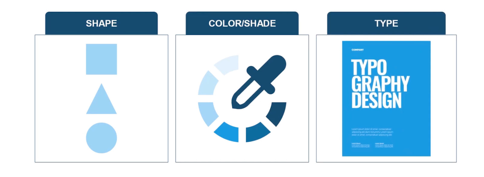
It should be used when a slide is communicating contrasting elements or if information (like a statistic) needs to be highlighted to make it stand out.
2. Hierarchy
Hierarchy is a great way to present information or data points to help audiences visually understand the importance of certain elements.
Take a look at these examples of hierarchical designs:
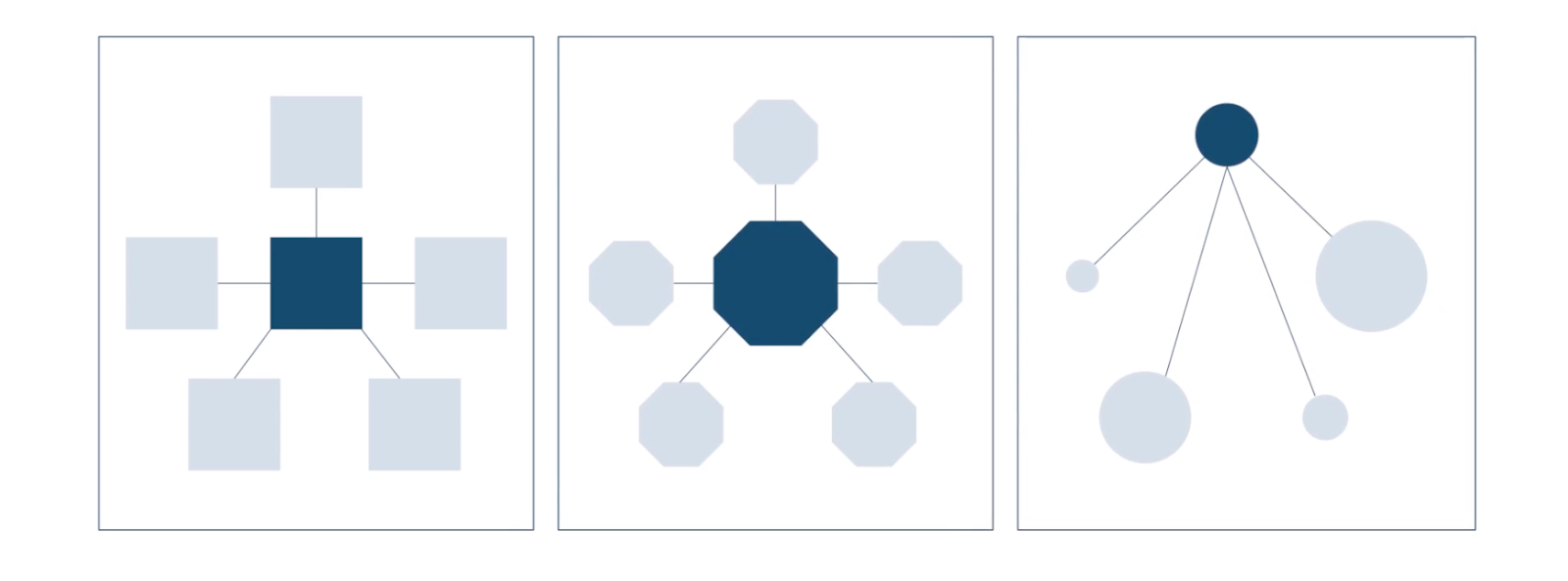
In the left design, each element is equal. But the center and right designs have higher priority elements that are communicated with different sized shapes.
3. Direction
Direction layouts guide your audience to what information they should absorb first. As images are placed in a sequence, the audience's attention will be automatically drawn to the start of the sequence (e.g., left to right).
Here's an example:
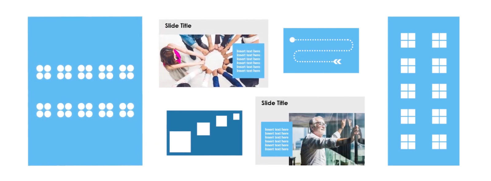
The first image shows left-to-right sequencing, whereas the right image shows top to bottom sequencing. But it doesn't always have to be left to right or top to bottom sequencing to be effective, as the middle slide layouts show.
4. Unity
Unity designs optimize arrangements of images and whitespace using layouts like grids.
Here's an example:
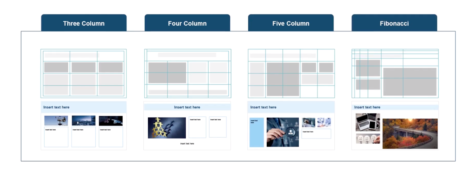
Using grids, elements are balanced across the page without adding hierarchy.
While these four layout options are an ideal way to improve any presentation, you still need to be careful about how images are integrated.
How to work with images in a presentation
Integrating pictures into presentations can impact how well your audience absorbs information and key facts.
But adding images incorrectly can overwhelm the presentation and make the audience lose focus on what you're trying to communicate to them.
Here are three ways to use images in presentations—the right way ⬇️
1. Crop with purpose
Cropping an image brings people and important elements into focus.
However, you must ensure each element in the image is still clearly visible. When cropping photos and headshots, for example, it can make your presentation look unprofessional if it's done incorrectly:
A quick fix to avoid this happening is to use the top and bottom of the headshots as a guide. As long as they stay within the frame, it will make the headshots look more professional.
2. Integrate images (without obstructing)
Images should only take up to (at most) a third of a layout design, especially if there is text or data on the slide.
If you don't stick to this rule, images can take away attention from the information benign presented and distract your audience. Here's an example:

Not only does the image obstruct the text and context of the slide, it also makes it hard to read.
3. Don't stretch images
Stretching images horizontally and vertically will make a slide look rushed and unprofessional.
Here's an example:

What do you see? 🤔
The first two images have been stretched beyond their original dimensions and look amateur. But there's an easy fix: hold the shift key to lock the dimensions when resizing an image so proportions remain correct.
Five hacks to make presentation building faster
Creating presentations is time-consuming.
It can take hours of formatting and editing to get each slide just right. However, using shortcuts on Powerpoint can cut down the time you spend on building slides and give you more time to focus on presenting to your audience.
Here are seven hacks to make presentation building faster ⬇️
1. Format Painter
Ever tried copying and pasting a format across several elements on the same slide, or throughout a presentation?
It takes hours. But the Format Painter, possibly Powerpoint's most underrated feature, does this in a couple of clicks. All you do is click the first element and hit Format Painter:
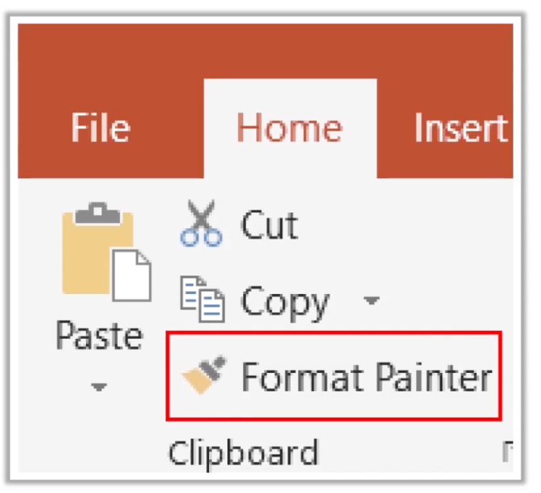
After that, click on the second element you want to format the same way as the first. Powerpoint will apply any existing formats or fonts instantly. To copy a format over more than one element, just double-click Format Painter and click each element you want to format.
2. Replace font
Each slide should have the same fonts and typography to give it a professional finish.
Even if your slides have already been created, you can change fonts on all slides so they're uniform. Just open PowerPoint's Home tab and click the replace dropdown arrow:
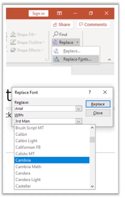
From there, all you have to do is select the font you want and click replace. PowerPoint will then replace every font style throughout your presentation.
3. Slide Master
The third hack on our list is the slide master feature.
It's used to create consistent elements across all your slides, like backgrounds and placeholders.
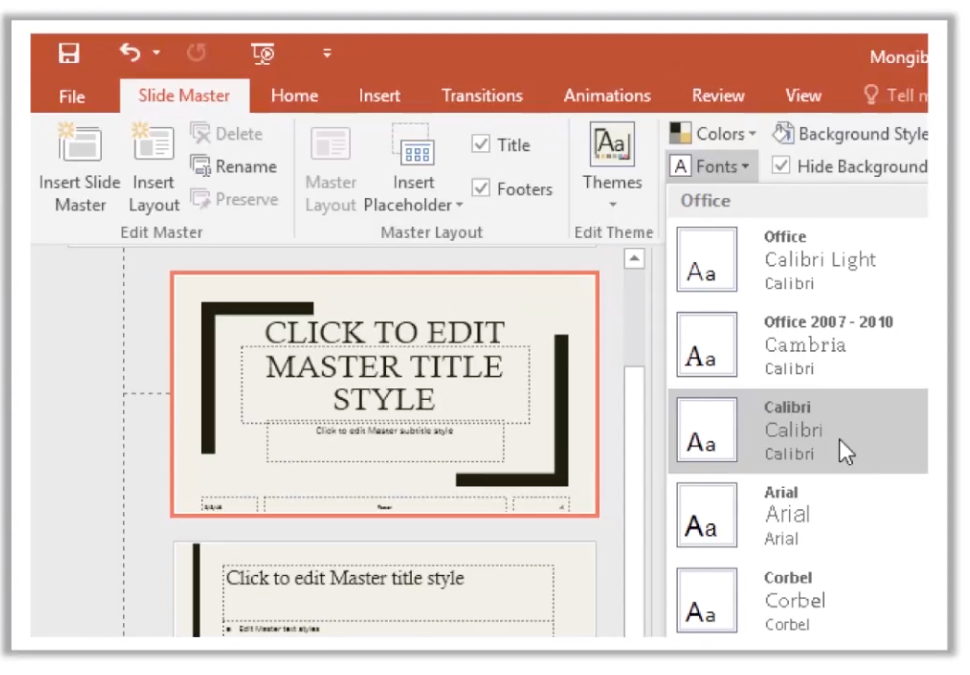
For example, you could add a watermark or logo to each slide in your presentation. Slide Master will do it in a single action so you don't have to edit each slide individually. It can also:
- Rearrange placeholders. Save time by rearranging placeholders and adjusting layouts of every slide
- Text formatting. Change the color of text and font and replicate it across each slide in the presentation
- Footnotes. Add footers, dates, or slide numbers to your presentation in one go
It's a great way to put the finishing touches on your presentation without adding hours of extra editing time.
4. Remove background
Cutting the background from an image can add whitespace to a slide and minimize distraction for your audience.
Powerpoint's background remover tool can do this without the need of photoshop or other editing tools. First, highlight the image and click Remove Background under Format tab. You can then select which part of the image you want to remove the background from:
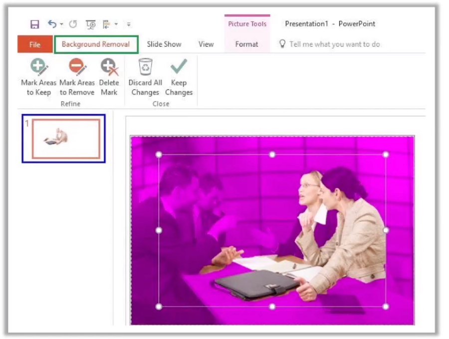
After the background has been replaced with white, you can use a softening tool to buffer the image's edges and make it look more natural.
5. Merge shapes
Finally, Powerpoint's Merge Shapes feature allows you to create custom shapes for your presentation.
First, select any two images in a slide and click the merge shapes feature under the format tab:
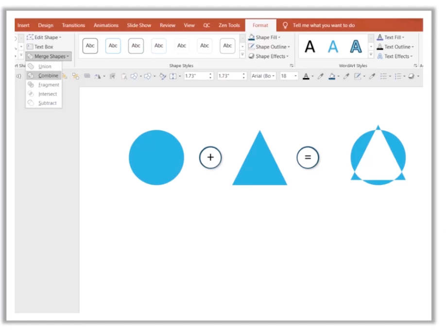
You'll then have a choice between combining the shapes or fragmenting them to create a unique illustration for your presentation.
Be smart when using images in your presentations
Images can make or break a presentation.
Use them well, and they can add an extra dimension to each slide and help your audience understand information clearly. But adding poor-quality images or ones that obstruct text can make presentations unprofessional.
Make your next presentation stand out with the right images.
Want to elevate your next presentation? Check out Prezent's detailed guide on how to communicate data in slides.
Related Guides


