Communicating ideas in slides
Simple communication sticks.
When IBM developed its branding in the 1920s, it eventually decided on a single word: Think
The word became the driving force behind the company's entire vision, appearing on office walls, signs, and newspaper articles.
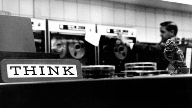
Nearly a century later, IBM still uses Think in company publications, and one of its most popular notebook computers is named after it.
So, what's the lesson here?
Presenting ideas clearly and concisely makes them easier to digest and, more importantly, engages your audience.
This guide will walk you through simple (yet powerful) techniques you can use to pique interest in your presentations.
Table of contents

The 23 most engaging slide layouts
Several elements make up a great presentation: clear communication, good ideas, and engaging design.
Steve Jobs famously said,
“Design is not just what it looks like and feels like. Design is how it works.”
People often limit design to the look and feel of something, yet great designs are much more than that, especially in slide presentations. A slide design can clarify the meaning of an idea or message and help the speaker engage deeply with their audience.
But what is the best layout to use on a slide to communicate ideas?
At Prezent, we've assessed over 1 million slides from our customers' presentations. With that data, we’ve found that 23 layouts—split into three types—stand out above the rest. Let's take a closer look at them:
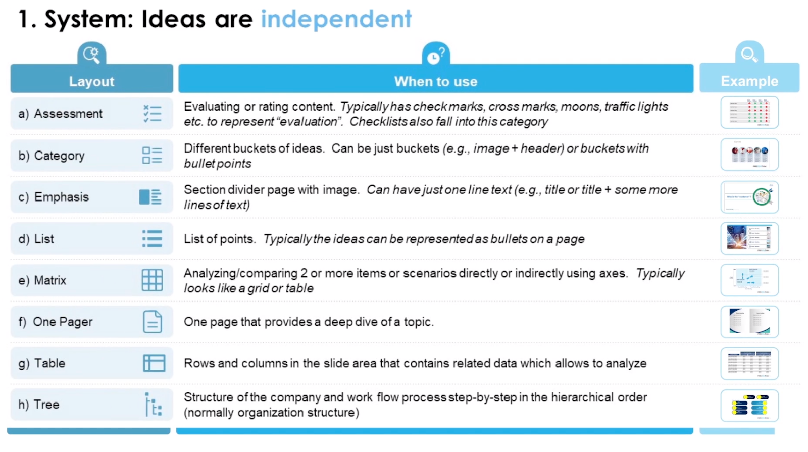
Layout #1: System 📊
System layouts are perfect for presenting ideas that are independent of one another.
From our assessment, there are eight slide designs using this format that will make your presentation pop:
- Assessment. For when content needs to be evaluated or rated, like lists and checkboxes.
- Category. Used for different buckets of ideas or communicating ideas with bullet points. The category layout is perfect for presenting strategic priorities using divided columns to highlight information.
- Emphasis. This layout uses slides with images and a single line of text. For example, section headers or titles help prepare the audience for what's coming next.
- List. One of the more popular layouts using systems, this design uses lists to communicate a sequence of ideas or points.
- Matrix. Ideal for comparing two or more items or scenarios directly (or indirectly) using an axis (usually a table or grid).
- One-pager. For diving deep into a single topic. For example, if you're presenting a new strategy or idea, you can create a one-pager to educate and engage your audience.
- Table. Commonly presented using rows and columns, the table layout is ideal for presenting analysis or data.
- Tree. This layout presents a step-by-step workflow process in hierarchical order.
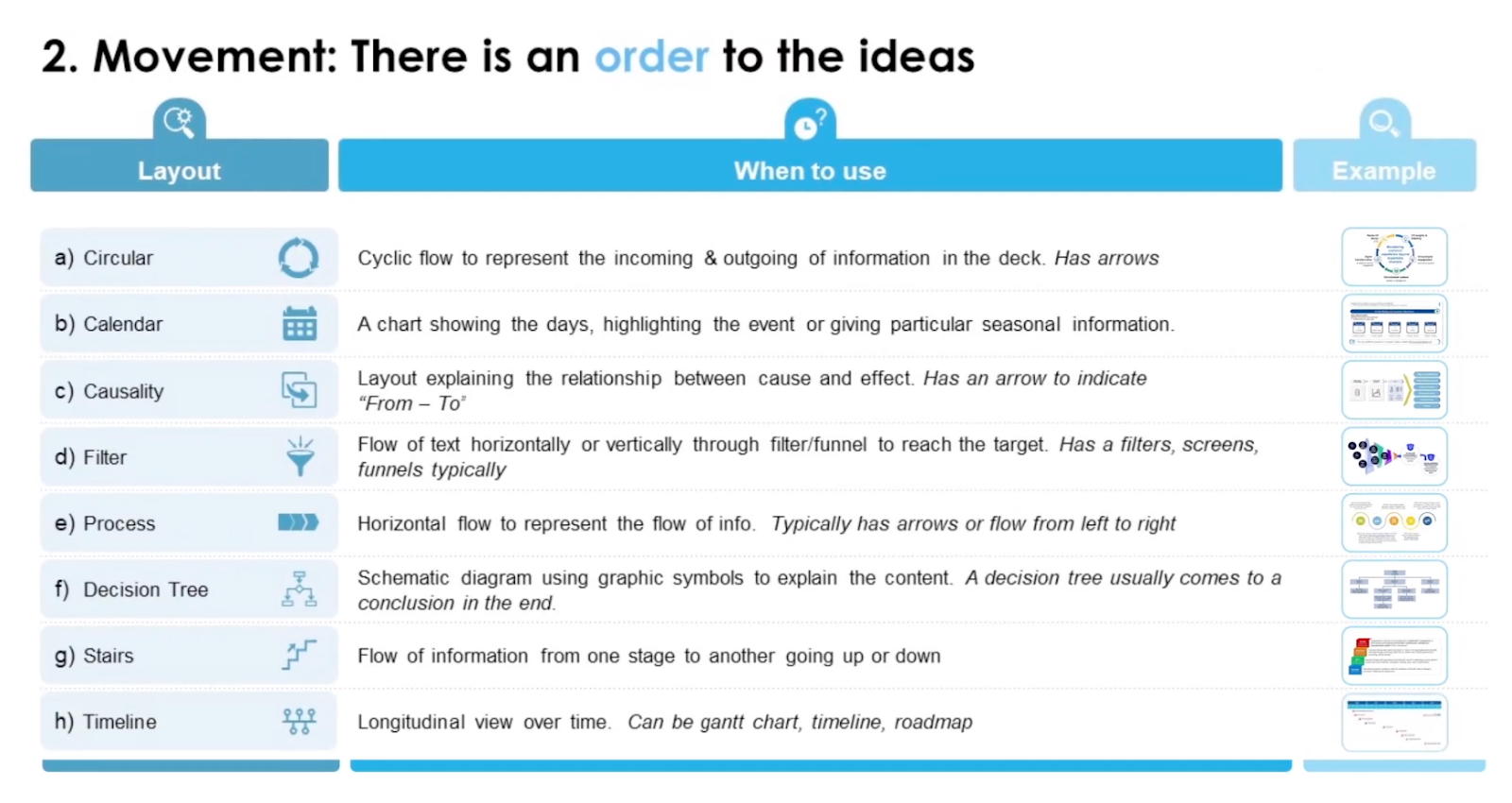
Layout #2: Movement 🏃
The next type of slide design is movement. This style is ideal if your ideas or discussion points need to be presented in order or follow a storyline.
Again, eight designs fit into this layout style:
- Circular. A layout that represents the incoming/outgoing of information. If you're making a presentation about company growth, this design will show the audience that great products lead to a better customer experience and, ultimately, higher revenue.
- Calendar. Highlights or communicates days of events or importance to an audience.
- Causality. Explains cause and effect during a presentation, like what actions will equal results.
- Filter. Shows horizontal or vertical text flowing through a funnel/filter to reach a target. This is usually used to communicate ideas like marketing or sales funnels.
- Process. Portrays the flow of information using arrows, usually left to right.
- Decision tree: A schematic diagram using graphic symbols to explain content. The diagram usually leads the audience to a logical conclusion.
- Stairs. Shows the flow of information from one stage to another, either going up or down. The stairs represent progress during a project or predict what will happen when you reach the "next steps".
- Timeline. Outlines a project or idea over time. Timelines are usually presented as Gantt charts or roadmaps to help teams visualize progress.
Layout #3: Time ⏳
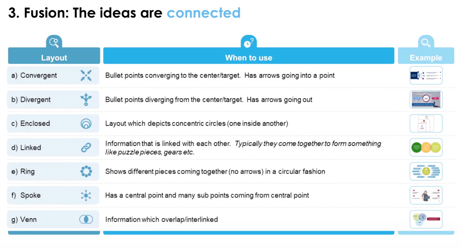
The final format for engaging slide designs—time—is used best when the ideas of a presentation are connected.
Here are the top seven designs used by presenters:
- Convergent. Bullet points are used to converge around a central target or idea. For example, if you have several ways that a project will meet a company goal, this slide will help communicate your ideas to the audience.
- Divergent. Similar to the convergent design, divergent layouts show arrows moving away from a central target.
- Enclosed. Circles (or shapes) are placed inside each other to show how ideas or thoughts are linked.
- Linked. Ideal for different pieces of information or data that need to be linked together. For example, if your company is running a marketing campaign to boost sales, a linked slide can outline how each piece of the campaign will come together to reach a specific revenue goal.
- Ring. Ideas are linked together circularly to show considerations and spur discussion before a project moves forward.
- Spoke. A central idea is placed in the middle of the slide, with points or information circling around it. This design is ideal for showing how certain elements, like culture or productivity, are linked to a central goal.
- Venn. The final design, the Venn Diagram, is perfect for communicating information that overlaps.
Take any of these 23 slide designs and adapt them to make your next presentation more engaging.
⚡ Prezent Pro Tip: 3 best practices for choosing the perfect slide layout:
Each slide design has its own purpose in a presentation. To choose a design that will make the most impact, ask yourself:
- What is the relationship between the ideas in the presentation? Decide if information needs to be linked or if ideas can be presented to the audience independently.
- Are you open to trying more than one type of layout? Sometimes, a mix and match of different design ideas can keep the audience engaged, especially during longer presentations.
- Are you accounting for audience bias? Everyone has biases. Be careful not to overuse (or underuse) a specific slide design to communicate ideas evenly.
The pros and cons of using bullet points in presentations
Bullet lists are common in presentations because they keep ideas simple and easy to read.
However, lists do bring their own risks. Overusing bullet lists makes presentations dull, boring, and confusing if used in the wrong scenario. The reality is lists and dot points only really work in two scenarios: as sequences or logical groups.
Let's use an example: a rocket launch. 🚀
Although there are many different phases to work through before the launch, we can break down what’s required for lift-off into digestible details: The company's experts agree on the data; simulation testing is complete; systems are ready; the launch date has also been set.
This is how the information would be presented to the company's team using a bullet list:
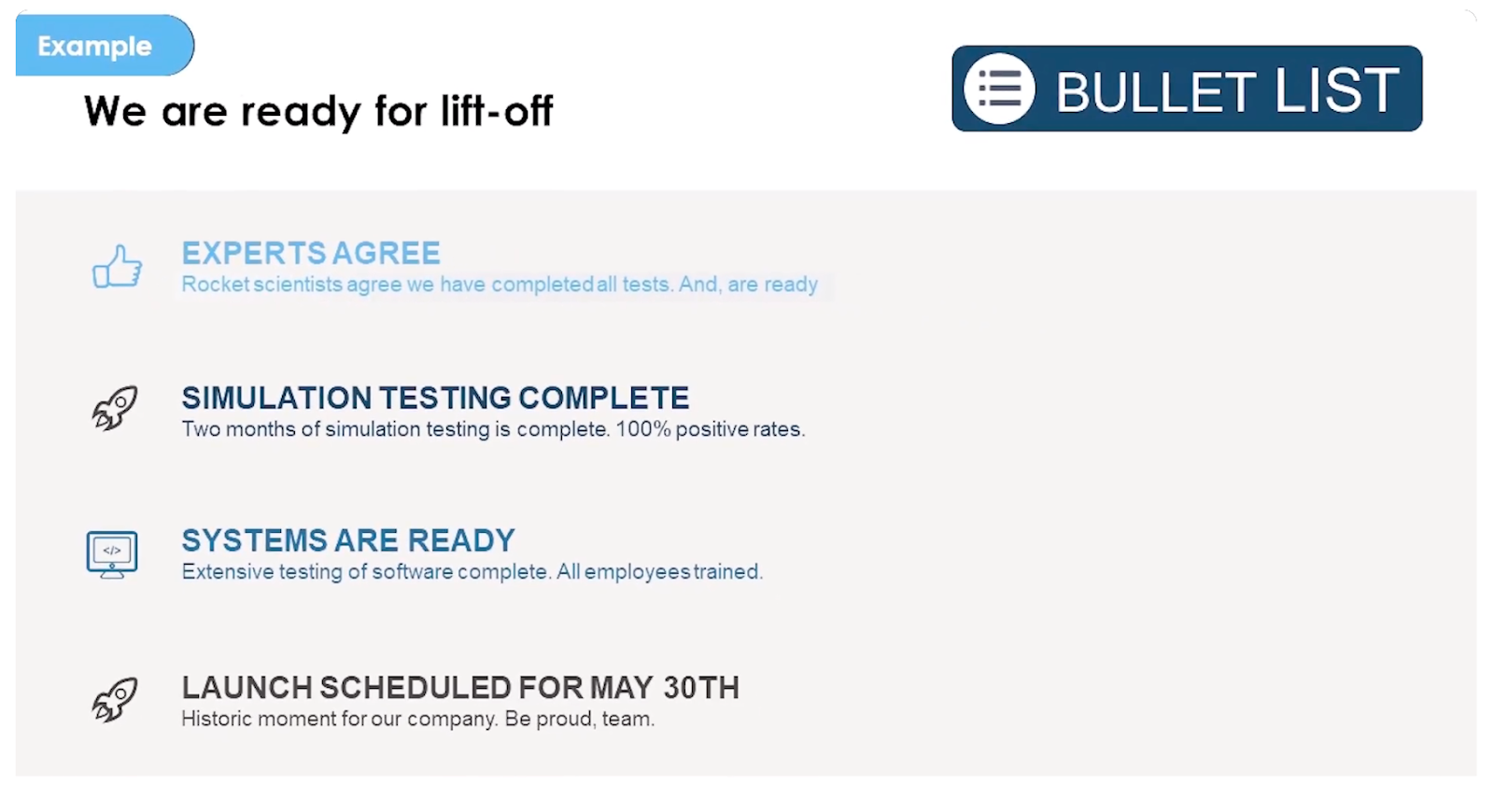
Can you spot the problem? 🤔
Using a bullet list to communicate information about the launch makes it seem like all four points are equal, but this is a mistake. Take a closer look at the first three points. Clearly, they are merely supporting the final point (the main purpose of the presentation), which is the launch.
Rather than using bullet points to communicate this information, causality would be a better approach. Here's an example:
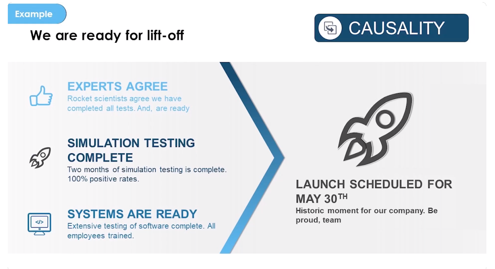
This slide design makes it clearer that the work leading up to the launch has been completed and focuses the audience's attention on the main event—the launch. 🚀
Expert Corner: How Guy Kawasaki simplifies communication

If there's one company that knows how to communicate value and engage its audience, it's Canva.
The company is barely a decade old. But its rapid growth and 75 million active users prove a simple offer and value proposition can resonate with a huge audience. Guy Kawasaki, Canva's Chief Evangelist, says it all comes down to erring on the side of brevity when describing an idea.
"Most ideas, most products and services, they're always described with a bunch of superfluous, extraneous adjectives," he says.
"Some of it may just be ignorance that people don't understand the power of simplicity, the power of brevity. Some of it may be so much a marketing and sales and evangelism and positioning and branding is abdicated to consulting firms and agencies."
Kawasaki takes a different approach. He tries to build a mantra, sometimes using as little as three or four words, to communicate an idea.
"If I were to describe the essence of why I exist, I could do that in two words: empower people."
Says Kawasaki, "There should be one verb and a noun. Power is a verb, and people is a noun."
The lesson is simple: it's possible to say more with less.
The best presentations are simple and to the point
Presentations have a lot of moving parts.
Beyond the information and ideas you're presenting, you must keep your audience engaged if you want any of them to stick. The best way to do this is with simple yet powerful designs that communicate your ideas with maximum impact.
Use these presentation slide ideas to supercharge your next presentation. And remember—less is more.
Learn how to strip your executive summary down to its essence with our detailed guide.
Related Guides


