Communicating data in slides
Don't let your data put your audience to sleep.
While getting an audience to listen is challenging, presenting data they understand and connect with will make presentations more impactful.
It all comes down to the types of charts, graphs and data you focus on, and which layout suits each dataset the best.
This guide will walk through how to communicate data effectively and grab your audience's attention.
Let's dive in ⬇️
Table of contents:

How to communicate data effectively
A slide layout can say as much about what you're telling the audience as the data itself.
The best layout will clearly communicate the relationship between the different data on a slide. We've reviewed data from Enterprise businesses and presenters on the best way to communicate data effectively.
Let's take a closer look at each layout strategy.
Layout type #1: Comparison
Comparison layouts do just that—compare data.
This layout is ideal for showing differences between data, like comparing numbers or showing progression over a timeline.
From our experience, these eight comparison layouts are the most effective ⬇️
1. Classic bar charts
Otherwise known as column graphs, classic bar charts use horizontal or vertical bars to compare data across categories. It's useful for presenting data over timelines so audiences can spot trends or emerging patterns.
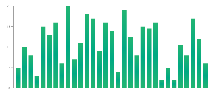
Example: Displaying net promoter score across multiple customer segments.
2. Multi-bar charts
The multi-bar chart is a variation on the column graph. It's used to present two (or more) data sets side-by-side on the same axis. This layout is ideal for comparing variables or groups of data across timelines or various categories.
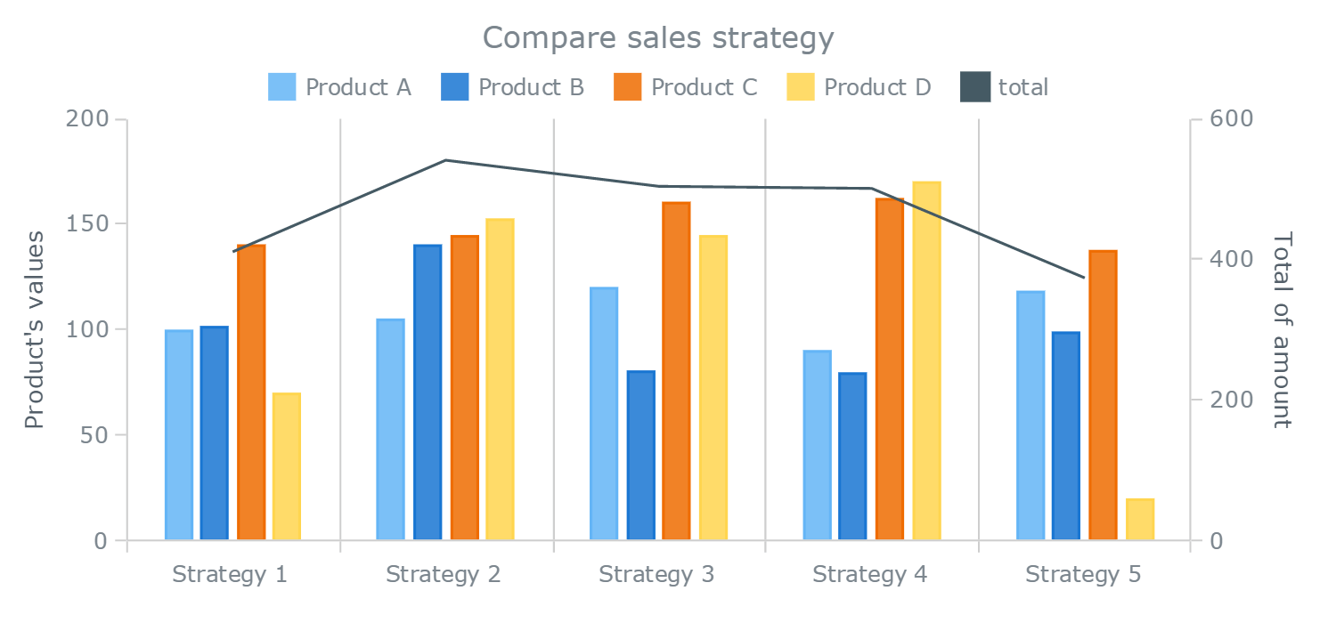
Example: Comparing control samples to show changes and patterns over many months/years.
3. Box and whisker charts
Often referred to as box plots, this chart displays data over quartiles. Multiple data sets from independent sources can be plotted on a chart, so they are related to each other.
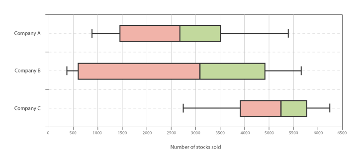
Example: Variations of segments to a particular marketing campaign emphasizing minimum, maximum and average effectiveness.
4. Bubble chart
A multivariable graph places points on a grid where the x and y axes are separate variables. Ideally, the chart makes it easier for an audience to visualize the relationships between numeric variables.
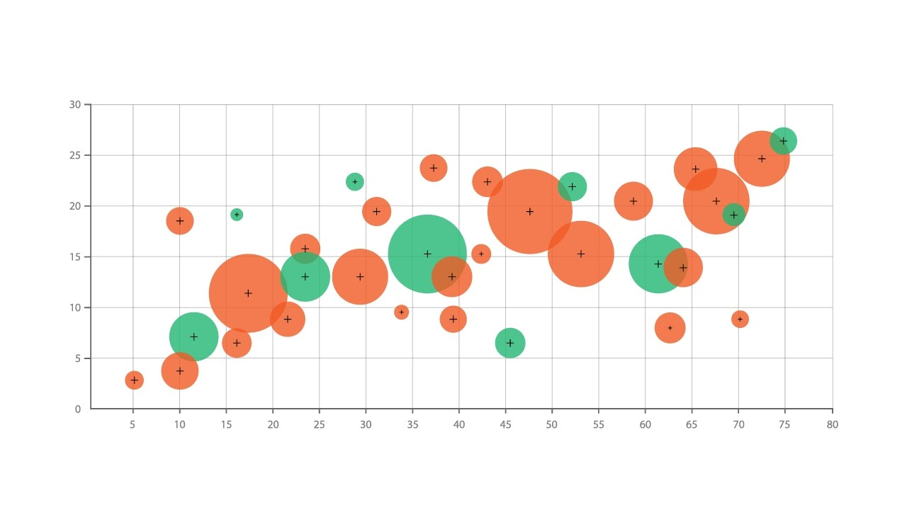
Example: How a certain corporate initiative impacts the size and effort of a company.
5. Bullet graphs
Bullet graphs function much like bar charts but with additional visual elements to create more context. These graphs are normally used for performance comparisons.
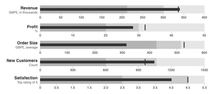
Example: Comparing multiple marketing campaign characteristics over time, like engagement and effectiveness.
6. Pyramid
A pyramid is a back-to-back histogram that displays data across two separate groups. If data is compiled hierarchically, this is an ideal way to display it to an audience.
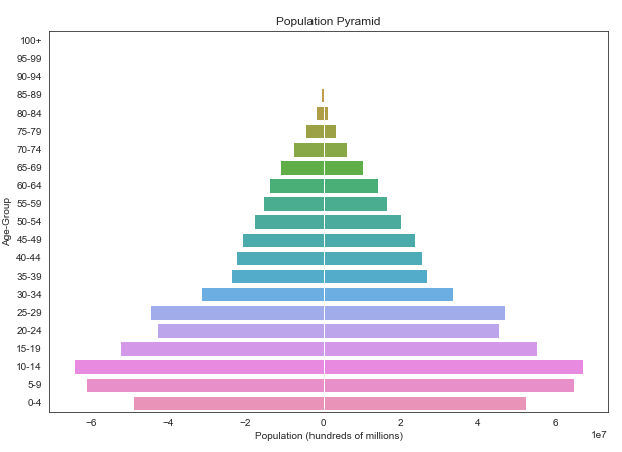
Example: Effectiveness of a marketing campaign across different customer segments.
7. Radar charts
Radar charts are ideal for showing deviation and similarity across a dataset. They are often used for measurements where variables are on the same scale and correspond with each other.
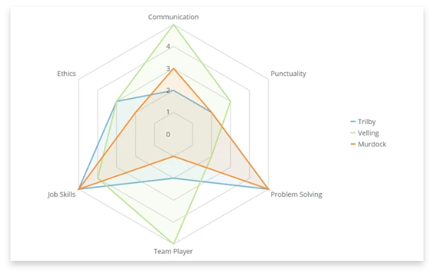
Example: How a marketing campaign performs across key metrics like cost per lead, unique visits and conversion rates that are plotted on a scale.
8. Pictogram
The final comparison is the pictogram, a unique way of making your data more interesting. This layout shows the magnitude of a particular stat or data point, like fractions or percentages.
Example: Adding shading to icons to show the effectiveness of specific marketing channels.
Layout type #2: Composition
Composition layouts can grab audience attention and segment data to show benefits or spending.
Here are three composition layout options to test out ⬇️
1. Pie charts
The trusty pie chart shows data percentages and proportions by dividing them into slices. It's most effective when breaking down data around finances or customer segments.
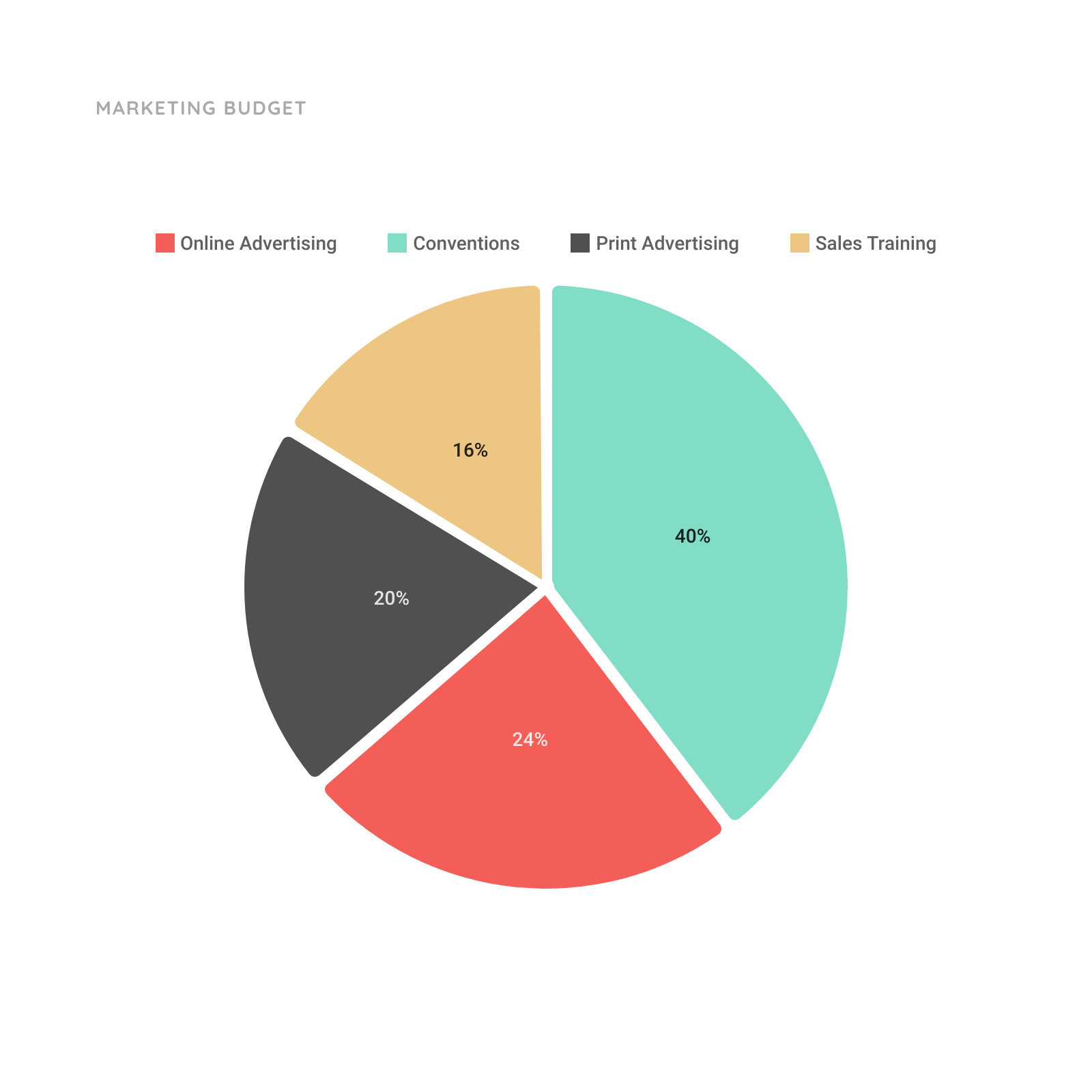
Example: Revenue percentages from different customer segments over a year.
2. Stacked bar graphs
This graph segments data using bars that are placed on top of each other. If you have several categories of data (with smaller subcategories) that are related to each other, it can present it all in a single graph.
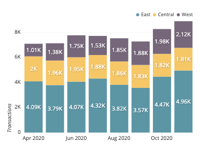
Example: Revenue percentages from different customer segments across multiple years.
3. Tree maps
Finally, tree maps can help present hierarchical data sets that are tied to quantities. Each category is given a rectangle area with subcategory rectangles nested inside of it, creating a "tree" structure.
Example: Recommended spend for marketing across various customer segments and channels.
Layout type #3: Trend
Finally, trend layouts accurately present data points over time. This is the chart to use if you need to present timelines, project progress or financial numbers to your audience.
Here are four trend layouts to add to your next presentation ⬇️
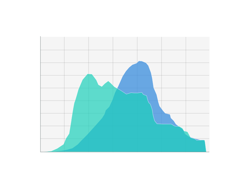
1. Histogram
Histograms distribute data over historical periods. Usually, each bar represents an interval or time period placed next to each other so the audience can see changes or patterns in a data set.
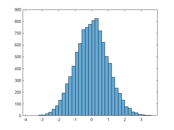
Example: Number of category five earthquakes yearly in a certain area since 2000.
2. Mind graphs
If you are presenting datasets with quantitative values over a specific time period, mind graphs are an ideal choice. This graph plots trends based on data when the number of data points is very high to highlight a specific timeframe to the audience.
Example: Average intensity of earthquakes every year since 2000
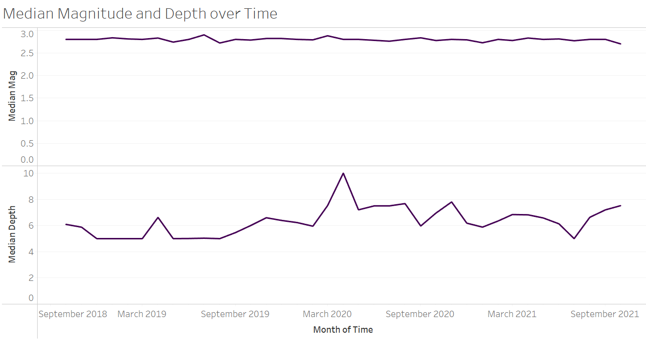
3. Area graphs
Otherwise known as line charts, area graphs show an area below a line filled in with a certain color to indicate movement. Data points are usually joined across the graph to form a line to create a timeline of events.
Example: A sample of some intensities of all earthquakes each year since 2000
4. Candlestick charts
Finally, candlestick charts plot movements like price and cost. It's most effective when presenting financial data points to investors or shareholders.
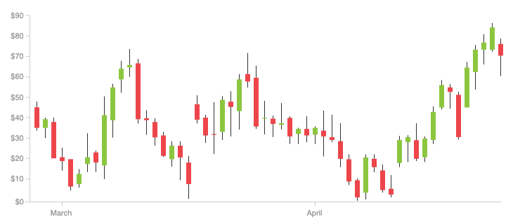
Example: A candlestick for one day to represent 30 days over a sales campaign and how much revenue was earned throughout the month
Choosing the right data layout can make your slide shine—spend time picking one that works.
Two expert tips for presenting engaging data
Data is crucial to almost every presentation.
But present too much of it or do it incorrectly, and you risk overloading your audience and losing their attention.
Here are two ways to add data to a presentation without ruining it ⬇️
1. Do not mislead
Misleading data is one of the fastest ways to lose your audience's attention and, more importantly, their trust.
Even small details, like changing the scale on the y axis of a graph, can make the differences between bars look larger than they are. Presenting annual revenue in a cumulative chart or inverting the axis of a pie chart to reduce the impact of bad news may seem like a good idea, but it's essentially lying to your audience.
Look at these examples:
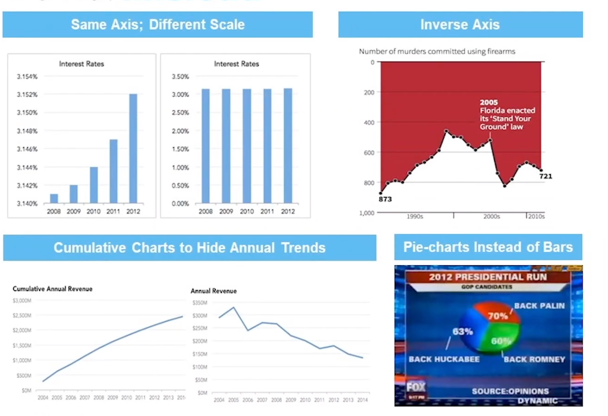
These charts are inaccurate, but the pie chart is particularly misleading. When the three segments of the pie are added up, the sum is greater than 100%. A small change, like a bar graph, would help communicate the data more accurately.
2. Make your point
Don't be afraid to highlight data so your audience takes notice.
Add arrows to a bar graph to show a specific data point, or draw a box around a specific column to emphasize its importance. For example, if a company has released a new product and has recently hit 1000 sales, highlight this milestone on the timeline, so the audience focuses on it.
The same tip goes for presenting negative trends. If revenue is down or customers are churning, emphasize when and where so your audience pays attention.
Expert Corner: How Bob Dvorak tells stories with data

Before founding Adaptam, Bob Dvorak spent a decade at McKinsey leading teams in media, sales, marketing, and tech.
Over that time, he learned a thing or two about how to engage audiences with important people in them. He says the first big step, if possible, is meeting with audience members before your presentation.
"When you've got multiple sets of players, what you want to do is actually pre-meet them. Give them the information in the data form that they require."
According to Dvorak, meeting with key players beforehand has two major advantages: you satisfy their need for knowledge, and you hear any major concerns ahead of time. This helps you refine the presentation and cut out any unnecessary slides or information.
"Make sure that what you're presenting is actually the least amount of information you need to be compelling," Dvorak says.
"All too often, people fall in love with an analysis or a chart they built, but it no longer fits their story. Fine, put it in an appendix, but don't present it."
And for those of you meeting with decision makers and executives, Dvorak has an important reminder: these people are tagline oriented.
"What you want to do is feed them some tag lines that both they can remember and that they're going to repeat," he says
"They're going to be obviously much more interested in big picture ramifications, so you have to anticipate those kinds of questions."
Layouts are crucial to effective data communication
Data is the foundation of any presentation, but your audience won't absorb it if it's not communicated effectively.
Layout choices for specific datasets will help make statistics and percentages easier for your audience to engage with. Take time to choose charts and graphs that communicate your data effectively and add an extra element to your presentation.
The right presentation layout is a shortcut for ensuring that your audience leaves with knowledge and data.
Check out our guide to ensure you're presenting your data effectively.
Related Guides


