Using color and space effectively
Don’t let your words do all the talking.
Use your slides. A slide presentation is your chance to use design to communicate your message to an audience. And if the design is off, your message will be drowned out.
The use of color, shapes, and white space is an important learning curve for any presenter. With a few simple techniques, you can make sure every slide in your presentation counts and complements your words instead of overwhelming them.
This guide will show you how to do just that.
Table of contents:

3 tips and tricks for using color in presentations
Colors are not just limited to being aesthetic components.
They have the power to influence the perception of products. For designers, choosing the perfect color is like second nature—a science—often referred to as color theory.
Let's take a closer look at what this means ⬇️
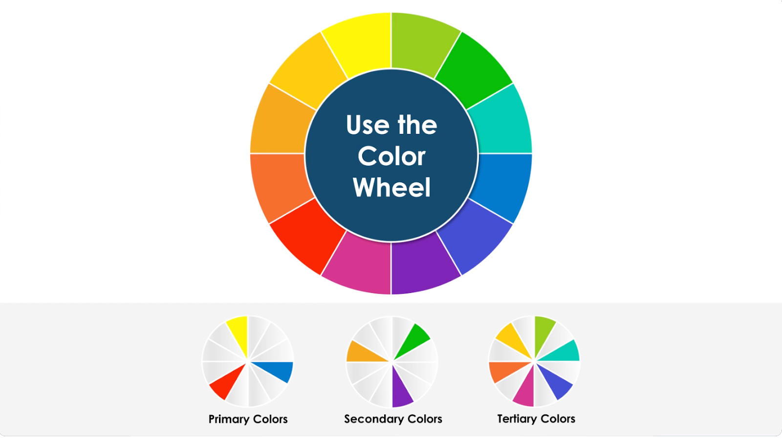
1. Use the color wheel
The color wheel is composed of 12 colors, broken down into three categories: primary, secondary, and tertiary.
According to Kris Decker at 99designs, color theory starts with understanding the color wheel, where colors are separated between warm (reds, oranges, yellows) and cool (blues, greens, purples):
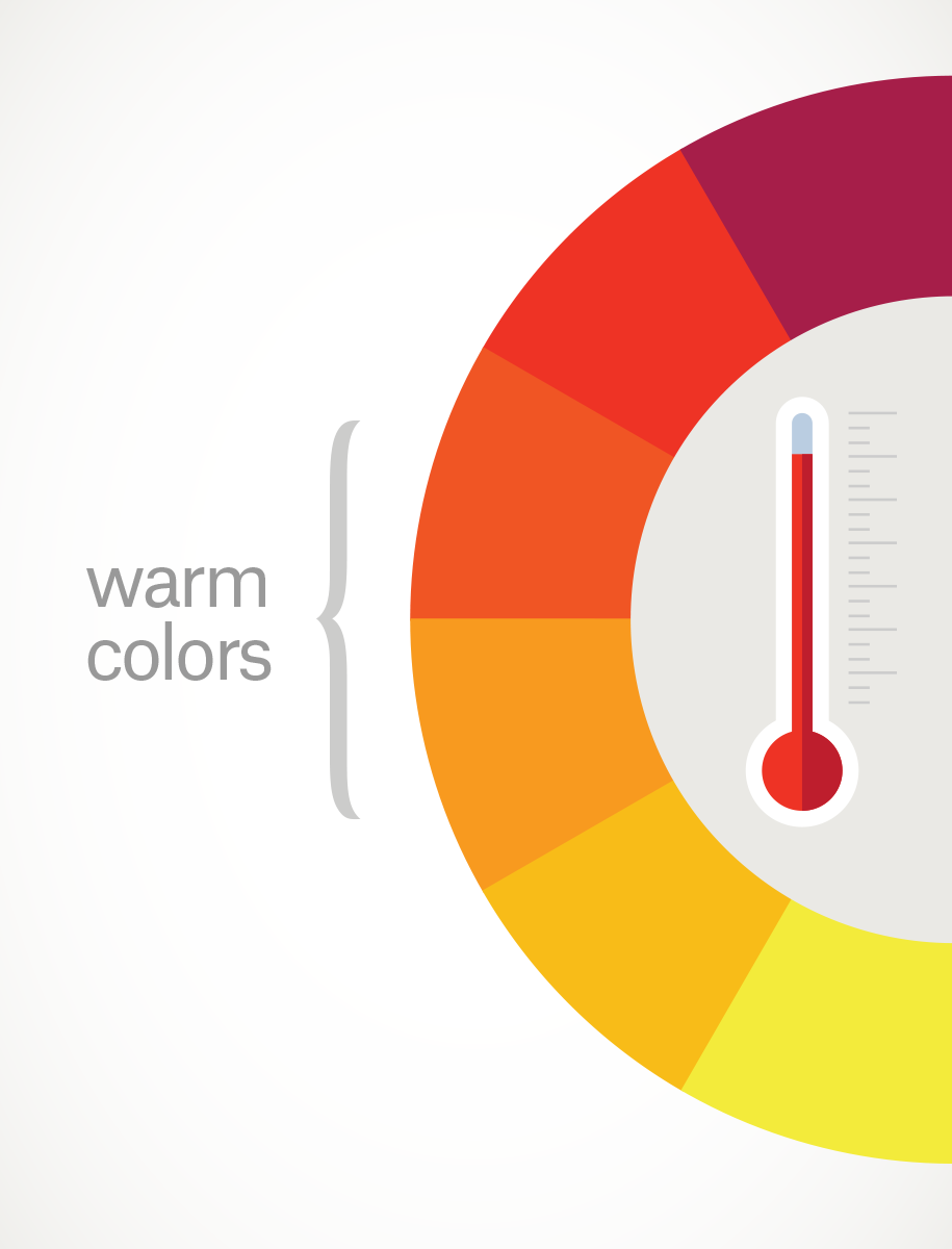
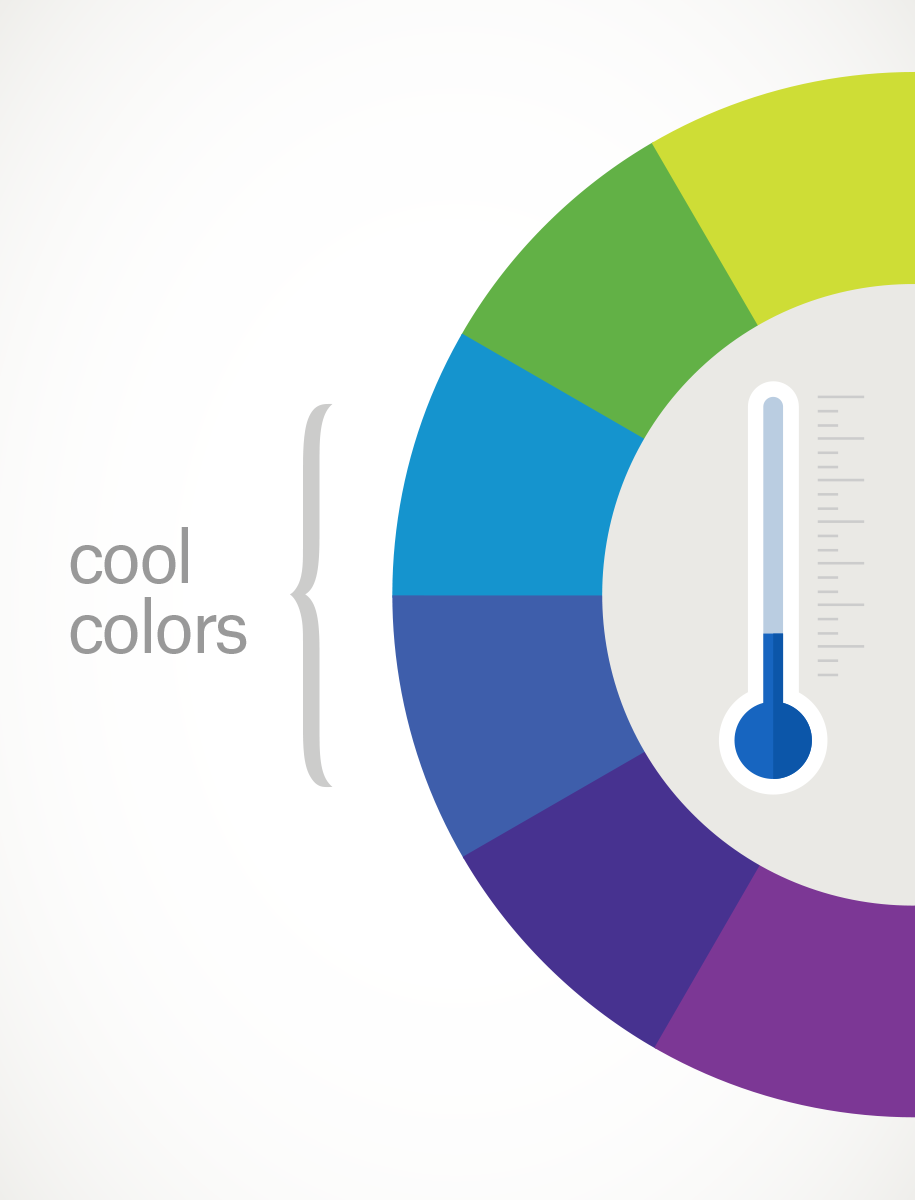
"Warm colors are generally associated with energy, brightness, and action, whereas cool colors are often identified with calm, peace, and serenity," Decker writes.
"When you recognize that color has a temperature, you can understand how choosing all warm or all cool colors in a logo or on your website can impact your message."
From there, the color wheel can be broken down into three different schemes:
- Analogous colors. These are low contrast, but perfect for a softer-looking design. Analogous colors are created by pairing a primary color with two adjacent colors.
- Complementary colors. These are high contrast and used in presentations to create eye-catching designs. These are built using colors directly opposite each other on the color wheel. You'll usually find complementary colors in football jerseys or food banners, where brands have mere seconds to grab someone’s attention.
- Triadic colors. A selection of three colors picked from those evenly spaced out on a color wheel. (e.g. red, yellow, blue)
First, let's look at an example of using colors the wrong way. This slide has some fatal design flaws:
The color backgrounds on the text boxes don't complement each other and are jarring for the audience. Using a bright color, like yellow, while overlaying white text makes it incredibly difficult for the audience to read. And the mismatched use of so many colors is visually distracting.
But if we take the skeleton of the slide design and change it to a complementary color scheme, this is what happens:
Not only does the slide look more professional, but it's easier for the audience to read and doesn't take attention away from the speaker.
That's the power of the color wheel.
2. Use tint, tone, and shade
Editing colors with tint, tone, or shade can add depth to a conversation point or change the mood of a slide.
Each element works differently:
- Tint adds a white hue so the original color is paler
- Tone adds a grey shade to original colors
- Shade adds a small amount of black to original colors
It's always a good practice to use tints, tones, or shades to figure out what intensity you want to communicate when using them. Here an example of using tints in a slide:

It's hard for the audience to figure out what is being communicated in the slide. Although each hue of blue is tinted with white, the elements are not presented in order of intensity. However, if we stack the elements from darkest to lightest, we get this instead:
It's easier for the viewer to follow the process and a speaker can use this color gradient to communicate a timeline or progress in a project without having to say that directly.
3. Stick to the rule of 60-30-1
The final technique is 60-30-10, where space is designed to have 60% dominant color, 30% secondary color, and 10% accent color.
According to UI/UX designer Fidel Komolafe, primary colors can be used for the main elements of a design like a background, while the secondary elements should make up text or icons. To finish up, the accent colors can be added to smaller parts of a design like call-to-actions.
"The beauty of this rule is you can switch things up and play with variations using the generated palette."
Let's take this Komolafe's color palette as an example:
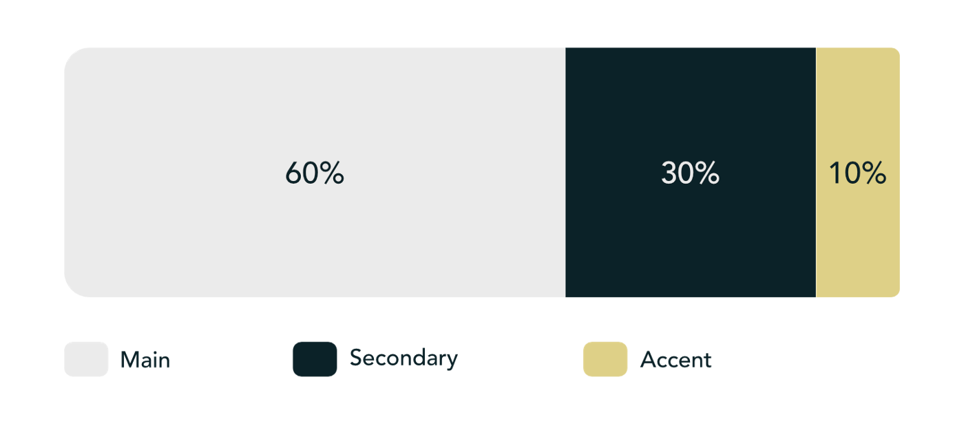
Using the three colors, different designs can be created by switching between the primary and secondary colors while leaving the accent color in place:
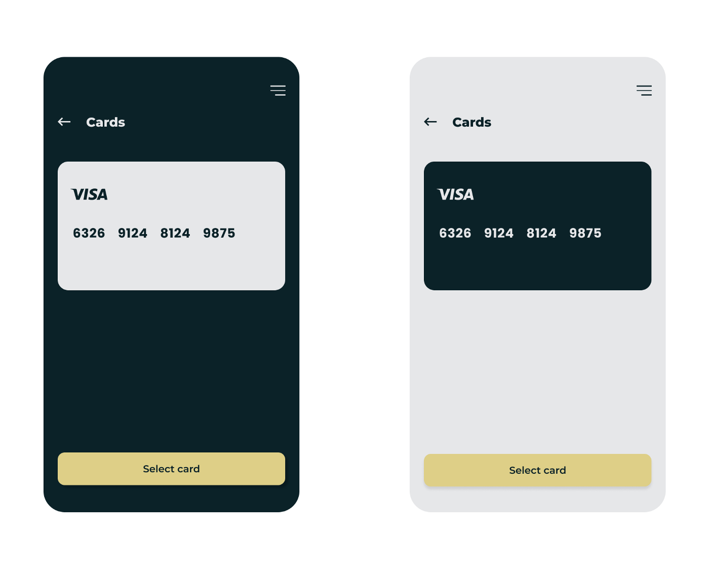
If the rule isn't followed, it can lead to distracting designs that lose the audience.
How to give slides room to breathe
Ever heard of the saying: when you try to please everyone, you please nobody? 🤔
The same goes for slide design
If you attempt to make each element equally important or force too many elements onto a single slide, your viewers will get distracted and hear nothing. Creating white space and visually explaining information to customers is a critical part of any presentation.
It's better to say more with less in a slide design. Giving text and images room to breathe allows your audience to focus on important aspects of your presentation without getting distracted.
Here are three pro tips for creating space in slides ⬇️
Tip 1: Balance images with blank space
Images and illustrations are almost always used in presentations to give audiences a visual reference or explanation.
However, there's a danger when using these elements as they can easily overpower text or data on a slide. For that reason, always balance images with blank space to help the audience grasp what you're trying to say.
Take a look at this slide:

At first glance, it looks okay. But it's tough for the viewer not to focus entirely on the magnifying glass as the bold colors behind it swallow up the text.
If we take that same slide and create some space (while using a similar image), here's what happens:

The blank space using a grey background brings balance to the slide and keeps the focus on the message and presentation theme—not the stock image.
Tip 2: Let your content breathe
Your audience can only consume content like text and data if it has space to make its point.
Using white space (or negative space) can increase reading comprehension and help your content breathe. Check out this example from Digital Ink:
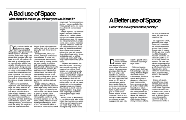
What do you notice? 🤔
The publication on the left uses every inch of space available, resulting in a cramped design. The layout on the right adds distance between the headings, image, and main text. This small (yet powerful) shift in design gives the reader a chance to concentrate on each element of the page without being overwhelmed.
Brands like Apple and Google have used white space as a key element in their presentations for decades. The well-known presentation, How Google Works, by ex-CEO Eric Schmidt and former SVP of Products Jonathan Rosenberg, is just one example. Look at the presentation's opening slide:

A simple illustration, a logo, and some text. That's it. The rest is white space.
The design continues throughout the presentation, even when the presenters discuss complex topics like strategic foundations and technology stacks:

White space allows the content to speak for itself and focuses the audience on the speakers rather than overwhelming slide designs.
Tip 3: Utilize space beyond the canvas
Make every inch count and utilize the space beyond the slide canvas.
To understand this technique, take a look at this slide:

What do you notice?
Although the slide is presented in landscape view, the image is jammed between the heading and dot point text. As the image takes up most of the space on the slide, the aspect ratio is knocked out and makes the design look unprofessional. However, with some small changes like extending the image vertically, this can be fixed:

The main elements of the image are still there, but an invisible barrier has been formed between the text and image, making for a cleaner design.
Remember, empty space can be as powerful as the primary object on any slide.
Next time you design a slide—give it space
The message in this guide is a simple one: when it comes to slide design, say more with less.
Presenters are quick to add as much as they can to every slide in their deck, but this can be a fatal mistake and lead to your audience losing focus. Exercise constraints and use the color wheel, balance, and white space to highlight important elements on every slide.
Give your content the room it needs to breathe so your verbal presentation will resonate better with a focused audience.
Want to learn more about presentation design? Check out Prezent's detailed guide on communicating ideas.
Related Guides


