No items found.
No items found.

In the fast-paced business world, you must come across at least one presentation daily. However, many of these experiences likely involve lackluster presentations—text-heavy slides, disengaged audiences, and forgettable content. Even the presentations you've worked on may leave you with a sense of something missing.
Effectively presenting information is an art; in today's communication landscape, a well-designed presentation is crucial. Presentations go beyond well-researched text; it's about weaving a compelling story presented with a balanced design.
This comprehensive guide aims to transform your approach, providing a roadmap for designing presentations that leave a lasting impression.
Presentation design is the deliberate arrangement and visual representation of information to convey a message. It goes beyond mere aesthetics, focusing on creating an engaging, coherent, and impactful narrative through a combination of visuals, text, and structure. A good understanding of presentation design can help you convey your message impactfully while ensuring that your audience is engaged throughout the presentation.
The significance of presentation design lies in its ability to enhance communication. A well-designed presentation captivates the audience and facilitates better understanding and retention of information. It transforms a mundane data dump into a compelling story, ensuring that the audience not only hears but truly absorbs the message. Not only this, but research suggests that 91% of the presenters feel more confident when presenting with a well-designed presentation.
Striking the right balance of design elements in your slides not only engages the audience but also encourages active listening. This not only establishes your credibility and trust but also entertains the audience, creating a more impactful and memorable presentation.
Below are a few tips that will help you elevate your presentation with the right design and impact.
Understanding your audience is the first step in creating a successful presentation. Research your audience and learn about their preferences, expectations, data consumption preferences, etc.
The initial step in creating a successful presentation is understanding your audience. Thoroughly research their preferences, expectations, and data consumption habits. To establish a genuine connection, shift your focus from your product, service, or issues to what your audience truly needs. Center your presentation around their desires and cater to their needs.
A skilled presenter identifies valuable insights that align with the audience's pain points, offering solutions and methodologies to address their concerns. By prioritizing the audience and addressing their primary challenges, you can build trust and resonance, positioning yourself as an expert they can rely on.
You can use surveys or analyze past interactions to understand what your audience prefers. Continuously gather feedback after your presentations to make ongoing improvements. This will help you to customize your content so that the presentation resonates with your audience, ensuring maximum engagement.
Discover the art of making your audience the focal point of your presentation in our blog titled "Your Audience is Your Hero." Dive into five actionable strategies that guide your audience through your business presentation, positioning them as the heroes of the narrative. Learn how to effectively engage your audience and ensure they play a central role in the story you're telling.
Avoid overwhelming your audience with too much information. Instead, focus on a single, compelling message in your presentation. A concentrated theme transforms a scattered array of information into a memorable experience, ensuring your message resonates with the audience.
Additionally, be mindful of text length. Lengthy or overly brief text can be irritating to the audience. An insightful survey on Annoying PowerPoint explores why presentations have become more annoying instead of being an insightful tool.
Craft your presentation around a singular core message. By pinpointing this central theme, you ensure that every element in your presentation aligns with the overall goal. Your presentation design should prioritize clarity, conciseness, and a seamless flow to effectively convey your message. Refine your approach to guarantee a focused and impactful presentation that resonates with your audience.
A strong presentation outline is a foundational and integral part of good presentation design. It serves as a guiding star for you as well as the audience by ensuring a clear and logical flow of information.
An outline provides clarity on the structure of the presentation by organizing key points, supporting details, and transitions between topics. It prevents information overload and keeps the audience focused on one idea at a time. It also assists in efficient time management as by breaking down the content into sections, you can allocate appropriate time to each part, ensuring that all essential points are covered in a definite time frame.
This will also help you to come up with a compelling storyline helping your audience engage and register the information shared in your presentation. According to studies, 63% of the audience remembers the information when shared using a good storyline.
Learning how to create a storyline for a presentation is a skill that can be cultivated and learned. By meticulously constructing a strong presentation outline, you enhance your clarity and create a roadmap for a captivating presentation that resonates with your audience.
Learning to build a captivating story for your presentation is a skill you can develop. By carefully creating a strong outline, you improve clarity and create a roadmap. This roadmap becomes a guide to delivering an engaging presentation that connects with your audience.
Using visuals is a powerful way to grab your audience's attention and keep them engaged during a presentation. Research shows that non-verbal communication, which includes visuals, contributes to 55% of a presentation's effectiveness, while text only adds 7%. So, using less text and focusing on visuals can make your message more impactful. It's recommended to present one idea per slide, using bullet points and images to convey information effectively.
Visuals can be used interestingly. For example, a flow chart to depict a process can help you to explain complex information in a very simple manner. Pay attention to elements like color, space, shape, value, line, and texture in your visuals, as they play a significant role in capturing your audience's interest. Learn how to strategically use these elements to create an engaging and memorable presentation with our blog on “The basics of good presentation design”.
Learn the essential visual elements for creating an attractive and engaging presentation. This knowledge will help you craft slides that captivate your audience, making your presentation memorable and impactful.
Color is a foundational element in design, particularly in presentations. Establishing a primary color palette based on the company's main colors creates a cohesive and professional look. Utilizing contrast in both colors and fonts is crucial for emphasizing essential information and ensuring readability.
Consistency is key in presentation design. Employing the same colors for headings, body texts, and icons enhances the overall coherence of the slides. While brand colors contribute to relevance, there's flexibility to introduce additional colors for specific messages or emotions.
Color, as a design element, can reinforce and amplify messages. Injecting strategic bursts of color not only highlights key information but also aids in distinguishing between different pieces of content, enriching the overall impact of the presentation.
Our blog on “How to choose the best colors for your presentation” discusses color significance in detail and shares 6 tips to help you choose the best colors for your presentation.
The role of space, particularly white space, is pivotal in maintaining audience focus. Achieving a harmonious balance between visuals and blank space is crucial for directing attention to the core elements of each slide. Inadequate white space can hinder the visual appeal and understanding of your presentation. Therefore, it is imperative to provide sufficient space, allowing your message and data to resonate effectively and ensuring a visually appealing and comprehensible presentation.
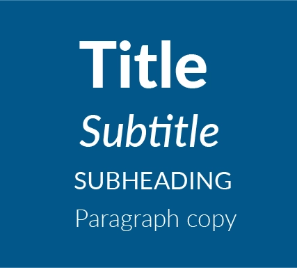
Typography, or the style and appearance of text, plays a crucial role in how your presentation communicates with your audience. It involves selecting the right fonts and determining the appropriate size variations to ensure that the text is not only readable but also visually engaging.
Improving text readability involves careful consideration of the fonts you choose and adjusting the size to suit the content. Additionally, typography allows you to strategically emphasize certain information by making changes to the font size, style, and alignment. For instance, you might use a larger or bold font for important headings or key points.
Another essential aspect of typography in presentations is creating a content hierarchy. This means using different font styles and sizes for headings, subheadings, and body text. Bold headings and distinct subheadings, possibly in a different font, help guide the viewer through the presentation, allowing the presenter to highlight and prioritize the most critical information on each slide. This thoughtful use of typography not only enhances the visual appeal of your presentation but also contributes to the overall effectiveness of your communication.
Typography is a detailed topic, and it's useful to research it thoroughly to understand its details. You can learn more about its significance in effective communication and design by reading an article on the importance of typography in graphic design.
Incorporating relevant and high-quality visuals, such as images, graphs, and charts, is essential for improving the understanding and engagement of your presentation. Surprisingly, the human brain processes images 60,000 times faster than text, as supported by data. This emphasizes the significance of leveraging images to make presentations more interesting and visually appealing.
Carefully selected visuals, including images, graphs, and charts, not only highlight the theme but also support the message, creating the right atmosphere and enhancing engagement. By using these elements, you can create images that captivate your audience and clearly convey your points.
In data-heavy presentations, visually appealing charts and graphs play a crucial role in simplifying complex information and emphasizing key points. Well-designed visual elements not only add style but also contribute to better comprehension.
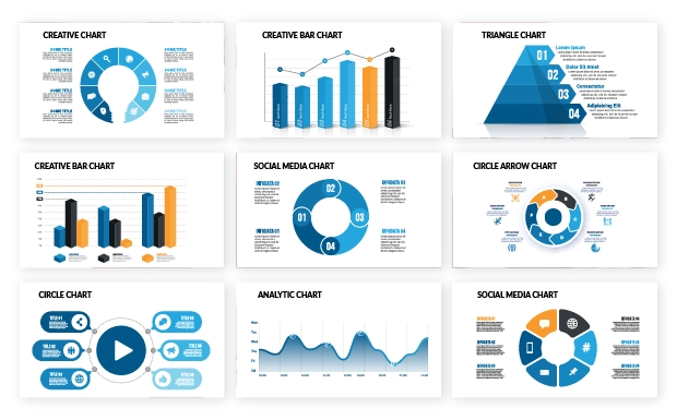
To explore different chart types and their effective usage in presentations, check out this insightful blog on data visualization. It provides valuable information on maximizing the impact of visuals in your presentation design.
The visual hierarchy of a presentation plays a crucial role in shaping the audience's experience and determining how they interact with the content. Elements like layout, font, color, and images work together to establish a visual hierarchy. As discussed in the Typography section, text hierarchy, including main headings, subheadings, and body text, guides the audience through the content in a specific order.
The design layout of slides involves strategically placing text, charts, and other content elements. A well-designed presentation maintains a consistent style across slide layouts with subtle variations to emphasize key messages. Consistency in visual theme, font, and color scheme is vital for achieving a polished and professional look throughout the presentation.
Explore our article titled "Visual Hierarchy: Secrets of Smart Presenters" to uncover how savvy presenters craft thought-provoking and memorable presentations through a skillful blend of three key disciplines: compelling visuals, positive user experience, and psychological insights. These components synergize to create an unforgettable and engaging presentation experience. When these elements seamlessly work together, the result is a presentation that captivates the audience and leaves a lasting impression. The harmonious integration of these elements ensures a positive audience experience and contributes to the overall memorability of the presentation.
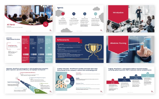
Explore these five compelling presentation designs for inspiration, each tailored for specific business needs. From Board of Directors meetings to Brand Performance Reviews, Business Cases, Communication Plans, and All-hands meetings, these presentation templates are crafted to ensure clarity, engagement, and effectiveness in conveying your message to diverse audiences.
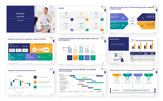
These are well-structured and professional slides for precise data visualization in your board of directors. Find tips and more sample template options for creating BOD presentations.
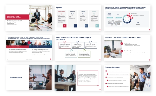
Make brand performance review meetings easy and result-oriented with these templates. Find tips and more sample template options for creating Brand review presentations.
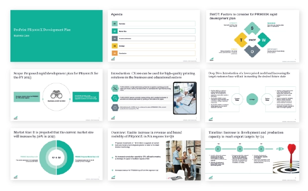
Professionally designed templates to effectively present your business case to stakeholders. Find tips and more sample template options for creating Business Case presentations.
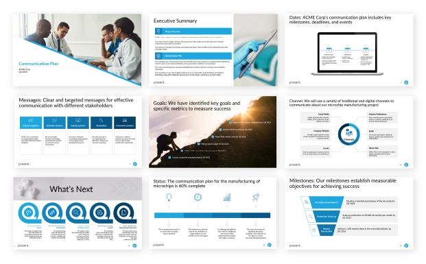
Ensure clarity and streamlined workflow in presenting communication plans with these effective templates. Find tips and more sample template options for creating Communication Plan presentations.
Engage different teams and employees effectively with these templates for engaging All-hands presentations. Find tips and more sample template options for creating All-hands presentations.
Explore how Prezent can elevate your presentation designs and empower you to create impactful templates.
In-built storylines: Prezent's in-built storylines help you craft narratives that captivate your audience and ensure a cohesive flow in your presentations.
Hyper-personalization: Tailor your presentations to perfection with Prezent's fingerprint feature which allows you to customize content for a more targeted and effective delivery.
Easy brand compliance: You can ensure brand consistency effortlessly using Prezent’s Compliance Checker tool designed to simplify brand compliance and maintain a polished, professional look across all presentations.
Engaging visuals: Prezent’s Slide Library helps you elevate your presentations with engaging visuals, making it easy to capture and maintain your audience's attention throughout your presentation journey.
Uncover the full potential of Prezent by registering for a free trial and experience firsthand how this tool can transform your presentation creation process. Additionally, you have the option to schedule a demo for a comprehensive walkthrough, ensuring a thorough understanding of the tool's features and capabilities.