Effective data visualization
Have you ever been puzzled by a statistic or number? 🤔
News reports are filled with statistics that are hard to relate to. Billionaires have bank accounts we can't fathom. Inflation percentages are flashed across televisions without explanations. These are examples of data that are not communicated to audiences visually. Static numbers make it hard for audiences to connect the dots.
The good news: If we communicate data visually or use objects the audience can relate to, it adds another dimension to our presentation.
This guide will teach you how to turn data into visual representations to keep audiences engaged.
Table of contents

Three ways to make (any) data relatable
Data can be hard to relate to—even if it's communicated succinctly.
When a news reporter talks about a 10% rising inflation, it's hard for our brains to figure out what that means in our daily lives. But if 10% is tied to an object (e.g. a gallon of milk has risen from $4.30 to $4.66), we instantly see the impact.
Take a look at this Forbes headline from 2018 about Jeff Bezos' soaring wealth:
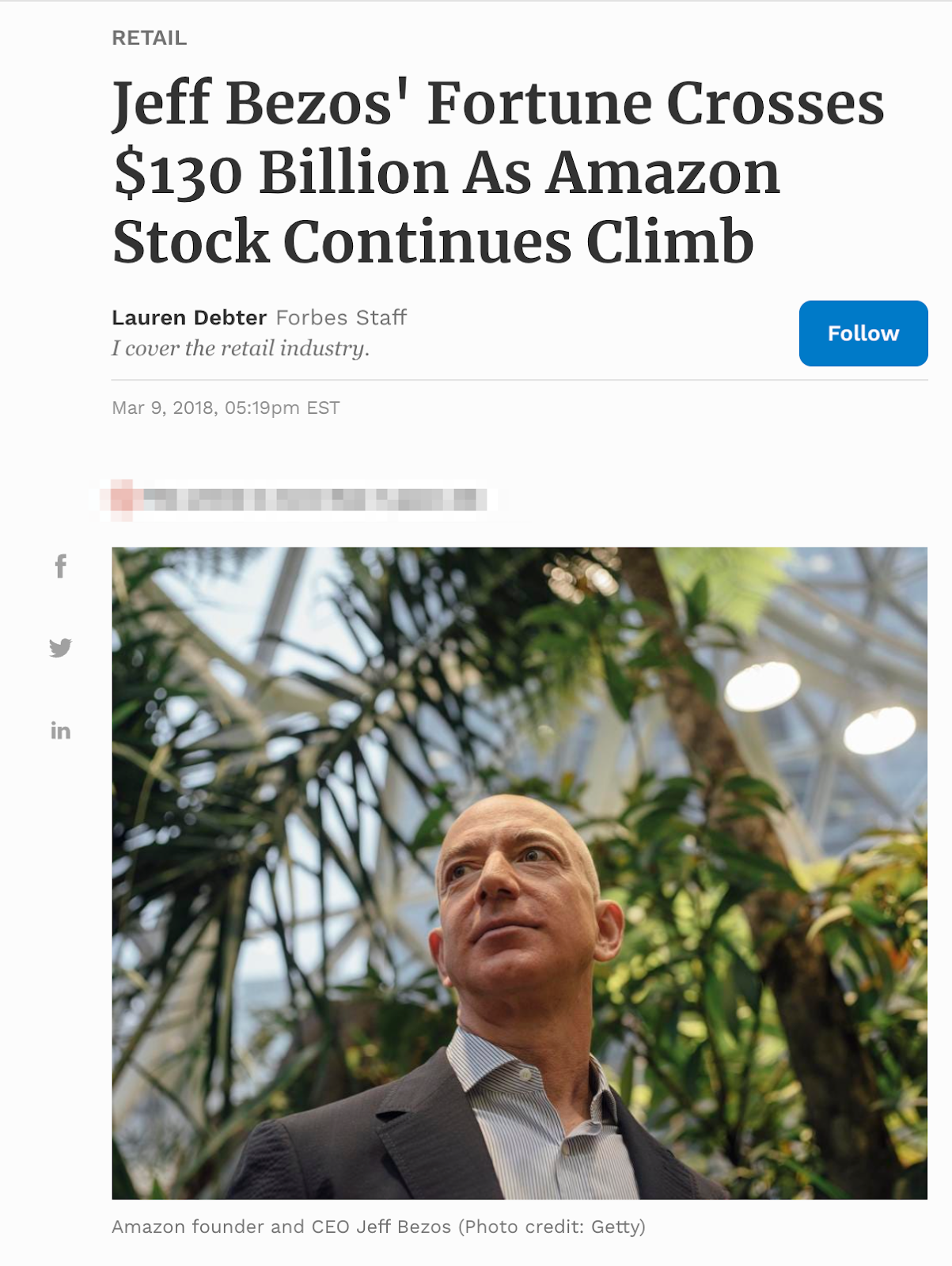
Is there a better way to communicate the same data?
Effective data visualization is not just about beautiful charts and graphs. The goal is to create an emotional connection with the audience. Data is more relatable if timeframes, like work hours or comparisons, are made against objects the audience is familiar with, like houses or popular buildings.
Let's look at how the Forbes data can be communicated using these techniques 👇
1. Time 🕜
Data is more relatable if it's communicated next to timeframes like hourly wages or times between cities or historical periods.
Let's jump back to the Forbes article about Jeff Bezos' fortune.
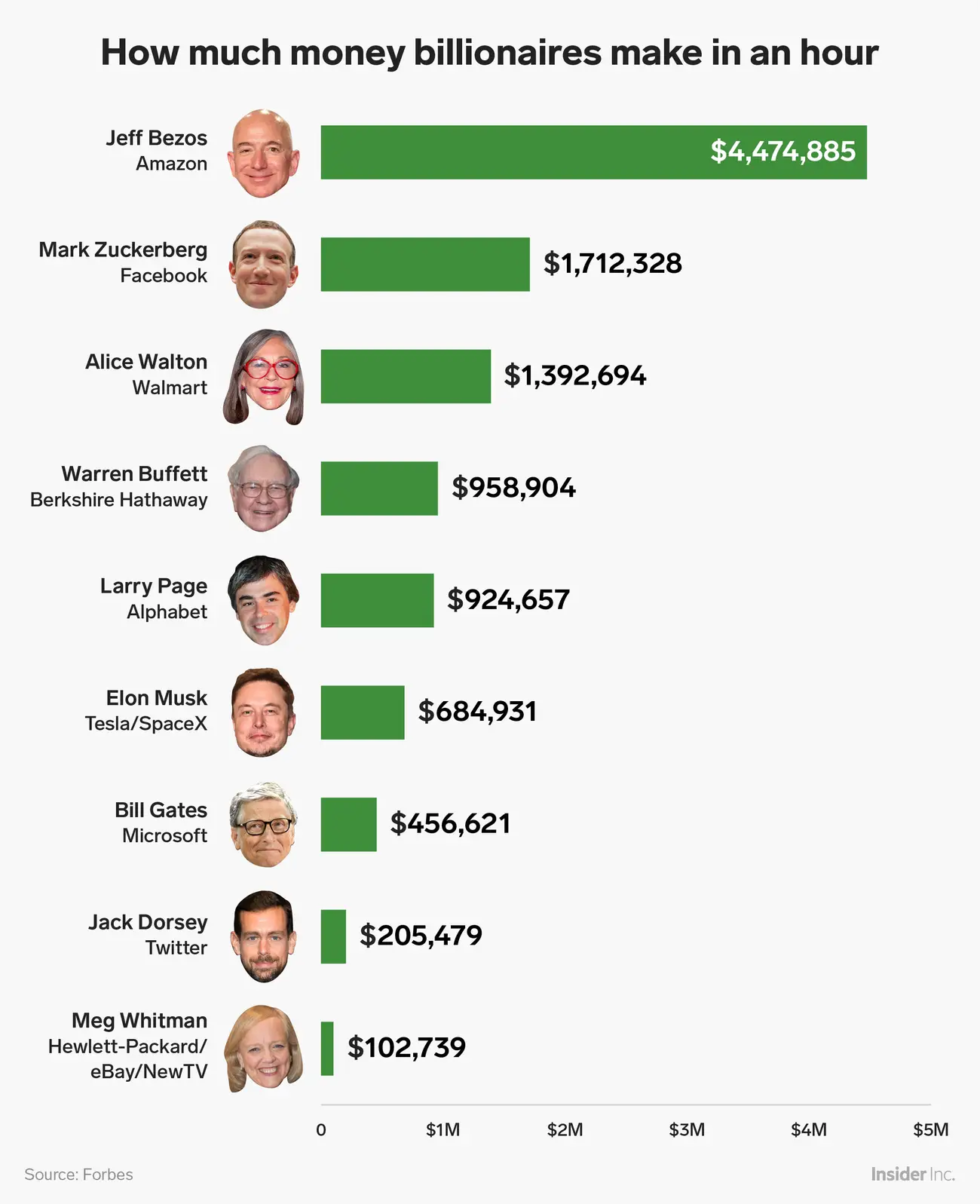
We can rephrase the $130 billion into a timeframe the audience can relate to, like a monthly salary or an hourly wage. At the time the article was published, Bezos made over $4 million an hour, which is staggering to read when the U.S. national average was $23/hour. This data is even more effective if plotted on a graph—check out this example from Business Insider:
According to Yahoo, this figure has climbed (a lot) since the Forbes article was published in 2018. Bezos is now worth an estimated $202.7 billion, a huge figure for our brains to comprehend. But here's what happens if we break the data down into relatable timeframes:
- $6.25 billion a month
- $1.44 billion a week
- $205 million a day
- $8.56 million an hour
- $142,667 a minute 🤯
Presenting the data using a relatable metric like time helps the audience understand just how vast Bezos' wealth is.
2. Objects 💰
Using people, places, and objects familiar to the audience is also an effective way to communicate data points.
Again, the figure of Jeff Bezos' wealth ($130 billion) can be used to demonstrate what this means to people who have purchased a house or are interested in social issues. For example, Bezos' wealth could buy a new house for every single homeless person in the United States, and he would still have over $19 billion left.
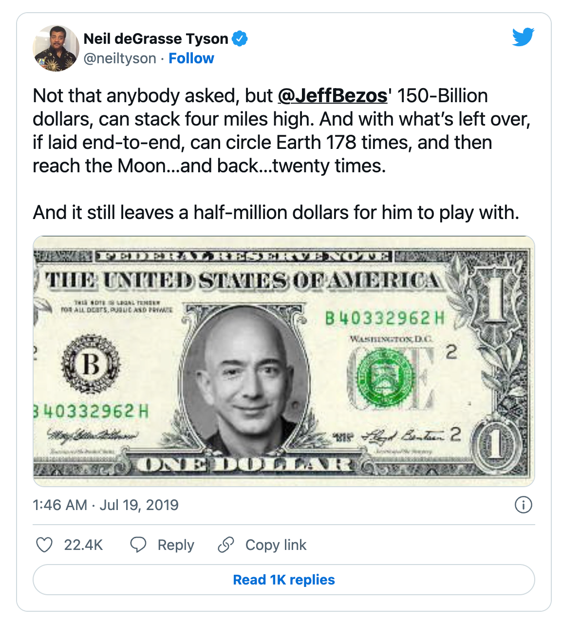
Measurements like length, width, and height can also be used to make a point to an audience. Astrophysicist Neil deGrasse Tyson used this approach when contrasting Bezos' wealth to the dimensions of Earth.
Use relatable timeframes and objects to help your audience visualize data with ease.
Lessons from the world's most famous graph
Napoleon Bonaparte is widely considered to be one of the greatest military leaders in history.
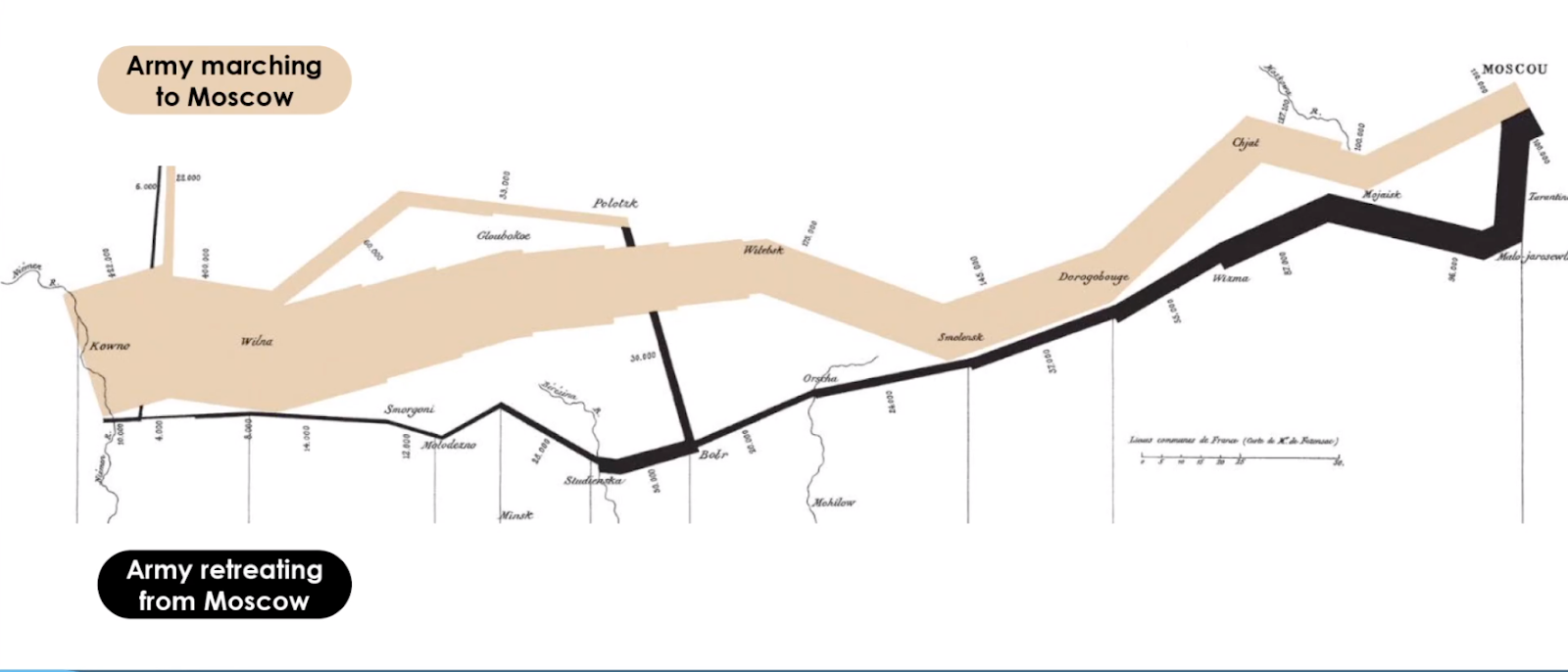
But his standing came under question in 1812 when he and his army—the largest in Europe—invaded Russia. Napoleon's troops left Poland with around 600,000 troops, but by the time they reached Moscow, only 100,000 remained.
When the war was over, and the army eventually returned to France, only around 30,000 troops were alive—roughly 5% of the original troop numbers.
Many historians consider the invasion the key reason behind Napoleon's eventual downfall. But digging into the data of the events, like geography, weather, and army size, gives us a clearer picture of why Napoleon's strategy failed.
Charles Joseph Minard examined the war from beginning to end and captured the most important data points on a single graph:
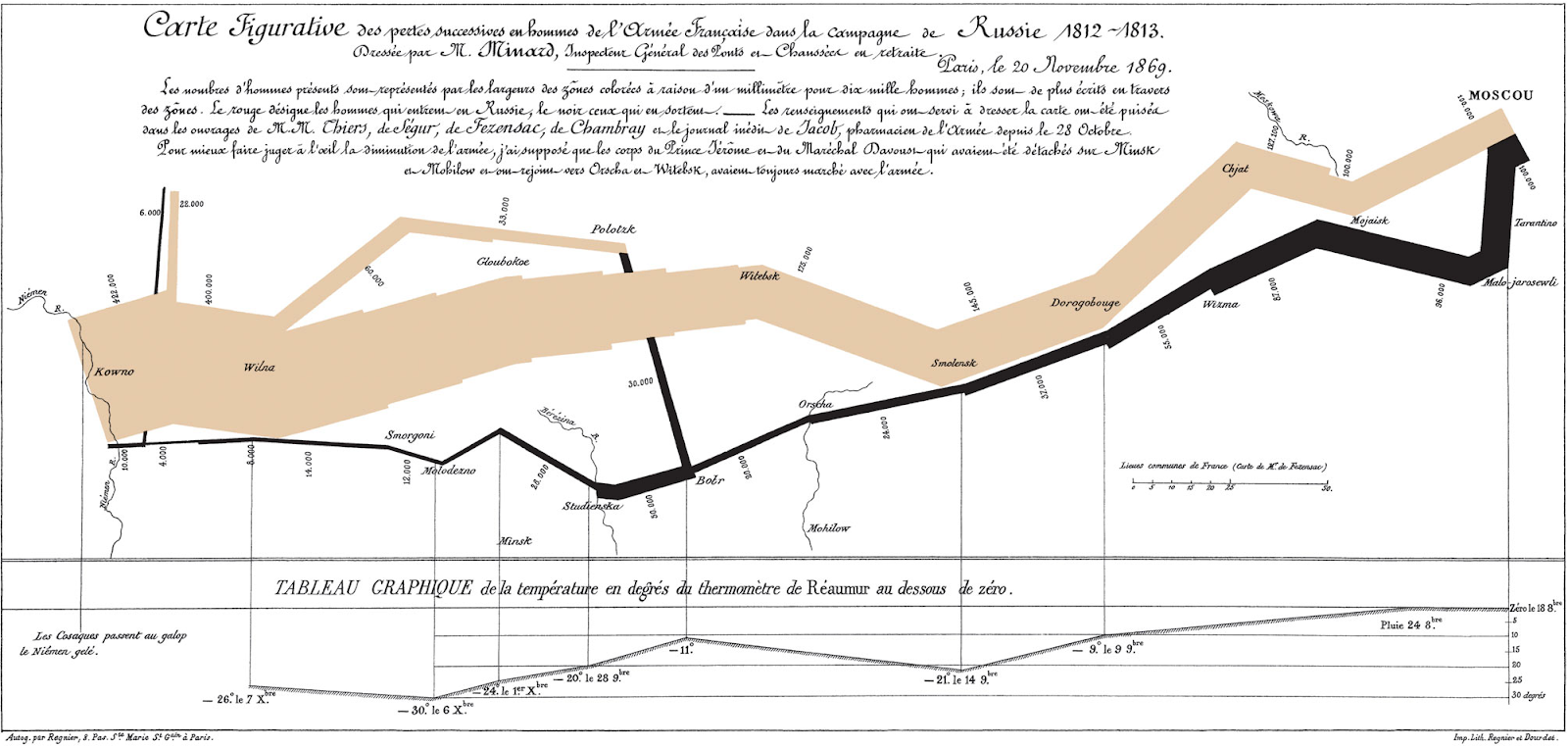
The data tells a dreadful yet accurate story of the war despite the complex elements involved. The visual display of quantitative information makes it one of the best statistical drawings ever created for three reasons:
- It balances multiple variables with simplicity
- It enforces visual comparison
- It illustrates causality between important factors
Let's take a closer look at why each data point on the graph is so valuable ⬇️
1. It balances multiple variables
Minard's chart shows six types of information:
- Dates
- Number of troops
- Direction of armies
- March distance
- Marched geography
- Temperature
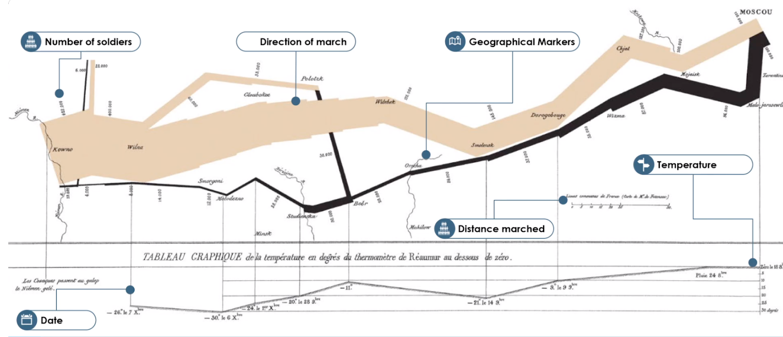
Presented individually, these data points don't help the audience figure out why Napoleon's invasion failed. But take a closer look. The width of the beige and black elements represent the size of the force at a scale of one millimeter to 10,000 minutes. This helps the audience visualize the loss of troops over crucial periods (like the dropping of temperatures and invasions of cities along the way) to see where the army encountered trouble.
2. It enforces visual comparison
The varying thickness of adjacent beige and black lines highlight how Napoleon's troops dwindle as they enter deeper and deeper into Russia:
Analyzing the army from total troop numbers compared to retreating totals allows us to compare when they faced major losses. If the troop numbers are tied to other markers on the graph, like march distances, we can also make assumptions about whether troops were deprived of food and supplies because of the length of the war.
3. It illustrates causality between important factors
Finally, the temperature chart at the bottom shows the impact of the cold Russian weather on the French troops.
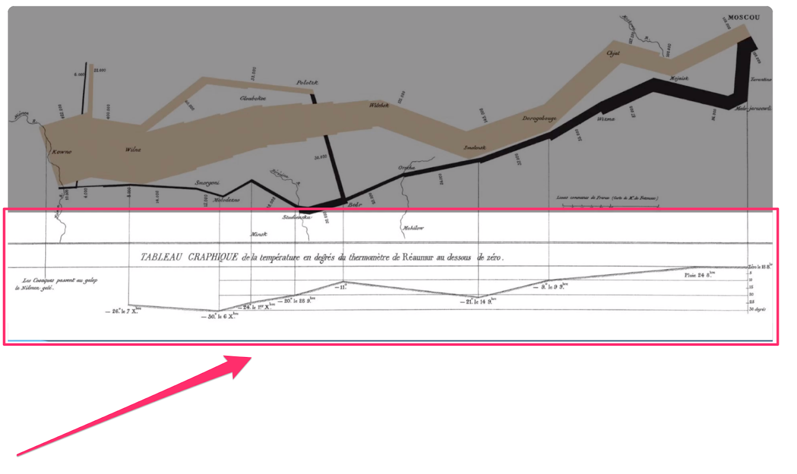
As temperatures get colder, troop casualties rise. There may have been multiple factors to these deaths, but showing a partial causality with temperature highlights its undeniable impact on troop numbers.
Main takeaways
So, what can we learn from Minard's detailed graph?
- First, if a complex set of variables is balanced with thoughtful visualization, it allows the audience to grasp cause and effect
- Second, visual comparisons can help communicate the difference between factors or elements of events
- Finally, highlighting the causality between two seemingly unrelated variables can help audiences reach conclusions
Relatable data is engaging data
Including data in a presentation is one thing, but making it stick in the audience's mind is another entirely.
Data points can be complex or hard to visualize. Connecting data to objects or plotting them on a timeline helps the audience see between the lines and relate to them.
Next time you present to an audience, tie data to real-life experiences to bring your presentation to life.
Want to make your next presentation more visually appealing? Check out Prezent's guide on how to use color and space efficiently.
Related Guides


