No items found.
No items found.

If you listen close enough, data will talk to you.
Unfortunately, the problem with many data-heavy presentations is that deliver lots of information with little insight. The audience is left inundated with numbers and charts—but the insight or “so what” is often missing.
Here are two tips to make your next data-heavy presentation shine.
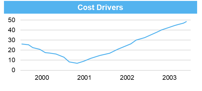
Below is a typical cost-drivers chart we see in data-heavy business presentations. It is a clearly laid out line graph.
But what should the audience focus on? There are many data points between 2000 and 2003.
What should the eye focus on? Is it the trough in 2001? Or the decline from 2000-2001? Or the increase from 2001 to 2003?
Contrast the above Cost Drivers chart with the one below.
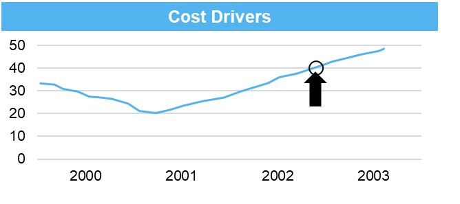
In this chart, it's clear that the presenter wants the audience to focus on the fact that in 2002-2003 the cost of “40” was hit.
Data-heavy business presentations can be powerful. Unfortunately, presenters are tempted to present the data in a form that makes it harder for the audience to understand the true meaning.
Let’s take a look at the chart below:
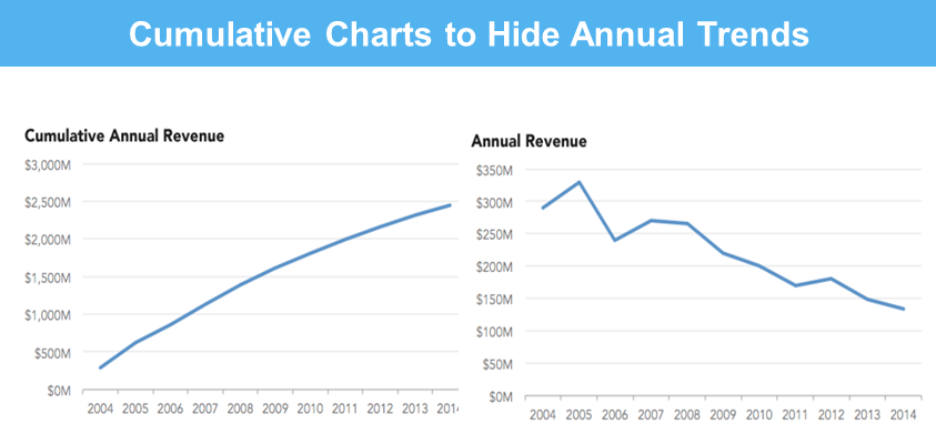
At first glance, the chart on the left looks like a smooth increase to the top-right from 2004 to 2014. However, a closer look would show that it's a cumulative chart. Plotting the data as annual instead of cumulative revenue presents the true and dismal picture of revenue decline.
We have all heard the jab at data charts, “Don’t let the data get in the way of a good story.”
I say, let’s not mislead with data and give credence to this narrative.


.png)